Energy apparently has more fuel in the tank. After underperforming the past couple years, it has rocketed higher to start 2013 and was the leading sector during what was a VERY solid January. As a student of history, that January strength bodes well for the stock market during the balance of 2013. Expect all-time highs on the S&P 500 later this year and those future gains are likely to be accompanied by a rapidly rising energy group. In my last article, I showed a chart of the oil services index ($OSX) that reflected relative breakouts that were just barely taking place. Given the action the past couple weeks, those relative breakouts are much more clearly defined now. Take a look:
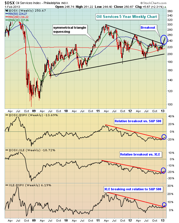
This is truly a perfect storm. Energy (XLE) is breaking out relative to the S&P 500 ($SPX). Oil services ($OSX) broke out of a symmetrical triangle on a long-term weekly chart. The $OSX is breaking out on a relative basis vs. both the $SPX and the XLE. Currently, I don't really see any better area in the market to trade than oil services.
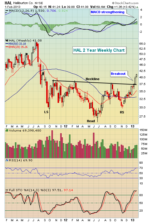
Within the $OSX, check out Halliburton (HAL), one of the many oil services components with improving technicals:
So where else can we turn? The market's overbought and chasing anything should be considered dangerous. Well, technology has been the most disappointing sector the past few months as Apple's (AAPL) struggles have been well documented and have compounded the difficulties for the NASDAQ 100 ($NDX). But let's not forget it was AAPL's strength that catapulted the $NDX on a relative basis prior to this latest period of disappointment. Could the $NDX be ready to jump back into the fray? Check this chart out and you be the judge:
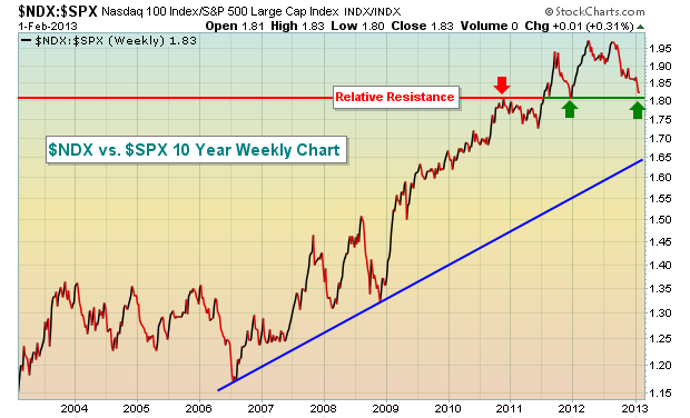
Since 2006, this relative chart has been trending higher. With every relative breakout, the previous relative support held during periods of tech weakness. According to the chart above, we're going to find out a lot about the long-term relative strength of the $NDX. Personally, I believe the group is now primed to outperform once again. But I wouldn't rush into the first component that you come across. In fact, on Friday, I listed 24 component stocks of the $NDX printing long-term negative divergences on their daily charts for the benefit of our members. I would avoid them. While that doesn't guarantee selloffs, it certainly increases the risk of holding or (gasp!) buying these stocks. The good news is that there were 32 stocks in the $NDX that looked very solid to me technically.
On Monday, I'm featuring one of these $NDX component stocks in the midst of a VERY bullish ascending triangle pattern. I expect it to lead to outsized gains, especially on a high volume breakout. If interested, you can sign up for our FREE weekly newsletter (simply provide your e-mail address) and I'll be happy to send you my annotated chart. CLICK HERE for more details.
Happy trading!

This is truly a perfect storm. Energy (XLE) is breaking out relative to the S&P 500 ($SPX). Oil services ($OSX) broke out of a symmetrical triangle on a long-term weekly chart. The $OSX is breaking out on a relative basis vs. both the $SPX and the XLE. Currently, I don't really see any better area in the market to trade than oil services.
Within the $OSX, check out Halliburton (HAL), one of the many oil services components with improving technicals:

So where else can we turn? The market's overbought and chasing anything should be considered dangerous. Well, technology has been the most disappointing sector the past few months as Apple's (AAPL) struggles have been well documented and have compounded the difficulties for the NASDAQ 100 ($NDX). But let's not forget it was AAPL's strength that catapulted the $NDX on a relative basis prior to this latest period of disappointment. Could the $NDX be ready to jump back into the fray? Check this chart out and you be the judge:

Since 2006, this relative chart has been trending higher. With every relative breakout, the previous relative support held during periods of tech weakness. According to the chart above, we're going to find out a lot about the long-term relative strength of the $NDX. Personally, I believe the group is now primed to outperform once again. But I wouldn't rush into the first component that you come across. In fact, on Friday, I listed 24 component stocks of the $NDX printing long-term negative divergences on their daily charts for the benefit of our members. I would avoid them. While that doesn't guarantee selloffs, it certainly increases the risk of holding or (gasp!) buying these stocks. The good news is that there were 32 stocks in the $NDX that looked very solid to me technically.
On Monday, I'm featuring one of these $NDX component stocks in the midst of a VERY bullish ascending triangle pattern. I expect it to lead to outsized gains, especially on a high volume breakout. If interested, you can sign up for our FREE weekly newsletter (simply provide your e-mail address) and I'll be happy to send you my annotated chart. CLICK HERE for more details.
Happy trading!

About the author:
Tom Bowley is the Chief Market Strategist of EarningsBeats.com, a company providing a research and educational platform for both investment professionals and individual investors. Tom writes a comprehensive Daily Market Report (DMR), providing guidance to EB.com members every day that the stock market is open. Tom has contributed technical expertise here at StockCharts.com since 2006 and has a fundamental background in public accounting as well, blending a unique skill set to approach the U.S. stock market.
Learn More


