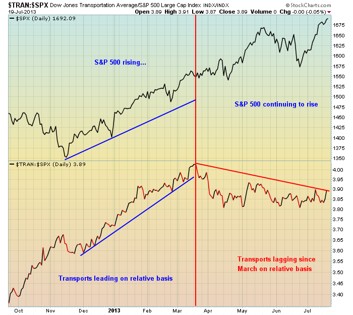
Transportation stocks helped lead the market rally from October 2012 through March 2013, but since that time it's been a struggle on a relative basis. Check out this relative chart:
Relative support resides near the 3.80 level in the chart above - a relative close beneath this level could be an additional warning sign.
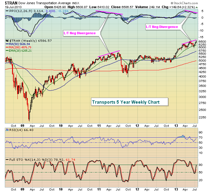
The biggest problem for transports, however, is the sign of slowing momentum on the longer-term weekly chart. The last two breakouts in transports have occurred with MACDs much lower. While this guarantees us nothing, it certainly suggests the risks of remaining long this group are spiking. Take a look at the chart:
It's looking eerily similar to the summer of 2011 when transports rose to fresh highs in July with a nasty long-term negative divergence. That evidence of slowing momentum eventually resulted in a significant selloff throughout the balance of the summer. We may not see a repeat in 2013, but the warning is there nonetheless.
There's one component of the transportation index that has printed negative divergences in each of the last two summers and then subsequently lost 30% (2011) and 15% (2012) in the following three months. It's set up in a very similar bearish pattern in 2013 and I'm including it as my Chart of the Day for Monday. CLICK HERE for more details.


