Hello Fellow ChartWatchers!
We've just complete a terrific visit to the New York area where we held our two day SCU seminars and where I was able to squeeze in a visit to the Long Island Stock Traders Meetup Group. During my presentation to the Long Island group, I needed to show them exactly how the MACD indicator works. As one of the most popular technical indicators, understanding the MACD is something that everyone should know. The typical answer is something like "Well, it shows a stock's momentum." OK, that's fine, but what exactly is "Momentum"?
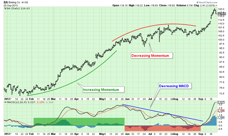
To make it visual, I created the following chart for my presentation:
(Click the chart for a live version)
As you can see with this chart, momentum is the concept of "the rate of increase for a uptrend." During the initial part of the uptrend for BA on the chart, not only were prices moving higher, they were moving higher at an increasing rate. That's what the green curve represents. Later, prices were still moving higher, but the rate started to decrease (the red curved line). Eventually, around the start of August, prices were just moving sideways.
So, the MACD and the MACD Histogram quantify that "rate of increase" that the curved lines show. First off, notice that the black MACD Line was above zero for most of this time - meaning that in general the stock was in an uptrend for most of the chart.
Now look at what happened to the MACD while the stock was moving higher with increasing momentum (i.e., the green box). First off, notice that during that time, the black MACD line moved higher (mostly). Also notice that the blue MACD Histogram bars (which represent the difference between the black MACD Line and the red MACD Signal Line) were (mostly) above zero during this time. That is how the MACD indicates that a stock has positive momentum.
Later, when momentum started to decrease (during the red box), the MACD Line was moving lower and the blue histogram bars were (mostly) below zero. That is how the MACD indicates negative momentum.
Understanding a stock's momentum is critical to understanding the strength of its current trend. And since riding trends is ultimately how technical investors make money, that means that understanding the MACD is very important indeed. Hopefully this chart has helped you better understand how it works.
Take care,
-- Chip


