Hello Fellow ChartWatchers!
If you are looking for lots of near-term optimism, I'm afraid the rest of this newsletter will be very disappointing. There are numerous technical reasons to think the market is overdue for a pull-back. And here they are...
Sector Rotation Points to Defensive Outlook
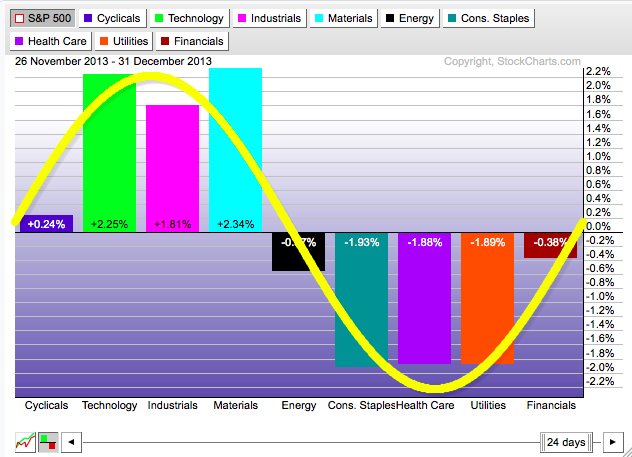
I've written on numerous occasions in the past about how anyone can quickly and easily use our Interactive PerfChart tool to study sector rotation effects. Rarely however has the picture changed so quickly from a clearly "offensive" (bullish) situation to a clearly "defensive" (bearish) picture. Check it out. Here's a picture of the situation at the end of 2013 (only 3 months ago!). This is a very bullish rotation picture:
To create this picture yourself, follow these steps:
- Visit our homepage, then click on the "S&P Sector PerfChart" link under all the ticker symbols.
- Click on the little "Histogram" button in the lower left corner of the chart.
- Right-click on the middle of the date-range slider (located at the bottom of the chart) and select "One Month" from the menu that appears.
- Press and hold down the left arrow key on your keyboard until the start date says "26 November 2013"
- Right-click in the middle of the chart and select "Show Cycle Line" to add the yellow line
- Finally, click and drag the yellow line until most of the bars are "underneath" it like I have on the chart above.
Looking at that chart, see how the bars on the left side (the bullish "offensive" sectors) are all outperforming the market while the bars on the other side are all underperfoming it? That strongly suggests that the market felt things were picking up and looking good for the future.
(And, to be honest, the rotation picture had been similarly positive for several months prior to December as well. Move the slider to the left to see for yourself.)
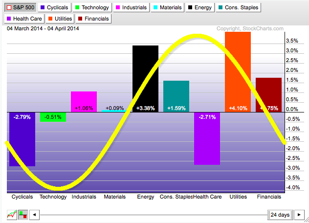
However, if you want to see the market change its mind about things in a short period of time, just press and hold down the right arrow on your keyboard. By the time the slider gets to now, things are almost 180 degrees reversed:
OK, granted, the Health Care sector is still negative, but can you think of anything that might be going on right now to cause that? ;-)
Ignoring Health Care, the "defensive " sectors - lead by Utilities - are currently in control of things. It's not a bullish situation folks. As always, you should check out this chart on a regular basis to see how things continue to evolve. For more details, check out our ChartSchool article on Sector Rotation.
- Chip
P.S. Space at ChartCon 2014 is filling up fast. I'd love to see you in Seattle this August if at all possible. John, Arthur, Greg, Erin, Alex, Martin, Gatis, and Dick would too. If you can make it, I guarantee you'll learn more about charting in those two days that you could ever imagine! Click here for details.


