I previously highlighted the chart below in this past Thursday's DITC article (12/19). But what does it mean?
What is it Showing?
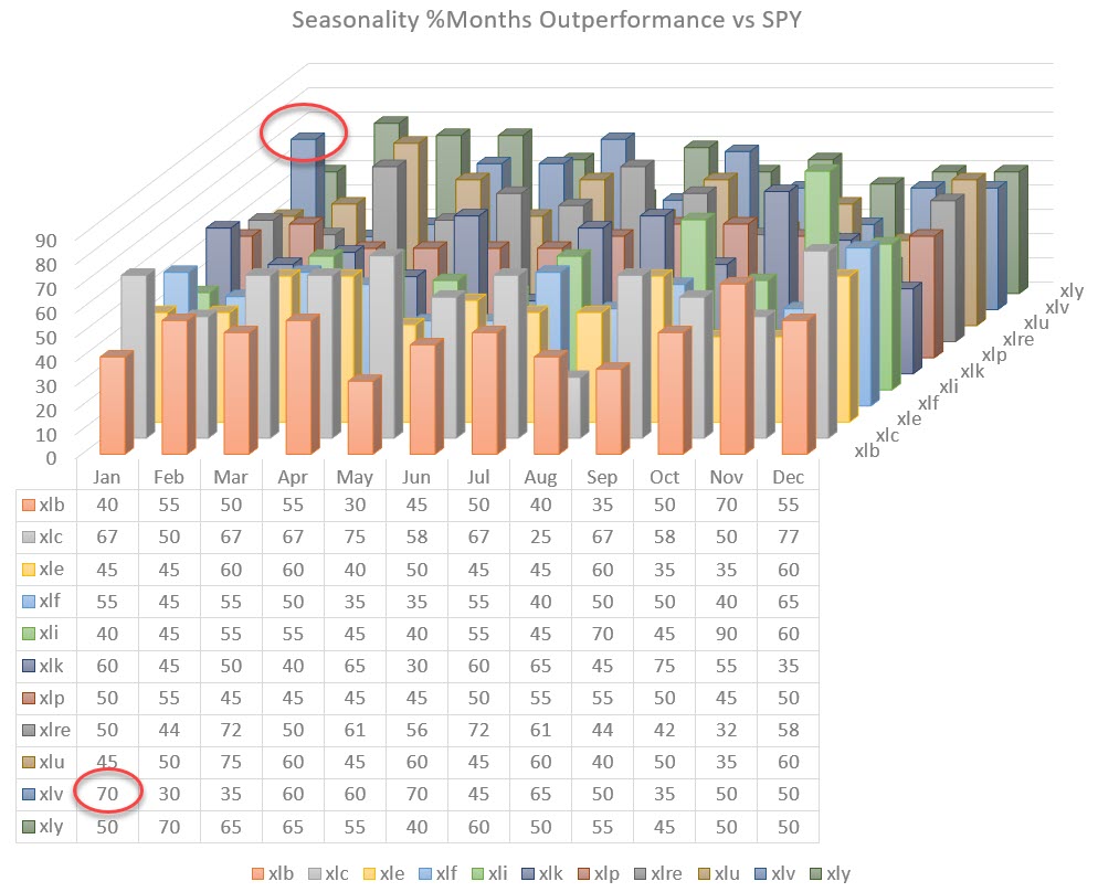
This chart visualizes the collective seasonality of all 11 sectors in the S&P 500.
To get there, I collected the numbers from the seasonality chart (which is available on the site) for every sector and the S&P 500 over the past 20 years (the maximum lookback period). I then punched all these numbers (288 indeed) into a spreadsheet and created this 3D-column chart. By visualizing these data in this way, we can get a view of the seasonality across the entire universe.
Just like a Relative Rotation Graph shows the relative rotations of all sectors around the benchmark (SPY) over a certain period of time (tail length), this 3-D column chart shows the annual Seasonality for all sectors in one picture.
These sort of visualizations, IMHO, are very helpful when it comes to getting a high-level overview of markets, seeing the forest from the trees and putting things in perspective.
Following the chart above, we can slice and dice this universe and zoom in on individual seasonalities - for example, by highlighting one month as shown in the chart below.
Highlighting the seasonality for all sectors for the month of January shows that Health Care has a tendency, at least over the last 20 years, to outperform the S&P 500. This occurred in 14 out of the 20 months of data that are available, or 70% of the time.
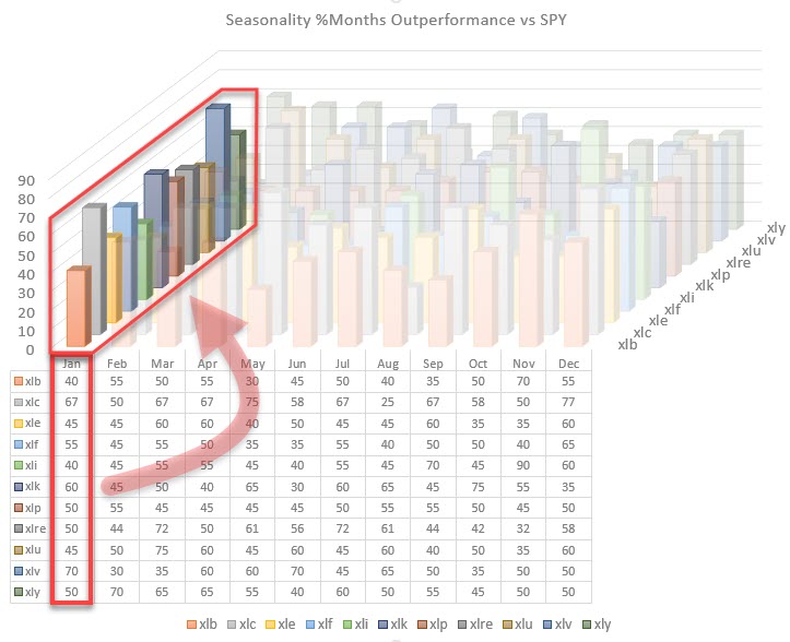
Highlighting the other axis can show us the seasonal tendency for XLV throughout the year. This is the same view that you get on the standard seasonality chart that we have on StockCharts.com for a single security.
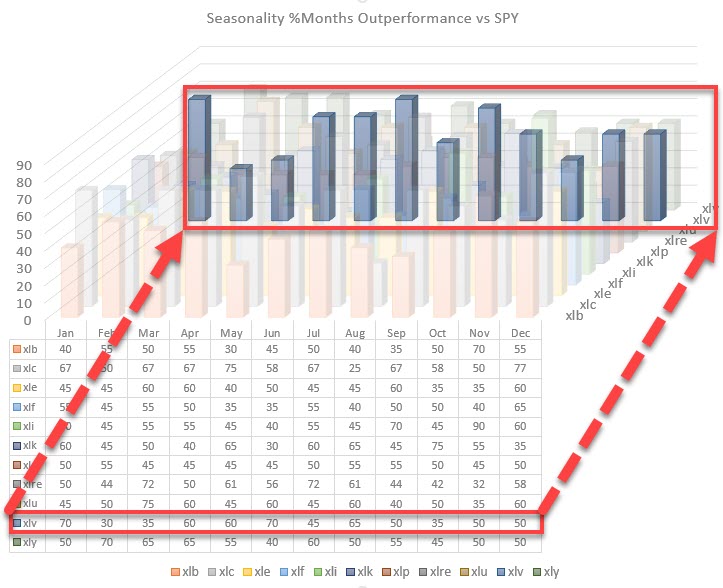
This exercise tells us that January, in general, is a good month for Health Care, as is the period from April-May-June. This is helpful information when analyzing the markets and/or individual securities.
Please bear in mind that the data used in the charts in this article are relative to the S&P 500. Clearly, a similar setup can be created for outright performance data.
What about returns?
Now that we can visualize the seasonality of months outperforming SPY, we can take the next step and make a visualization of the average returns per sector, per month. That gives us the chart below:
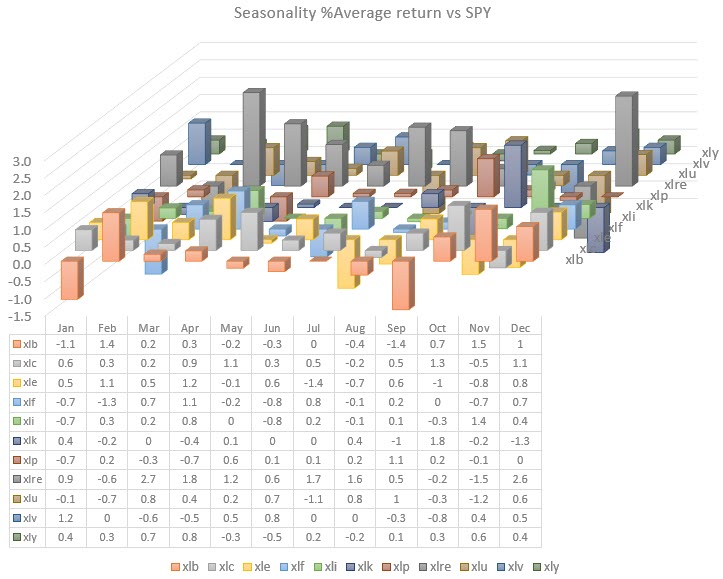
Obviously these RELATIVE (don't forget) returns can be positive and negative, so this chart has a virtual floor at zero. Columns that rise above that floor indicate an outperformance on average, while columns that drop below that virtual 0-floor are indicating an underperformance on average.
Zooming in can be done in a similar way as we did for the seasonality.
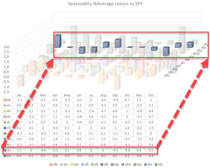
This chart highlights the average relative performance for the Health care sector throughout a year. We see that January not only scores high on seasonality for XLV, but also produces 1.2% of outperformance over SPY on average.
The average return for April is a bit out of line. April-May-June are months with strong seasonality numbers 60-60-70. The fact that the average return in April is negative suggests that one or more of the negative months (40%) were really bad, which is dragging the average down. A good example how of working with averages can be dangerous...
"Don't cross a river if it is (on average) four feet deep," - Nassim Nicholas Taleb
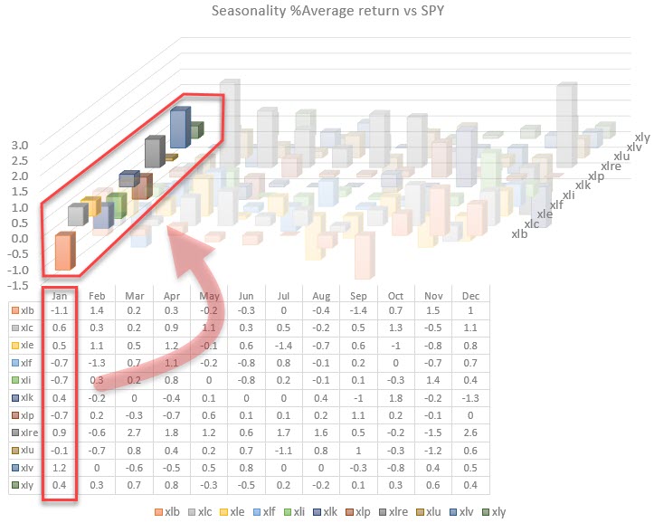
The other entry would be to highlight the relative performances for a month. In the image below, January is highlighted and shows not only the peak for Health Care but also, for example, the negative return for Materials (and XLF,XLI,XLP,and XLU).
Combining Various Pieces of the Puzzle
Seasonality and average performance per sector per month are very helpful tools/metrics to get some guidance on what usually/on average happens with a sector on a forward-looking basis. As with all tools that we have in our toolkit and on StockCharts.com, there is no certainty. They are all providing us with pieces of the puzzle.
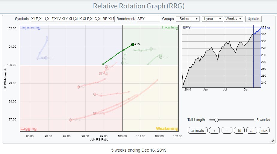 Weekly RRG for US sectors highlighting XLV
The combination of various tools is what provides us with insight. Obviously, I want to combine things with a Relative Rotation Graph. When I run the RRG for US sectors, XLV seems well-positioned to enter the new year on a positive note.
Of course, there are still a few weeks left in this year, but the combination of a strong rotation on the Relative Rotation Graph and an outperformance from SPY in 14 out of 20 Januarys over the last 20 years (average outperformance 1.2%) suggests a good relative start in 2020 for the Health Care sector.
--Julius
My regular blog is the RRG Chartsblog. If you would like to receive a notification when a new article is published there, simply "Subscribe" with your email address.
Julius de Kempenaer
Senior Technical Analyst, StockCharts.com
Creator, Relative Rotation Graphs
Founder, RRG Research
Want to stay up to date with the latest market insights from Julius?
– Follow @RRGResearch on Twitter
– Like RRG Research on Facebook
– Follow RRG Research on LinkedIn
– Subscribe to the RRG Charts blog on StockCharts
Feedback, comments or questions are welcome at Juliusdk@stockcharts.com. I cannot promise to respond to each and every message, but I will certainly read them and, where reasonably possible, use the feedback and comments or answer questions.
To discuss RRG with me on S.C.A.N., tag me using the handle Julius_RRG.
RRG, Relative Rotation Graphs, JdK RS-Ratio, and JdK RS-Momentum are registered trademarks of RRG Research.
Julius de Kempenaer
Senior Technical Analyst, StockCharts.com
Creator, Relative Rotation Graphs
Founder, RRG Research
Host of: Sector Spotlight
Please find my handles for social media channels under the Bio below.
Feedback, comments or questions are welcome at Juliusdk@stockcharts.com. I cannot promise to respond to each and every message, but I will certainly read them and, where reasonably possible, use the feedback and comments or answer questions.
To discuss RRG with me on S.C.A.N., tag me using the handle Julius_RRG.
RRG, Relative Rotation Graphs, JdK RS-Ratio, and JdK RS-Momentum are registered trademarks of RRG Research.