It's been some time since I revisited my sentiment charts. I used to do a weekly sentiment update on MarketWatchers, but since then I haven't written or talked about sentiment much, so it is long overdue.
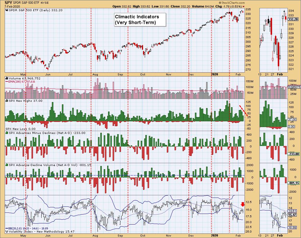
Sentiment is a measure of how bullish and bearish participants are regarding the market, where we look for extreme readings in one direction or the other. Sentiment is contrarian, meaning that, when everyone is bullish, it is usually a signal of a nearing decline. On the other side, when everyone is very bearish, that is the time to look for a market bottom. Many of us typically use the VIX as a sentiment gauge all the time whether we know it or not. When the VIX hits high readings, the "fear factor" is high, so you should look for a price rise when that happens. Below is the VIX chart. I update, annotate and analyze this chart daily for DecisionPoint Alert subscribers, for whom I give my analysis of market conditions based on this chart and (of course) many others.
I've marked cardinal tops over the past year and you can see that they typically occur when the VIX is at overbought extremes (very low readings), many times puncturing the upper Bollinger Band first. Very low VIX readings are telling us that participants are bullish or even complacent. Seeing a market top when this condition occurs is a great example of highly bullish sentiment resulting in a bearish decline. Remember, I use an inverted VIX to accentuate overbought and oversold conditions. Looking at the current readings on the VIX, I am bothered that it is turning back down below its 20-MA. This suggests internal weakness in the SPY. So, while neither Bollinger Band has been pierced, watching how the VIX reacts to its average is also important.

As investors, we want to accomplish two basic things: (1) determine the trend and condition of the market, and (2) select stocks that will ride that tide. The DecisionPoint Alert helps with the first step, while DecisionPoint Diamonds helps with the second. Go to DecisionPoint.com and SUBSCRIBE TODAY! (Charter Subscriber Discounts Still Available!)
Let's look at some of the other sentiment indicators that DecisionPoint updates. You can find these charts in the DecisionPoint.com "DP Alert ChartList," annotated and curated by Carl and I exclusively for our subscribers. To simply get the charts themselves, you can download the "DP Market Indicators" ChartPack on StockCharts.com (free to Extra members and above).
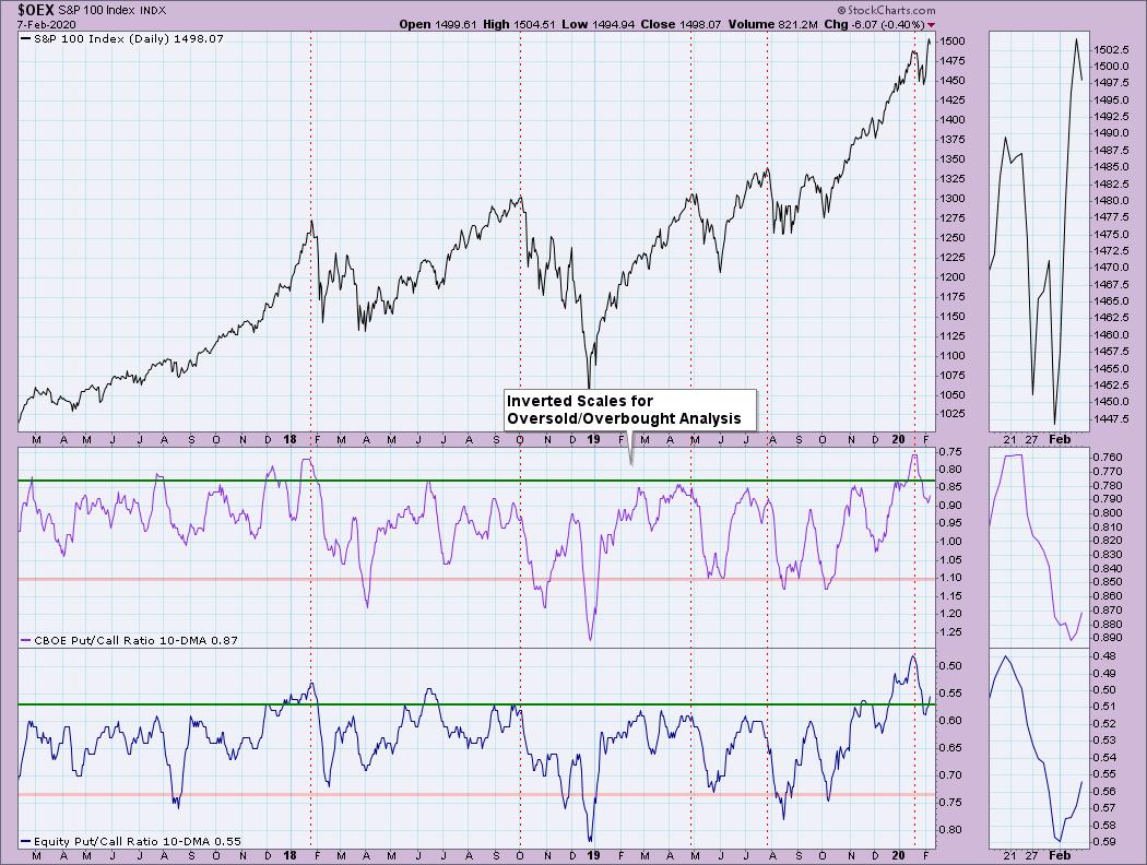
First up is the 10-DMA of the Put/Call Ratios. You'll note that when the ratios get overbought (again using inverted scale to make clear the "overbought" vs. "oversold" readings), it typically precedes market declines. I've again annotated cardinal tops so you can see the behavior of the indicator going into the declines. The ratios topped in very overbought territory before last month's pullback. Today's readings aren't climactic, but, until we get a solid bottom on these indicators, the market is vulnerable.
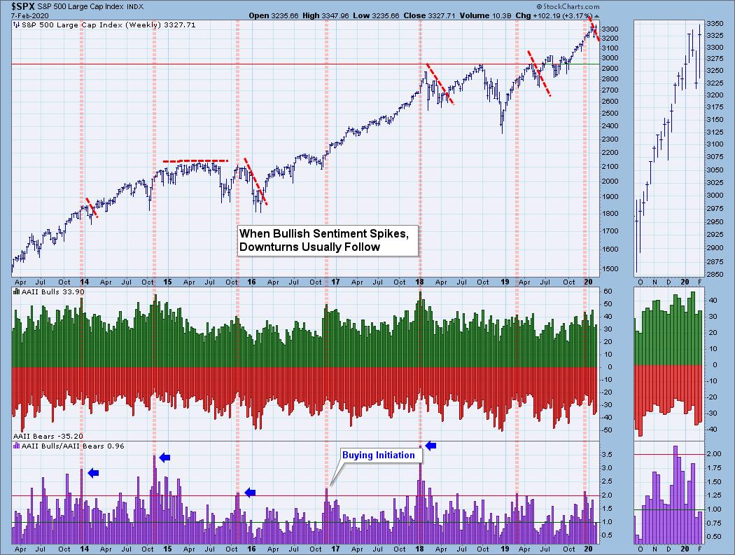
Next up is the American Association of Individual Investors (AAII) poll results. Every week, anyone can go to their site (aaii.com) and take the simple "I'm bullish, I'm bearish" survey/poll. We track the results weekly with fresh readings coming in on Thursday afternoon. Again, note that when we get climactic readings on the bull/bear ratio, the market usually tops or consolidates. It's not an "every time" indicator, but sentiment sets the stage and lighting for the show. Though unusual, sometimes these readings can mark the beginning of a buying initiation, I usually look for buying exhaustions when we get high-ratio readings. Currently, we're in neutral, with a near equal amount of bulls to bears.
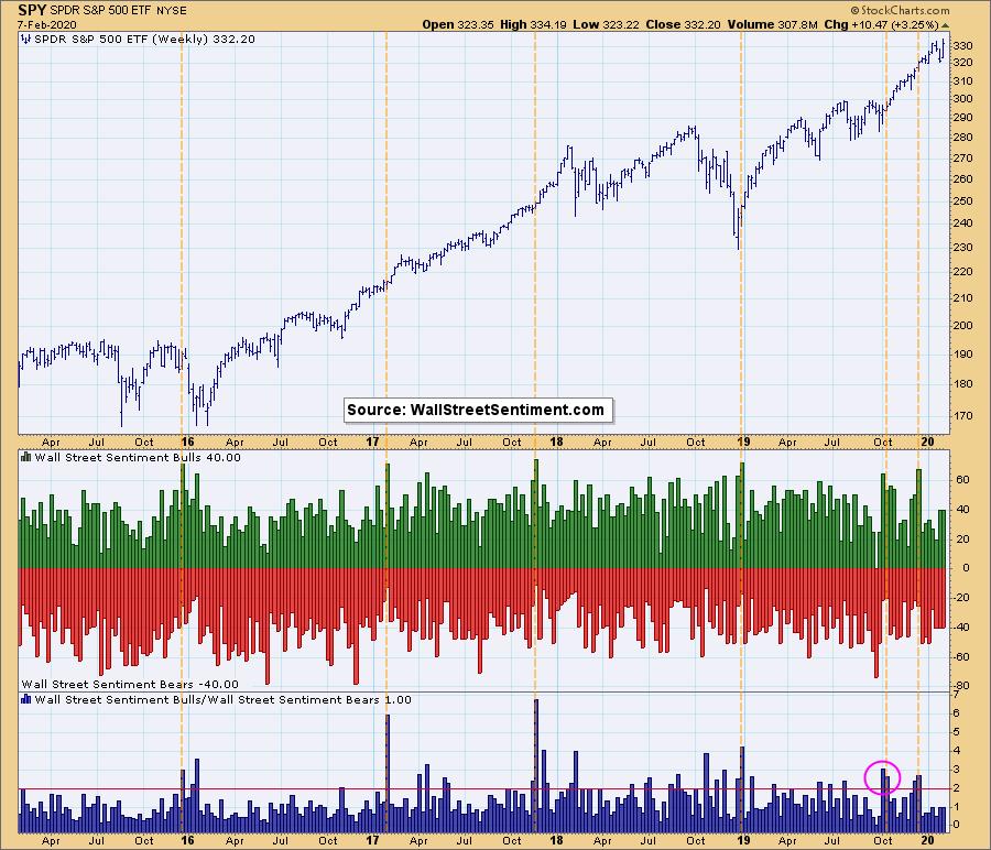
My friend Mark Young at WallStreetSentiment.com gives us the data for this chart. Mark sends out a survey on Friday afternoon asking a group of near-static market timers whether they think the market will go up or down the following week. Carl and I are among the survey participants, so it does make me proud to say that my market timer brethren tend to be right when the ratio hits bullish extremes. Currently, the reading is 1.00, which isn't helpful because it means there are an even number of bulls and bears. No sentiment extremes this week. This chart updates on Mondays.
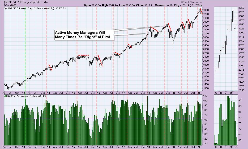
The National Association of Active Investment Managers (NAAIM) surveys big money managers and asks how "exposed" they are to the market. Notice that extremes tend to come before consolidation or decline. At first, they will tend to be right, but, shortly thereafter, a decline or consolidation usually occurs. The green line in 2013 was the mark of a buying initiation. Currently, we are seeing low levels but no extremes, which tells me managers are cautious right now (as am I!).
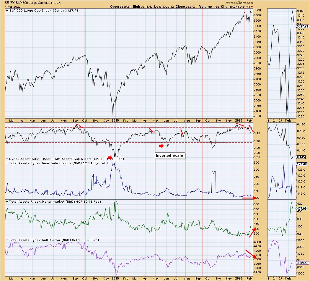
The final chart I consider one of DecisionPoint's hidden gems. Carl came up with this indicator many years ago when Rydex used to manage a group of funds that are divided into bull funds, cash (money markets) and bear funds. Guggenheim manages them now, but we have kept the "Rydex" name since the indicator has always been known as the "Rydex Ratio." It's really ingenious, if you ask me. We monitor the number of assets each night within the bull funds, money markets and bear funds, then track the ratio between bull/equity funds and bear/money market funds. This is why this chart isn't showing readings for today - they won't be in until tonight.
Right now, bear funds are holding even. Money market assets are increasing significantly, suggesting money is moving out of the market. Bull and equity funds are declining. So, interestingly, even as prices began to rally, money was moving to the sidelines. Rather than a finger in the wind survey, this is based on actual money. I've marked cardinal tops and notice the warning we get when the ratio turns down. Currently, the ratio is moving lower and there is some distance to oversold territory, which suggests caution.
I hope you enjoyed the sentiment update! I'll be posting another one soon for our DecisionPoint.com subscribers. Many of you have written to Carl and I over the years telling us how helpful and lucrative our reports have been for you. If you used to regularly read the DP Alert Mid-Week and Carl's Weekly Wrap, we now have those in even more detail (and daily!) on our website. Additionally, I moved the DecisionPoint Diamonds Report to our website.
As one subscriber told us, "You do all the work for me!" as we provide overall market analysis daily and 15 stock suggestions a week. Read the DecisionPoint blog archives for sample reports. You can also sign up for our free email list to be notified regularly of free content when it is published. Just go to our homepage DecisionPoint.com.
Happy Charting! - Erin
Technical Analysis is a windsock, not a crystal ball.
Helpful DecisionPoint Links:
DecisionPoint Alert Chart List
DecisionPoint Golden Cross/Silver Cross Index Chart List
DecisionPoint Sector Chart List
Price Momentum Oscillator (PMO)
Swenlin Trading Oscillators (STO-B and STO-V)