
I very much enjoyed participating in our StockCharts TV special event "Navigating a Bear Market" along with many of my fellow StockCharts contributors. In this article, I'll provide my comments and charts from that special, along with some brief updates on what has changed in the last couple days.
Let's explore the bear market through an asset allocation lens. We tend to think a lot about stocks and their current sell-off, but how does this sell-off relate to other asset classes? We're going to go through what I would consider the asset allocation decision - that is, looking at stocks vs. bonds vs. commodities vs. currencies. Next, we'll briefly examine each one individually for some key themes of note.
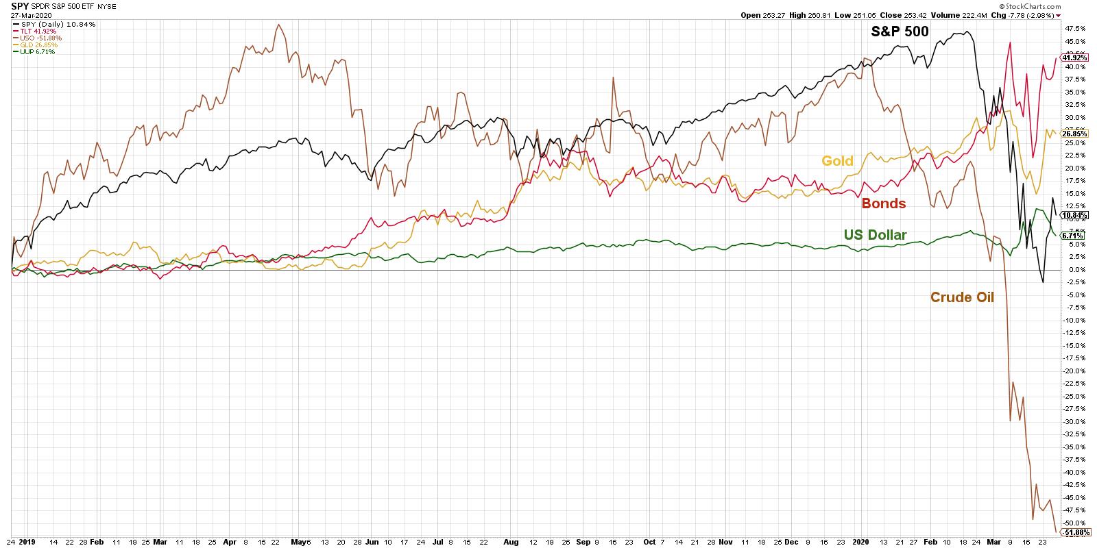
When I gave a presentation here in Seattle in mid-February, I noticed all of these asset classes were going up at the same time. That 2nd week in February, it seemed everything was in a bull market, and I made the comment that this is certainly unsustainable. There was no way that pattern could continue - something had to give.
That "give" happened in the 2nd half of February when stocks sold off very quickly, crude oil sold off aggressively, the dollar started to weaken and even gold pulled back. Bonds were the only thing that rallied, and they rallied hard into the first week in March.
Since that time, things have stabilized just a bit. However, it's undeniable that crude oil continues to be in a significant downtrend, while stocks, even with a bounce here early in the week, continue to be in the downtrend of lower highs and lower lows. The question, then, is how does this relate to other asset classes?
A crucial point to note - don't get too caught up in what "should" happen. People tend to think "Stocks are selling off, so a safe haven like gold should do well." There are plenty of times when this is the case, but in the last couple weeks stocks and gold have actually been moving together and selling off in tandem. So don't think as much about what should happen - look at what is happening.
Let's look at each asset class individually and notice some of the patterns.
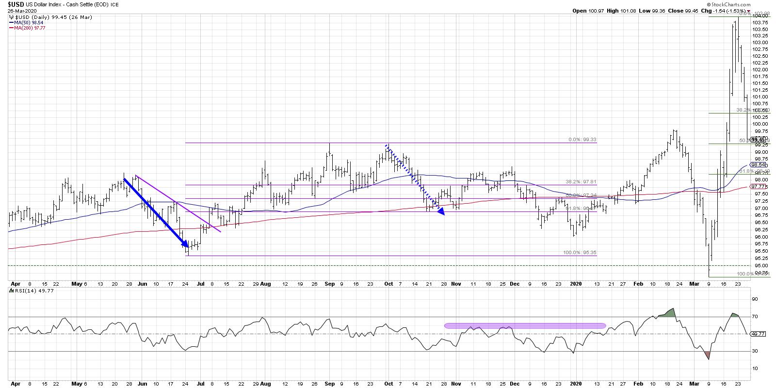
When looking at the US dollar index, it has overall been in a slow and steady uptrend before really coming off in mid-February to mid-March. Afterwards, it moved into full rally mode. Even with days where the dollar weakened, the trend has remained significantly strong overall, which tends to favor US stocks over non-US stocks.
In general, this would also be more supportive of small-cap stocks, but with the coronavirus pandemic and how the economy is adjusting, I don't think this is as much of a theme. Nevertheless, it certainly speaks to the strength of US versus non-US stocks.
It's worth noting that going into the end of this week, the Dollar pulled back aggressively, retracing 50% of its gains from the two previous weeks. Overall, this puts the US Dollar chart on my short list of "reversal watch" charts, as it may be nearing a key inflection point here.
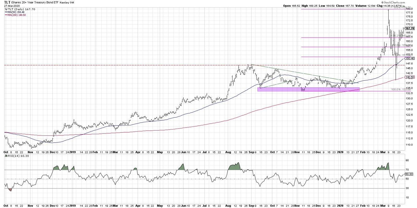
I usually look at bonds with the TLT. Bonds had rallied strongly into the 2nd week of March, and since then they have pulled back aggressively to the 200-day moving average. What's interesting with the chart of the TLT is it found support right at the 200-day, traded below that support intraday a couple days ago, then rallied to close back above the 50-day for the next couple of days.
It's important to note that it also came right back down to that region of stability from the 4th quarter of last year, which is certainly becoming a key support level for bonds. Since then, even with increased volatility in most asset classes, bond prices seem to be going higher.
A word of caution - people are seeing interest rates near all-time lows and starting to ask, "How much higher can bonds actually go?". The answer is that they can go much further than you think, while interest rates can keep going lower... much more than you probably think is reasonable.
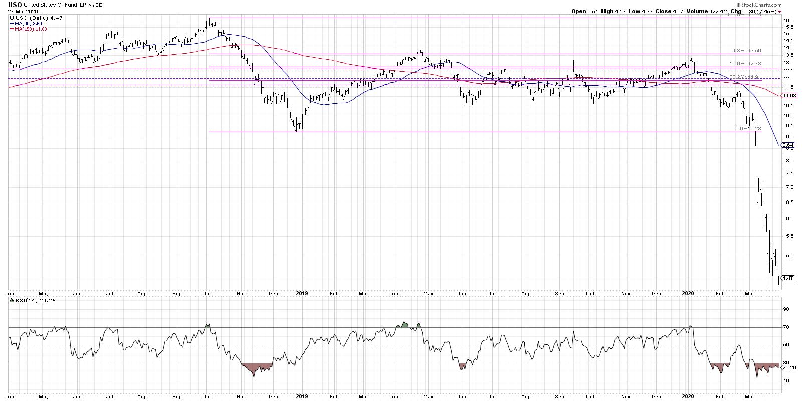
Oil seems to be in a falling knife scenario. In this scenario, you will notice huge percentage swings because the price is so low. Remember to take a step back, look at the peaks and the valleys and examine the trend.
I'm seeing oil in a downtrend - and not seeing the stability I would expect if we were going to get some sort of lasting rally. Consequently, oil seems relatively muted for the near future. Friday's selloff pushed crude oil to a new closing low, confirming severe price weakness leading into next week.
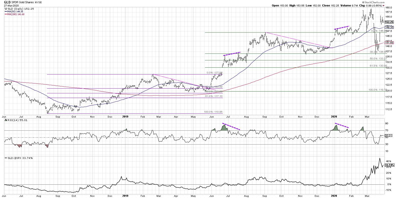
Of all the assets we've discussed so far, perhaps with the exception of the US Dollar, Gold appears to be set up most keenly to grow from here. The USD gapped up pretty well in the last couple days as a reaction to further sell-off in stocks, but overall it is setting up beautifully to appreciate. It pulled back to the same support level it found from last November and December when it broke below the 200-day, but that was a false breakdown. It rallied back above and is now once again approaching previous highs.
All of that is compelling, but relative strength is what tells the real story. If you want to outperform the S&P 500, you need to own assets that are improving in relative strength. Gold is certainly one of those assets.
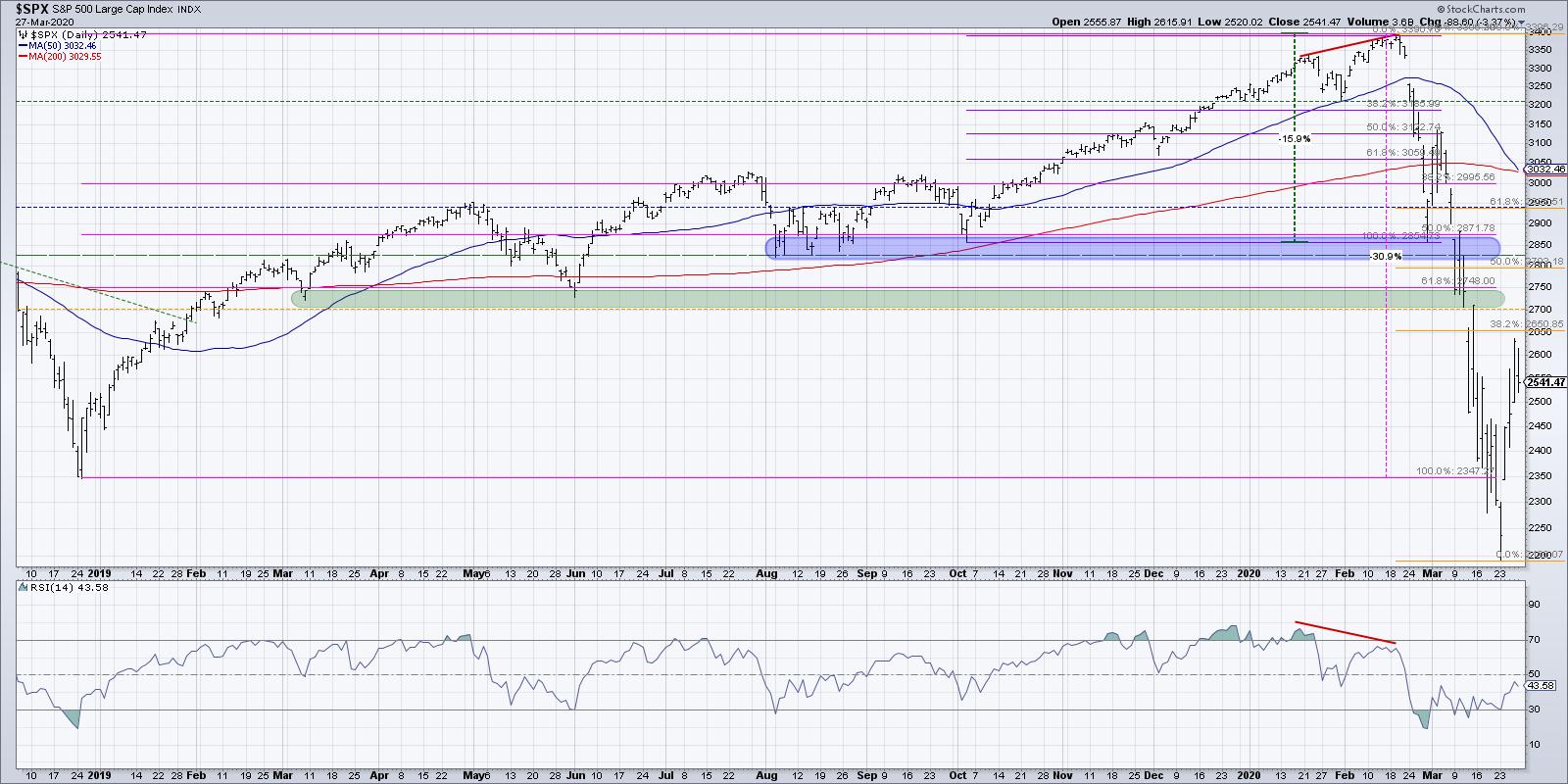
Finally, in looking at the chart of the S&P 500, what concerns me overall about stocks is that the breadth characteristics are now more similar to the 4th quarter of 2008 as opposed to the 1st quarter of 2009. I think this means further weakness for stocks and further increases in some of these other asset classes.
This week saw the S&P improve dramatically, yet the distribution leading into Friday's session made it feel as if there is plenty of selling pressure out there for equities.
Combine this with the fact that Friday's close to Monday's close has usually been a down move, and next week may be setting up for further price weakness and uncertainty.
RR#6,
Dave
David Keller, CMT
Chief Market Strategist
StockCharts.com
Disclaimer: This blog is for educational purposes only and should not be construed as financial advice. The ideas and strategies should never be used without first assessing your own personal and financial situation or without consulting a financial professional.
The author holds positions in TLT and GLD at the time of publication. Any opinions expressed herein are solely those of the author and do not in any way represent the views or opinions of any other person or entity.


