
Technical analysts use a lot of breadth data in their work, which is understandable as it can give us a lot of useful information about how a market as a whole, usually a broad index level, behaves. Plus, it can help us to find developments "under the hood" which may not (yet) be visible at the index level yet.
This also ties in nicely with an oft-used phrase which says that the stock market is really a market of (individual) stocks. That refers to the fact that movement in individual stocks can often differ from the movement in the overall index.
I had to think of that when I came across this image of the street signs across from the NYSE building. In a way, it perfectly illustrates how a "Broad" market index connects with individual stocks traded on "Wall" Street. Most of the time these, broad market indexes are very high-level, such as all NYSE stocks, all NASDAQ stocks, all S&P 500 stocks, etc.
Someone who has, and still does, a lot of work and analysis using breadth data is Arthur Hill. If you are interested to learn more about breadth and how to use it, I suggest you check out Art's articles.
One of the breadth measures I started to use and track is the number of stocks that are trading above their own moving average. StockCharts.com maintains these data on three time frames - above 200-day, 50-day, and 20-day moving average. The symbols for these indexes start with an exclamation mark <!> followed by <GT>, then the number of days in the MA (200, 50, 20) and finally the index symbol. So, for the number of stocks trading above their 200-day MA, the symbol is !GT200SPX. For stocks above their 50-day MA, it is !GT50SPX, etc.
The main reason for my interest in this particular dataset is the fact that these metrics are available at a sector level as well. That gives me the opportunity to use them in a Relative Rotation Graph. The RRG below shows an example, illustrating the 200-day breadth rotations of the eleven sectors vs. 200-day breadth for $SPX.
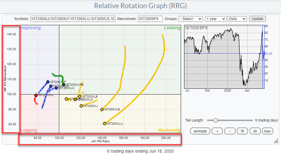
One of things that you may notice is that the spread of values on both axes is much wider than what we are used to on regular, price-based RRG. That is because the values of these breadth symbols is range-bound between 0%-100%. That means that, when you compare something good, i.e. high number of stocks above their MA, with something bad, i.e. a low number of stocks above their MA, you will get a huge difference.
Also, these values can change rapidly and, because of that in combination with the range-bound nature of this metric, plotting them on a weekly RRG can sometimes cause erratic movements on the RRG. For that reason, I have a (slight) preference for using the daily timeframe for the RRG when showing breadth rotation.
On the RRG above, the XLU breadth-tail shows the widest rotation. I wrote about that in Thursday's "Don't Ignore This Chart" article (Sector) Breadth Confirms Weak Rotation for Utilities. The other tail that stands out with regard to length and rotation vis-a-vis the other sectors and the benchmark is XLE.
In the image below, I have lined up the rotations for the price-based RRG at the top and the breadth-based RRG at the bottom. In addition, I have annotated a few points in time where the breadth-based RRG showed turning points.
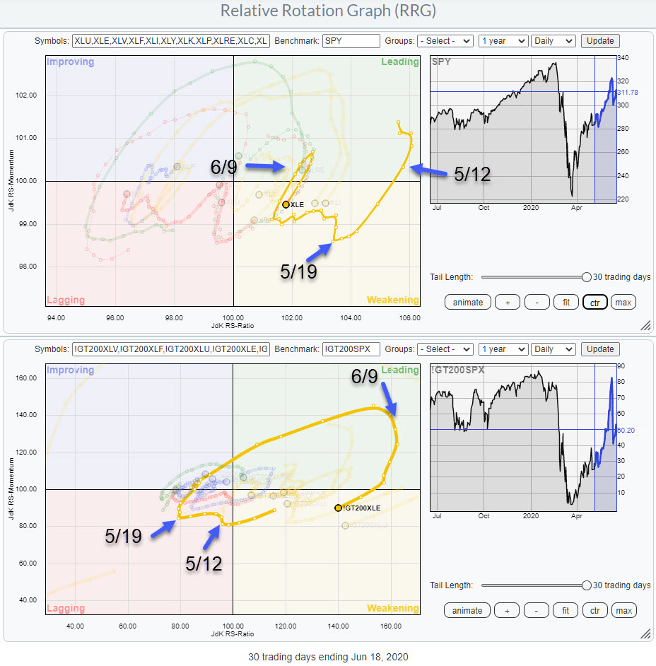
On 5/12, the first turning point, we find breadth just inside lagging and ticking up. At that time, the price-based tail was inside leading and heading lower towards weakening. In the days following, the breadth tail bends back to the left again but primarily moves sideways, no longer picking up negative momentum.
Then, on 5/19, both tails turn upward - price-based in weakening and breadth-based inside lagging. After that simultaneous turn, the breadth tail makes a big rotation back into the leading quadrant. The price tail ticks up a little, then moves left for a few days in a zig-zagging movement, before then picking up steam and moving into leading.
On 6/9, the breadth tail turns around again while inside the leading quadrant. The price-based tail follows that move a few days later and has now also turned back into the weakening quadrant.
From eyeballing and comparing a lot of these rotations between price- and breadth-based tails, it looks as if breadth leads the rotation on the price-based RRG on a regular basis. And, if they do not lead, they are pretty much in sync with the price tail. This means that breadth-based RRGs can be an additional tool to help you spot turns early without being harmful.
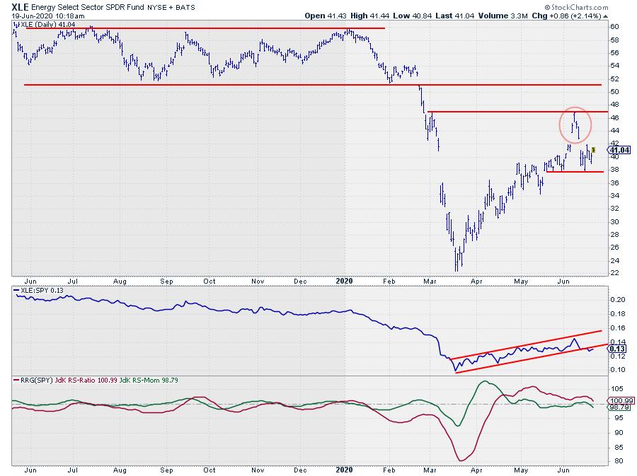
Wrapping this up with a look at the chart of the Energy sector, it looks as if the rally out of the March low has come to an end. The recent peak near $47 was formed against an intermediate resistance level and, of course, there is the clearly visible island formation, which limits the upside potential (at least in the near term).
I am watching a break below the recent low at $ 37.70. When that happens, a downward acceleration is likely, which will also fuel a further loss of relative strength.
The RS-Line is about to break out of its short-term channel while the RRG-Lines are rolling over.
All in all, energy is not a very good sector at the moment.
#$StaySafe, --Julius
My regular blog is the RRG Charts blog. If you would like to receive a notification when a new article is published there, simply "Subscribe" with your email address.
Julius de Kempenaer
Senior Technical Analyst, StockCharts.com
Creator, Relative Rotation Graphs
Founder, RRG Research
Host of: Sector Spotlight
Please find my handles for social media channels under the Bio below.
Feedback, comments or questions are welcome at Juliusdk@stockcharts.com. I cannot promise to respond to each and every message, but I will certainly read them and, where reasonably possible, use the feedback and comments or answer questions.
To discuss RRG with me on S.C.A.N., tag me using the handle Julius_RRG.
RRG, Relative Rotation Graphs, JdK RS-Ratio, and JdK RS-Momentum are registered trademarks of RRG Research.


