 I've spoken recently of the bearish divergences emerging from breadth indicators, including the anemic new 52-week highs list, as well as a breakdown in the percent of stocks trading above their 50-day moving averages.
As we recorded Friday's episode of The Final Bar, it appeared that the market weakness into the closing bell could trigger further deterioration in breadth readings.
After reviewing the final breadth readings on Friday evening, I have adjusted one of my key market breadth charts from 100% bullish to 50% bullish/50% neutral. Here, we'll review why this change is a significant one, and what we're looking for to rotate to a bearish breadth reading.
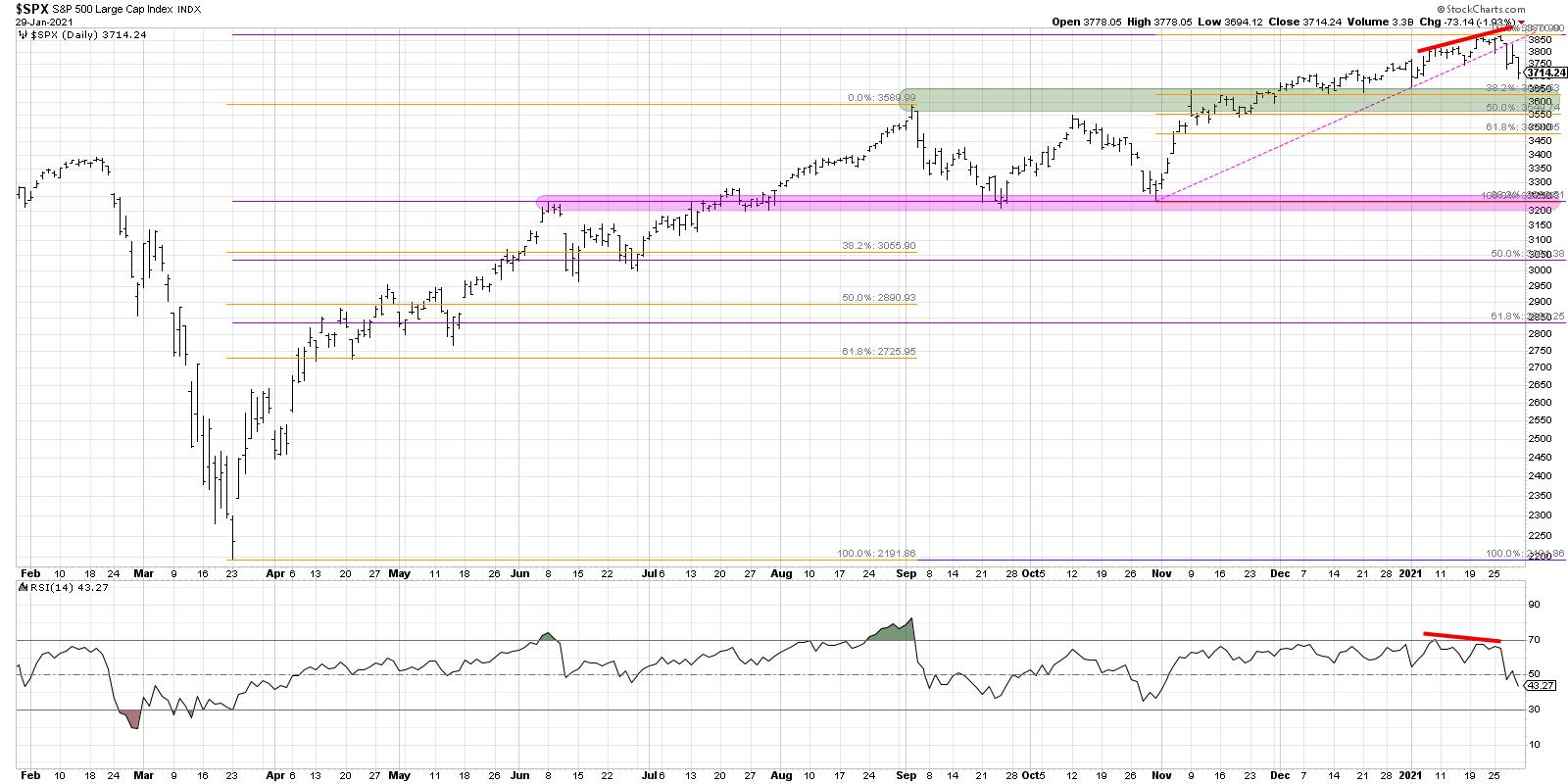
Market tops often begin with bearish divergences, both from breadth indicators like the ones we've mentioned above as well as momentum indicators like RSI. In fact, one of the most telling bearish signals in February 2020 was the lower peak in the cumulative advance-decline lines as the S&P 500 continued on to higher highs.
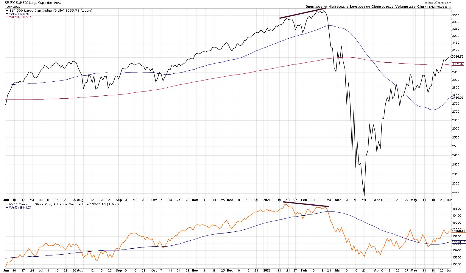
The lower peaks in the advance-decline lines were a cause for concern, but the price and breadth lines all breaking down were what finally confirmed the downtrend. This is a fantastic lesson in the value of using a mix of leading indicators (weakening breadth and momentum on higher prices) and lagging indicators (price breaks down through support).
Looking at the current breadth picture, we can see that none of the four advance-declines shown have established a lower high. All have continued to make new highs along with the S&P 500 index. So we have not seen the bearish divergence - yet.
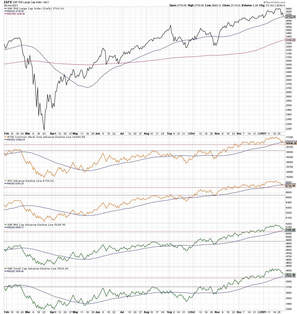
The color-coded advance-decline lines represent the NYSE (common stocks only), S&P 500, S&P Mid Cap and S&P Small Cap indexes. The colors themselves are based on my (quite subjective) evaluation of their trend and signal, using a simple stoplight approach. Based on this week's pullback, the two A-D lines that broke their own 50-day moving average deserve a neutral rating, with the other two (which have remained above this basic smoothing mechanism) remain in bullish green.
What would cause me to turn these indicators red, indicating a higher likelihood of a selloff? I've added red horizontal lines, which recognize the most recent swing low in the breadth line. If they remain above this support level, then the breadth conditions would suggest limited downside from here and a shallower price correction.
This approach is simple and is based on the simplest part of the technical toolkit: our ability to define uptrends and downtrends using swing highs and lows. As much as we love to complicate the picture with sophisticated analysis and details, I've often found that simplest approaches tend to stand the test of time.
By the way, earlier I mentioned the bearish divergences with momentum indicators. Here's the daily S&P 500 chart with what is definitely a bearish divergence with RSI.
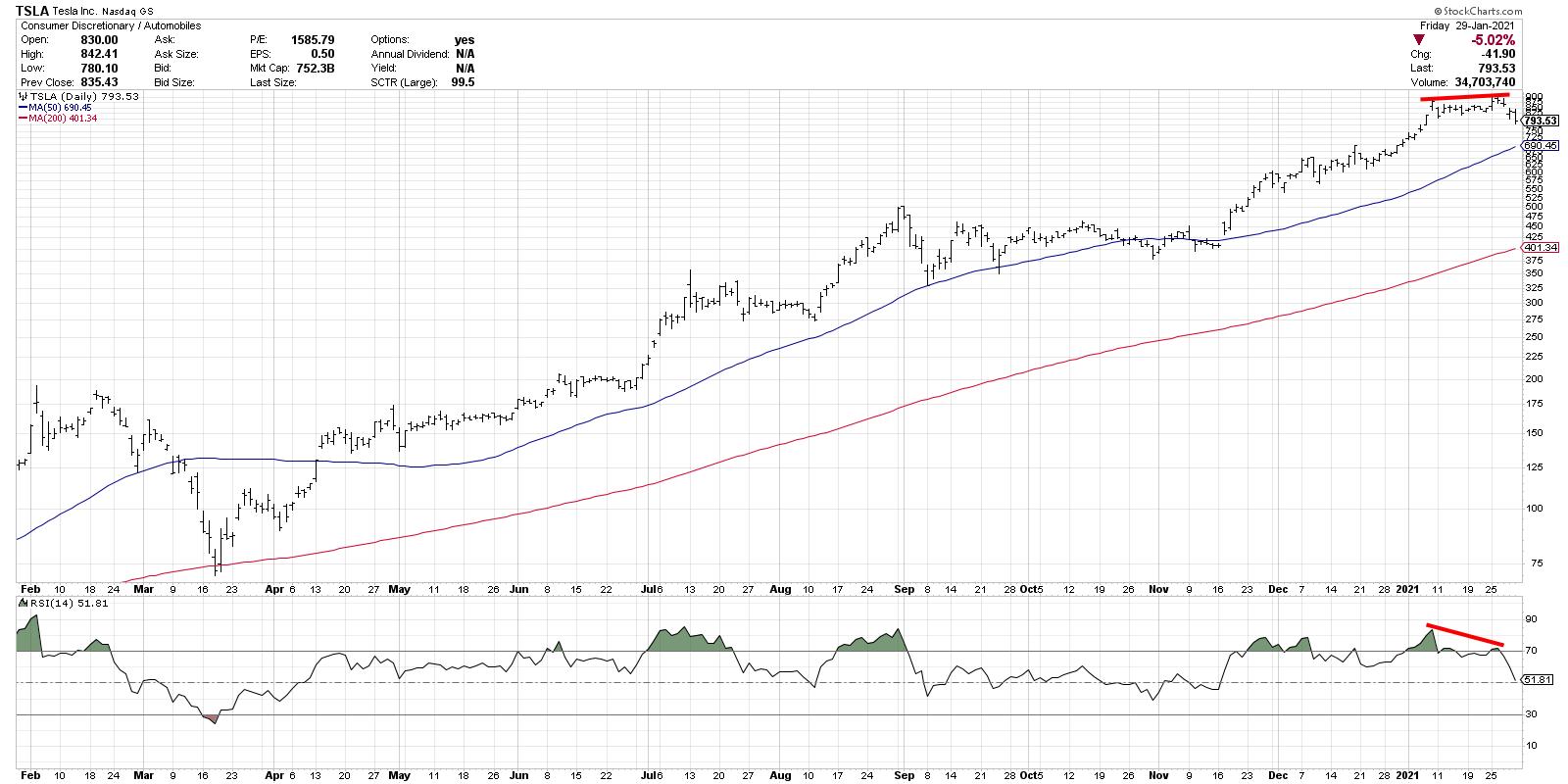
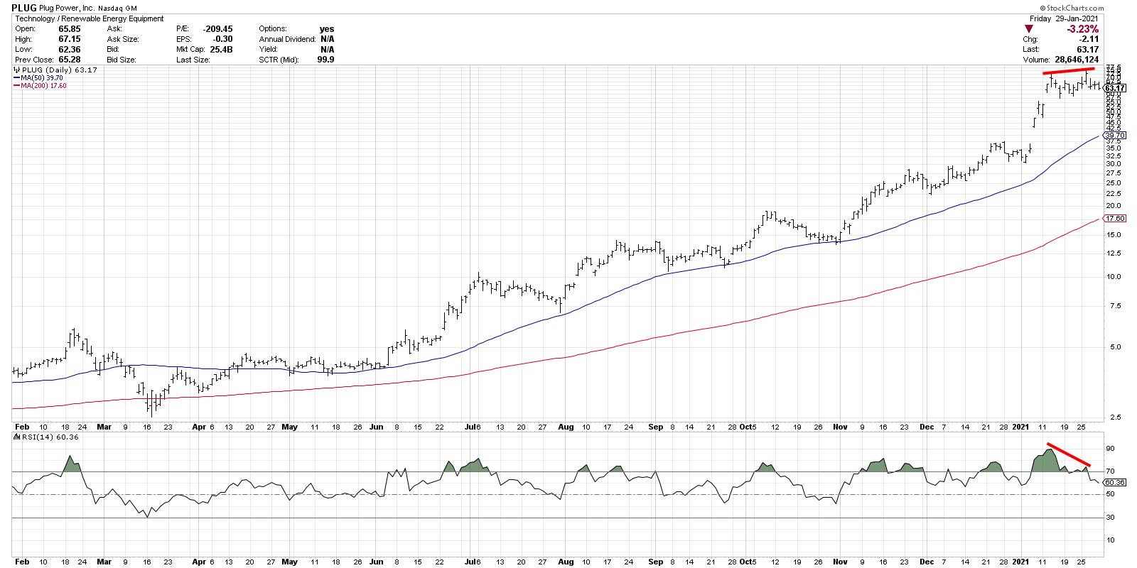
What's even more concerning are the similar divergences in high-flying leadership names like Tesla (TSLA) and Plug Power (PLUG), both of which spent much of last year at the top of the Large Cap and Mid Cap SCTR rankings, respectively.
Can the market continue higher given all of this negativity? Of course. To negate this overall bearish thesis, I'd need to see the following:
- The S&P 500 bounce off its 50-day moving average and a return to previous highs.
- Cumulative advance-declines turning back higher and making further new highs.
- Stocks like TSLA and PLUG shrugging off bearish momentum divergences and continuing a pattern of higher highs and higher lows.
Until then, the path of least resistance for stocks is lower.
RR#6,
Dave
David Keller, CMT
Chief Market Strategist
StockCharts.com
Disclaimer: This blog is for educational purposes only and should not be construed as financial advice. The ideas and strategies should never be used without first assessing your own personal and financial situation, or without consulting a financial professional.
The author does not have a position in mentioned securities at the time of publication. Any opinions expressed herein are solely those of the author, and do not in any way represent the views or opinions of any other person or entity.