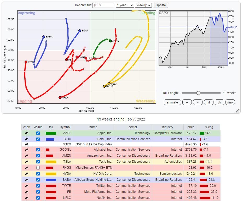
This Relative Rotation Graph shows the rotation for the NYFANG+ members over the last thirteen weeks (quarter). Plotting this universe against the S&P 500 index clearly shows the weakness that crept into this universe recently.
Leading Quadrant
AAPL is the only stock that managed to keep up inside the leading quadrant, but, as you can see, the RRG-Velocity (week-to-week distances on the tail) has decreased strongly, indicating a fading momentum, and the tail is starting to roll over.
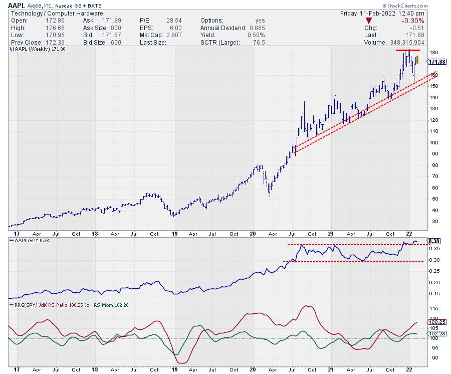
On the price chart AAPL is still holding up above its rising support line and relative strength is still above its breakout level, albeit not by much. Putting in a first lower high on the price chart and falling back into the range on the RS-chart in the coming weeks will be signs of more weakness ahead.
Weakening Quadrant
Inside the weakening quadrant, we find TSLA and NVDA.
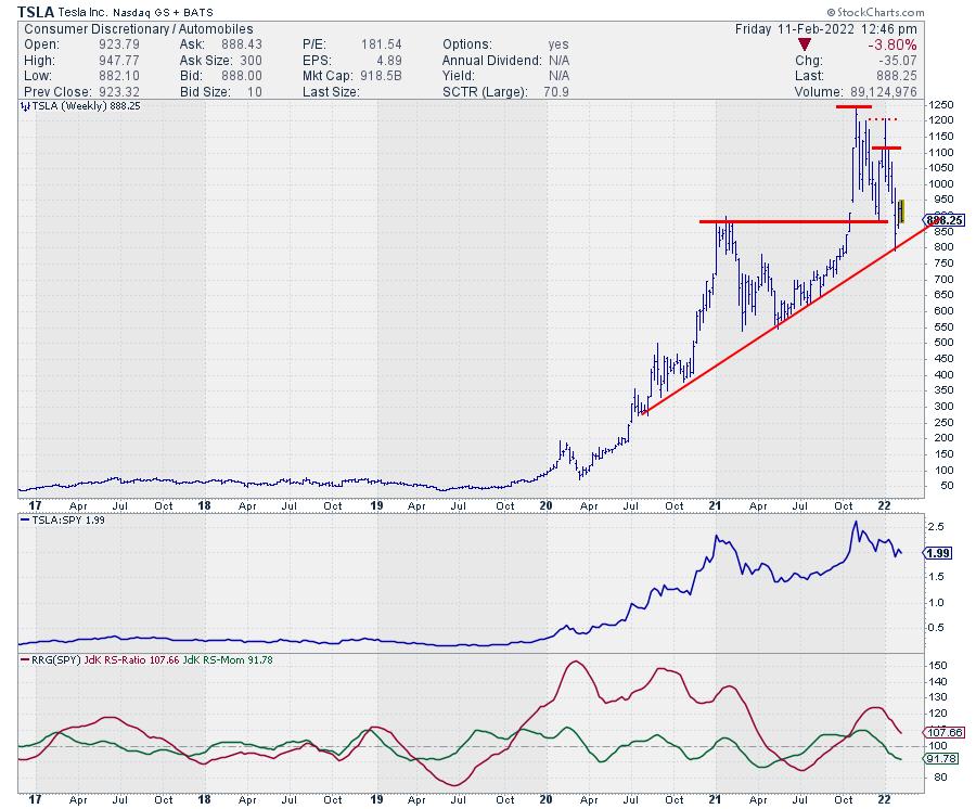
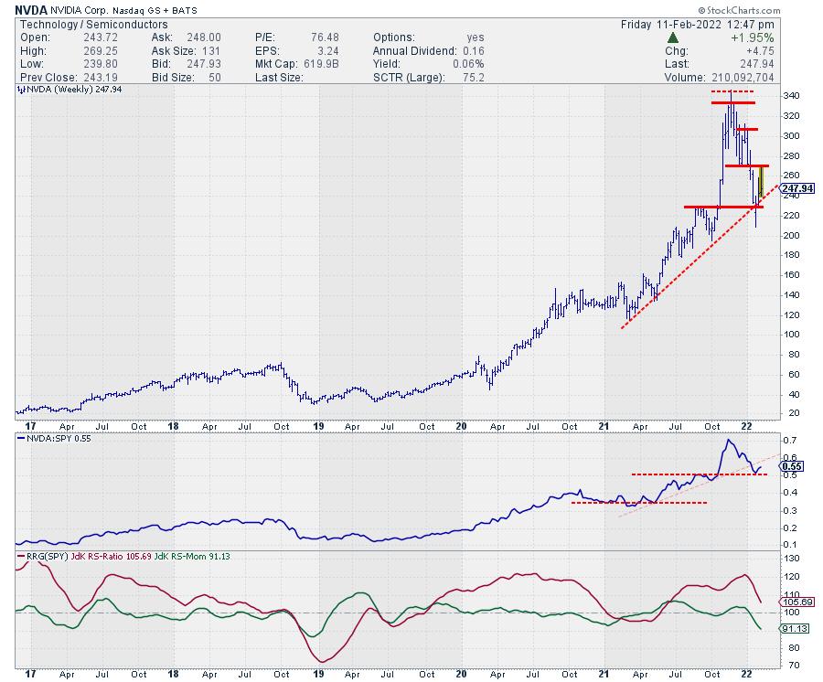
Both stocks are already in a pattern of lower highs and lower highs on their weekly charts. For now, they both managed to bounce off the long-term support lines that are connecting the major lows over the last 12-18 months. Breaking these support levels will very likely also cause a further deterioration of relative strength and eventually push both TSLA and NVDA into the lagging quadrant.
Lagging Quadrant
The lagging quadrant is pretty crowded. TWTR is the lowest on the JdK RS-Ratio scale and currently going through a recovery that, so far, is only momentum-based (vertical move on RRG). No sign of improvement in terms of relative strength yet.
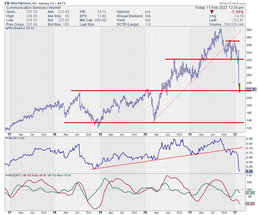
Most of you will be familiar with the chart of FB, as it recently came crashing down. At the moment, FB is resting at long-term horizontal support and, given the magnitude of the drop, a serious bounce is absolutely possible. Trading the move is probably not for the faint of heart, as the damage to the charts, both price and relative, is done and is huge.
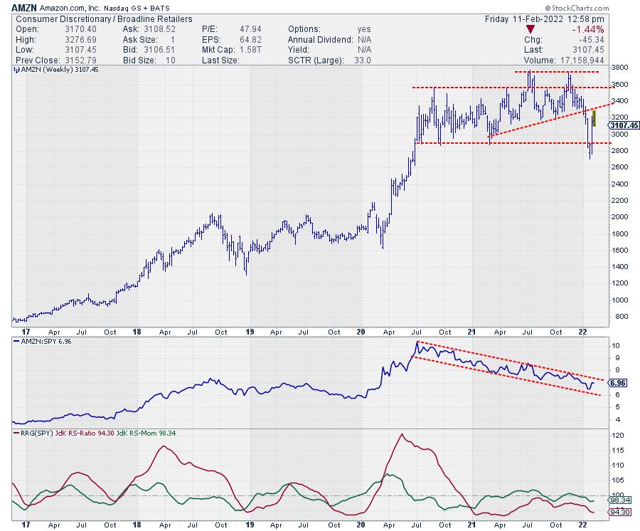
AMZN was in a relative downtrend for a while already before the recent drop in price. The relative picture has not changed, only gotten stronger. AMZN is an underperformer!! When the price sets a new lower high in the coming weeks, the relative weakness will start to spill over to the price chart as well. The downside risk here is significantly higher than the upside potential.
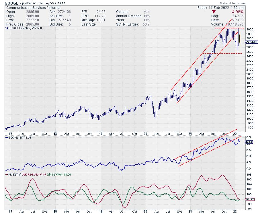
GOOGL is also positioned inside the lagging quadrant, but at a tail that is a lot less long than others on the graph, and it has started to pick up a bit of positive RS-Momentum in the last three weeks. Nevertheless, the chart (above) does not look fantastic. Price dropped out of its rising channel at the beginning of the year after the RS-line dropped out of its channel in December. A rhythm of lower highs and lower lows has already started to emerge on this weekly chart. Here also, downside risk is much more imminent than upside potential.
The tail on NFLX is the most telling. Very long, indicating a lot of power, and at an RRG-Heading between 180-270, losing on both scales. With a 50% loss since mid-November, the damage on the charts for NFLX is severe.
Improving Quadrant
The two stocks inside the improving quadrant are BABA and BIDU.
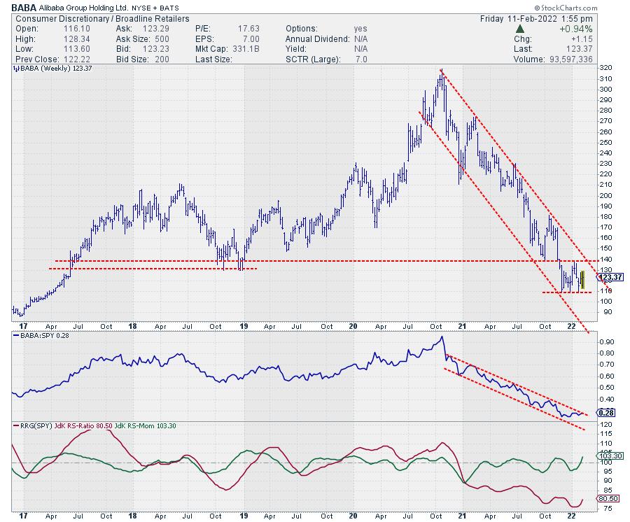
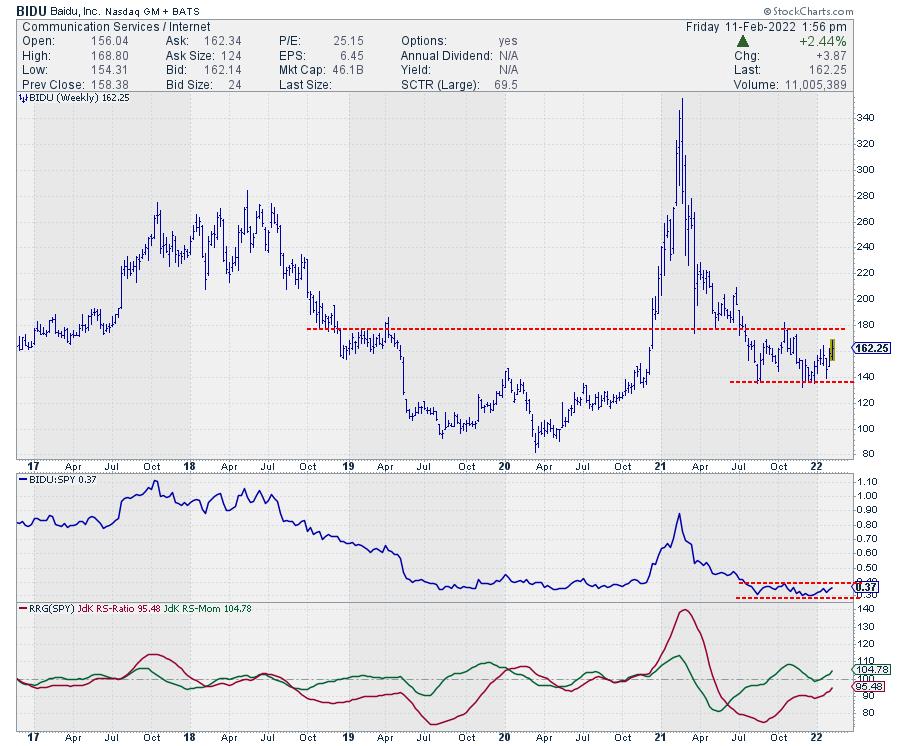
Both stocks completed a rotation lagging-improving-lagging and have recently returned into the improving quadrant again. The charts above show that the improvement is purely relative in nature, as their price trends have been very weak since late 2020 and the start of 2021. The stabilization at very low levels, while other members of the universe are dropping, is now causing relative improvement for these stocks.
They are now both caught in trading ranges, BABA between 110-140 and BIDU between 135-170. As BABA is still inside its downward channel, it looks like BIDU is in slightly better shape. In both cases, we need upward breaks above significant resistance levels in order to get things back on track.
These are some of the major stocks in the US in terms of market capitalization. The fact that they are predominantly moving lower and showing weak tails on the RRG suggests that there is some trouble in the FAANG(sta's) Paradise.
Have a great weekend and #StaySafe, --Julius
My regular blog is the RRG Charts blog. If you would like to receive a notification when a new article is published there, "Subscribe" with your email address.
Julius de Kempenaer
Senior Technical Analyst, StockCharts.com
Creator, Relative Rotation Graphs
Founder, RRG Research
Host of: Sector Spotlight
Please find my handles for social media channels under the Bio below.
Feedback, comments or questions are welcome at Juliusdk@stockcharts.com. I cannot promise to respond to each and every message, but I will certainly read them and, where reasonably possible, use the feedback and comments or answer questions.
To discuss RRG with me on S.C.A.N., tag me using the handle Julius_RRG.
RRG, Relative Rotation Graphs, JdK RS-Ratio, and JdK RS-Momentum are registered trademarks of RRG Research.


