Chart 1 shows that, starting in early 2020, stocks began to slowly but quietly underperform commodities. Since the start of this year, though, this trend has begun to really accelerate on the downside, i.e. moving in favor of commodities. The center window also shows that, when a lengthy trendline of this relationship has been violated, an extended move in the opposite direction typically follows.
The red trendline dating from 2011 was violated in early 2021 and has already had a negative effect on the ratio. However, bearing in mind the length of the penetrated line and the fact that the KST of the ratio has only just crossed below zero, it seems likely that the trend of superior commodity performance will extend much further. Our signal to the contrary would arise if the ratio can move above the dashed-green down trendline and 24-month MA. If not, what are the likely implications?
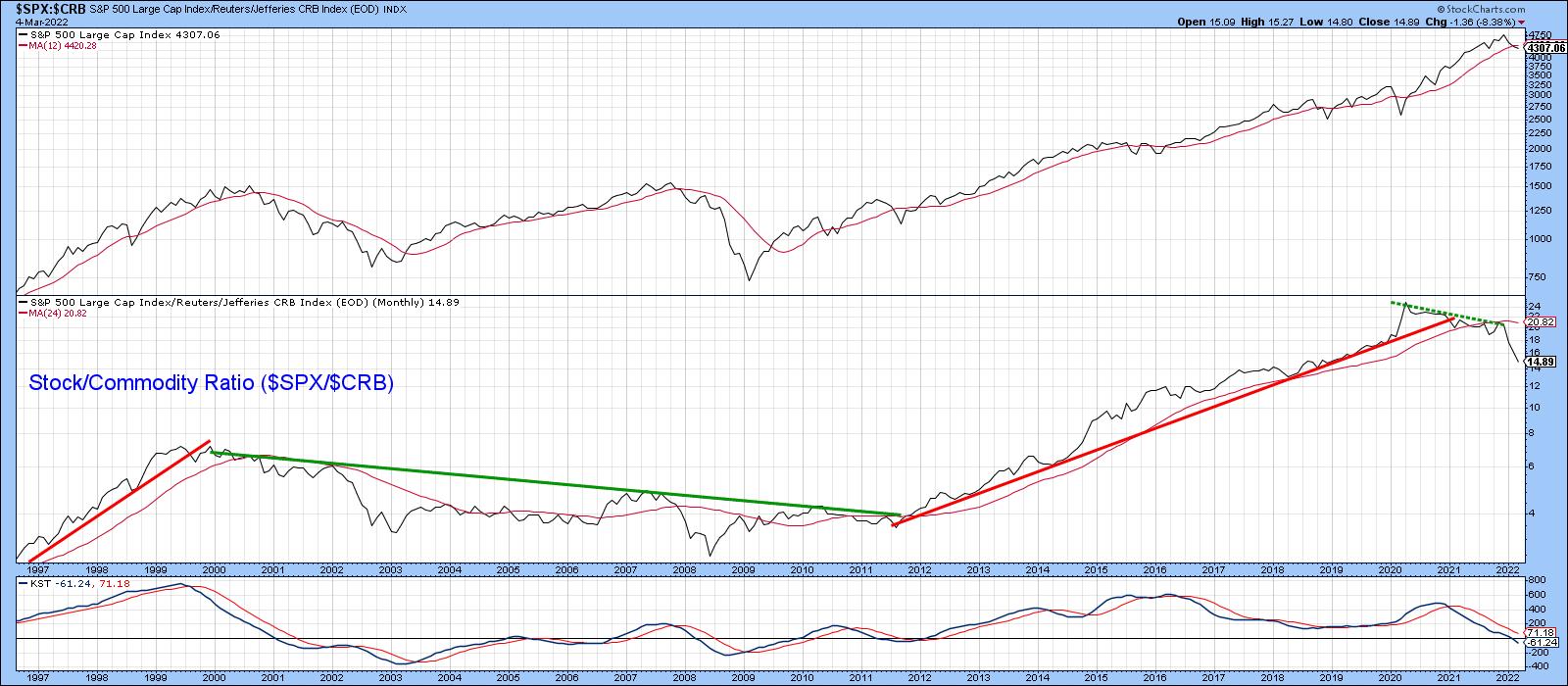 Chart 1
Possibility of a Secular Bear Market for Stocks
Chart 2 displays the ratio back to 1964, but, this time, compares it to the inflation-adjusted S&P Composite. When considering long periods of time, adjusting the equity index by consumer price inflation makes sense. After all, if your stock portfolio rises 10% and inflation is at, say, 12%, the portfolio is actually losing purchasing value. To me, that's a bearish state of affairs.
Using the benefit of hindsight to identify the actual peaks and troughs, the pink shadings flag the two secular bear markets that have developed in the last 60 years or so. Both largely occurred when the stock/commodity ratio was trading below its 41-month MA, although the ellipses indicate those relatively brief periods when it was not. By the same token, secular bull markets rarely, if ever, saw the ratio drop below its MA. If that happened, it was usually a one-month whipsaw. These misleading breaks have been flagged by the small-dashed arrows. It is also true to say that neither secular bull experienced as decisive a MA crossover as the one that has already taken place. The implication is that a secular bear may well be underway.
That said, it's important to note that this crossover represents just one piece of evidence. We need more. Also, the ratio did cross marginally below its MA at the end of January. However, the latest, more decisive, plot is only based on four trading days in March. In order to make it official, we need end-of-month data. I am really showing the chart to point out that this relationship is very close to triggering a major long-term signal, indicating the overall environment may have become more like 1965-1982 or 2000-2009, as opposed to 2009-2021. For stock market investors, inflation, as I emphasized in my 2022 outlook, will very much matter as the year unfolds.
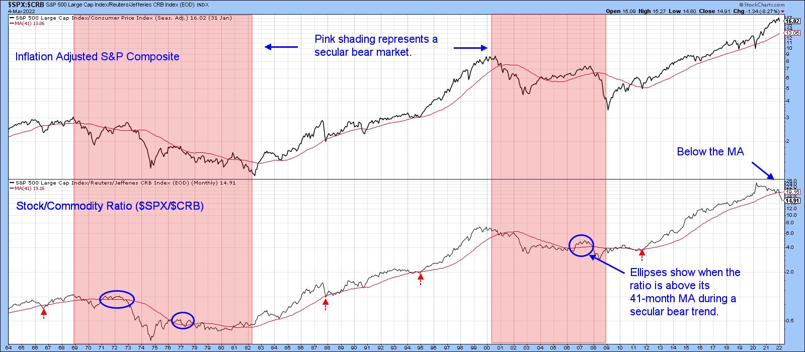 Chart 2
Inflation-Sensitive Stocks Likely to Outperform on a Long-Term Basis
My Inflation Index, which you can read about here, comprises several S&P industry groups that respond positively to inflationary conditions. For instance, mining and energy stocks. The Index is featured in Chart 3, alongside the Commodity/Stock ratio. Note that I have switched the components from the two previous charts in order to reflect inflationary (up) and deflationary (down) trends. There is a rough correlation between the two series, but, since the stocks included in the Inflation Index are subject to swings in the stock market, there are some occasional glaring differences between them. For example, the Index bottomed in early 2016, whereas the ratio hit its low point in early 2020.
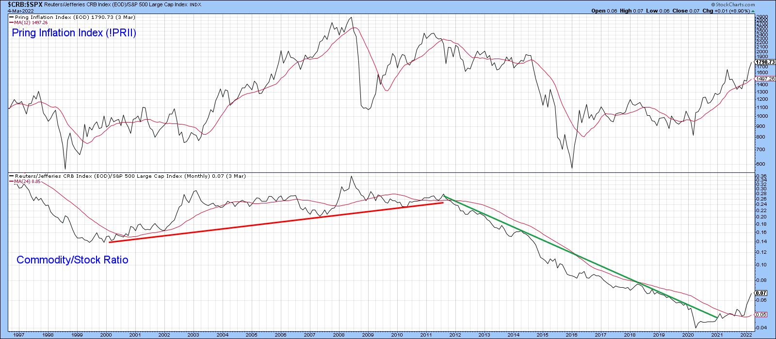 Chart 3
Fast forward to Chart 4, which compares the relative action of the Index to the S&P, and you can see that there is a much closer relationship. If I am right about the change in trend between the stock/commodity or commodity/stock relationship, then the implication would be for a long-term superior relative performance by these inflation-sensitive stocks.
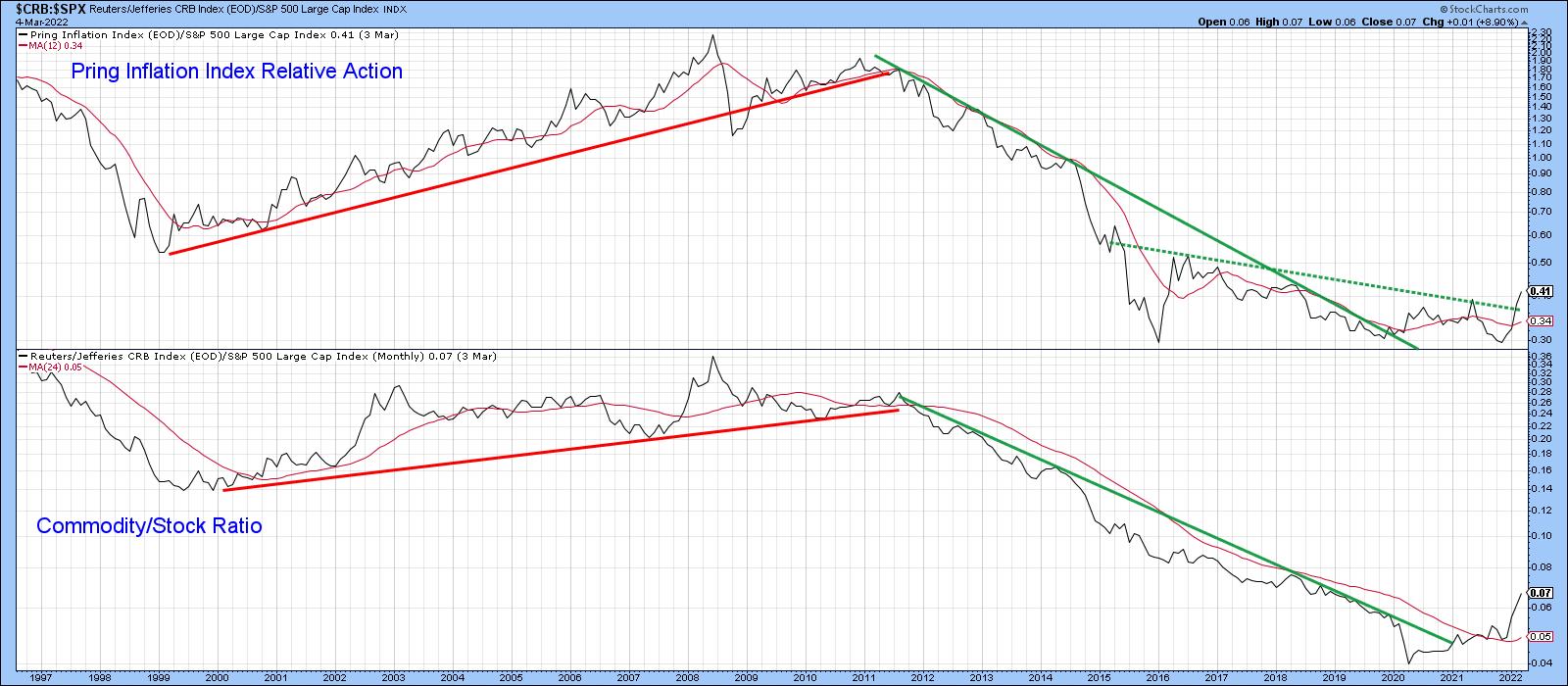 Chart 4
Higher Oil Prices are Likely Over the Long Term
There is no doubt that the oil price is overstretched on a short- and intermediate-term basis and, therefore, subject to an unexpected shakeout at any time. However, Chart 5 shows that it has broken out on both an absolute and relative basis against the S&P.
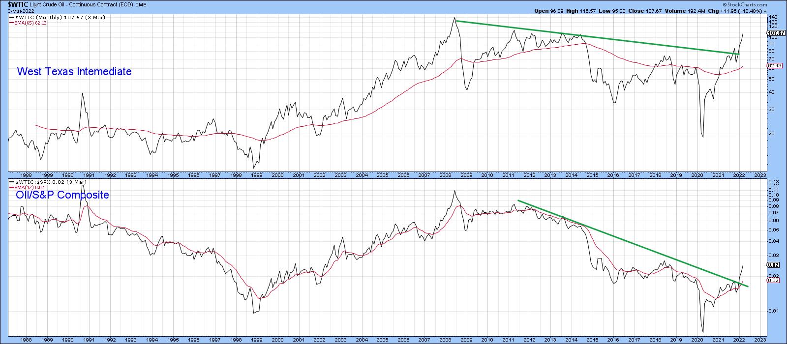 Chart 5
Finally, Chart 6 tells us in the second panel that oil is on the verge of breaking out in a relative sense against the CRB Composite. It's already tentatively above the 2013-2022 resistance trendline. Again, though, it's important to note that this is a monthly line chart; the official close will not be known until March 31.
 Chart 6
This article is an updated version of an article previously published on Wednesday, March 2nd at 6:19pm ET in the member-exclusive blog Martin Pring's Market Roundup.
Good luck and good charting,
Martin J. Pring
The views expressed in this article are those of the author and do not necessarily reflect the position or opinion of Pring Turner Capital Group of Walnut Creek or its affiliates.