
Silver is like that drab and boring coworker who you say "hi" to, but never really care to engage.
It may not possess gold's glitz but... it's the only metal that has can boast both monetary and industrial-tech use cases. Its history as money is millennia-old, and much of it is needed to produce emerging technologies, particularly in the clean energy space. So, it's an arguably undervalued metal.
In March of 2020, the gold/silver ratio shot up to a never-before-seen 126:1. If you're not familiar with this ratio, it represents the number of silver ounces it takes to buy one ounce of gold (Mish Schneider does a great job explaining it).
In short, 126:1 was a 300-year high, at the least. And most investors slept through this rare event.
So, if you're trying to decide between gold and silver, the gold/silver ratio is a key technical indicator to keep an eye on.
- When the gold/silver ratio is at or near historic highs, that means gold is outperforming silver. It's an opportunity to build a larger silver position while lightening up on a gold position.
- When it's nearing historic lows, silver is outperforming gold. When the ratio is at historic lows, it's an opportunity to buy gold and lighten up on a silver position.
Where's the ratio now, and where is it "supposed" to be? It's currently at 88:1. As far as where the "average" might be, throughout most of the 20th century, it was at 45:1. Over the last 20 years, however, the average rose to 60:1. Let's take a look.
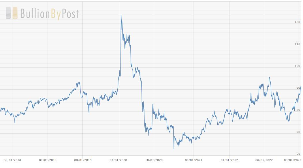
CHART 1: THE GOLD/SILVER RATIO. Over the last 20 years, the gold/silver ratio averaged 60:1. An 88:1 ratio indicates that gold is trading higher than average with respect to silver.Chart source: BullionByPost.com. For illustrative purposes only.
How can you get this on StockCharts? You can build it on SharpCharts by typing in two ETF proxies: GLD:SLV. Both are metal-backed ETFs, and combining them will get you pretty close to a ratio of the two "spot" metals.
Try it yourself. Here's what it should look like:
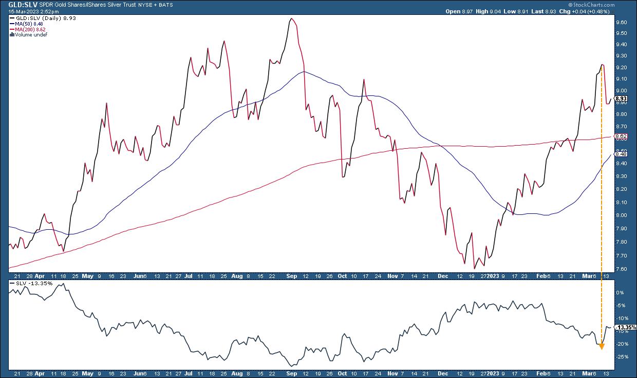
CHART 2: GOLD/SILVER RATIO USING GLD AND SLV ETFS AS PROXIES. Charting the GLD:SLV ratio gives you a ratio that's close to the ratio between the spot prices of the two metals. Chart source: StockCharts.com. For illustrative purposes only.
Notice that the ratio number to the chart number is the same figure divided by 10 (88:1 becomes 8.81).
Applying the Gold/Silver Ratio
Suppose you thought the ratio reading of 91:1 signaled an opportunity to go long SLV. Here's what you might have done.
First, a trader might have pulled up a chart of our proxy ratio (GLD:SLV), adding SLV's Price Performance at the bottom of the chart to see where the top of the ratio coincides with SLV's prices.

CHART 3: DAILY CHART OF SLV.Chart source: StockCharts.com. For illustrative purposes only.
Notice the following:
- To start things off, the 50-day and 200-day moving averages began exhibiting a Golden Cross toward the end of December, signaling bullish conditions.
- The moving average convergence/divergence (MACD) oscillator appears to be in a prime position for an upward reversal. The MACD line has crossed above the signal line, and both are well below the baseline.
- SLV has found a relative bottom slightly below the 61.8% Fibonacci retracement level.
- The candle on March 7 closed below the lower of the Bollinger BandsⓇ (2nd standard deviation), indicating a high probability of an upward reversal.
Although this may seem like an aggressive entry, a trader might have opted to place a "long" entry right above the March 7 candle at 19.00 (which, you might have noticed, gapped downward) and a stop loss slightly below the following day's candle at 18.35 as soon as it began showing signs of a near-term bottom.
With strong resistance nearing 22.50, the reward-to-risk ratio would seem favorable, with a $3.50 per share return goal to a potential loss of $0.65 per share—or over 5-to-1 reward to risk.
The bottom line: The gold/silver ratio, despite being an important indicator, is still subjective and leaves plenty of room for interpretation, particularly when it comes to specific trading setups. The StockCharts platform has plenty of indicators to fine-tune your entry point. This is just one example of many in applying this ratio to real-market engagement.
Disclaimer: This blog is for educational purposes only and should not be construed as financial advice. The ideas and strategies should never be used without first assessing your own personal and financial situation, or without consulting a financial professional.

Happy charting!