
Occasionally, the stock market gets hit with unpredictable black swan events. These throw the market into panic mode and send investors rushing to sell their positions. It can be a terrifying experience for individual investors and traders. Wouldn't it be great to see market volatility ahead of time?
While there's no forward-looking indicator that can anticipate tail risks, there is one indicator that can signal signs of jitteriness among professional traders. It's the MOVE Index—Merrill Lynch Options Volatility Estimate, and when it moves, it's time for traders and investors to be vigilant.
What Is the MOVE Index?
The MOVE Index measures fear in the bond market, that is, uncertainty about interest rates. It's similar to the CBOE Volatility Index ($VIX). Both look at one-month volatility and realized volatility. The difference—VIX looks at equities, whereas MOVE looks at bonds.
Why is volatility in the bond market important? Well, the bond market is a much larger behemoth compared to the stock market. It includes corporate, government, domestic, and foreign debt securities. The bond market is the backbone of the financial system. While bonds are generally not volatile, they can be, especially when there's a change in interest rates. Given that interest rate changes are front and center in investors' minds, what happens in the bond market can be an earlier signal of volatility than in the stock market.
But aren't equity markets more volatile than bond markets? Stocks are more volatile than bonds. But when bond volatility is higher than equity volatility, it's a sign of trouble ahead. This is why it's a good idea to regularly view a chart that compares the $VIX and $MOVE.
How to Apply the MOVE Index
The two-year chart of the MOVE index ($MOVE) below brings up some important points.
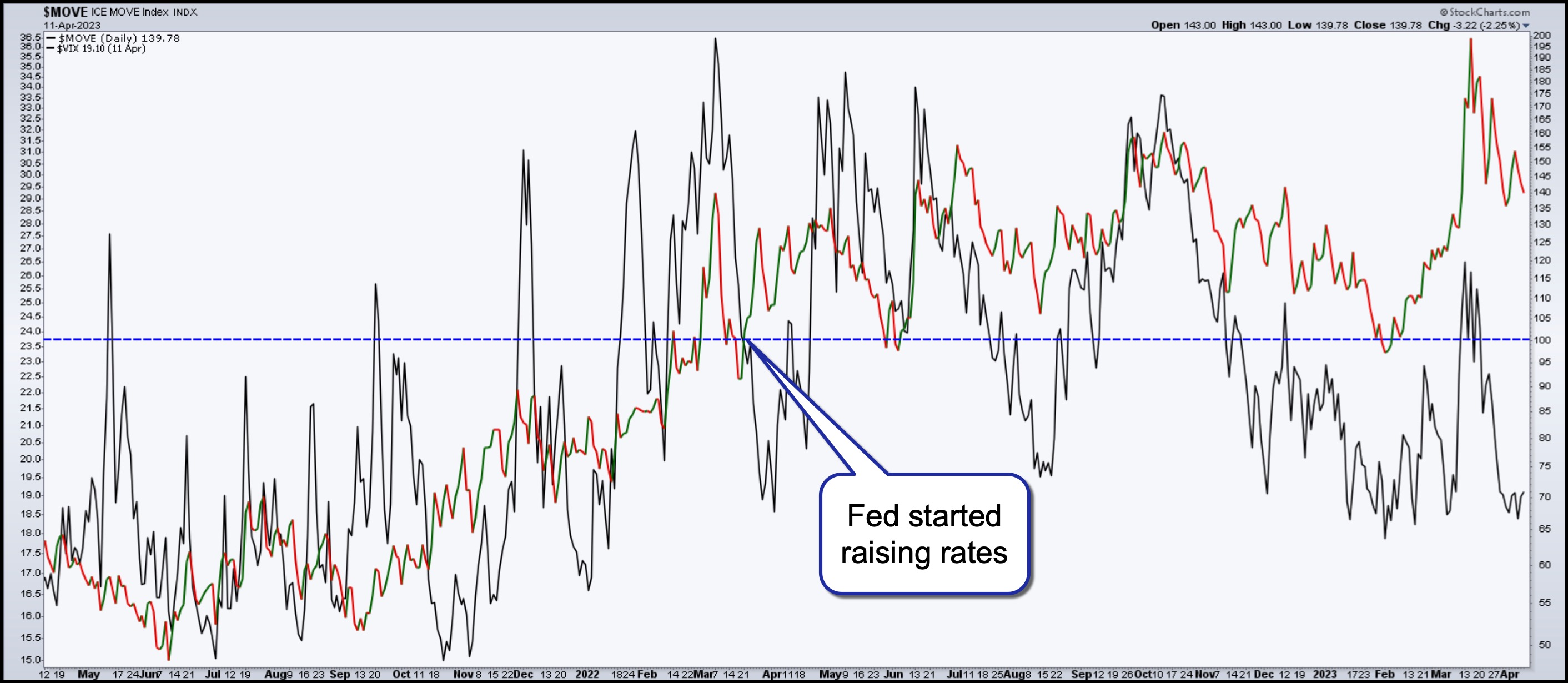
CHART 1: $MOVE VS. $VIX. Although the $VIX is more volatile than $MOVE, when $MOVE moves up more than $VIX, it's a sign of trouble ahead.Chart source: StockCharts.com. Data source: ICE. For illustrative purposes only.
- $VIX is much more volatile than $MOVE.
- For the most part, $MOVE and $VIX move up and down in sync, but there are times when there's a divergence between the two.
- $MOVE was below 100 (the index is expressed in basis points) during 2021 when interest rates stayed put. But when the Fed started raising rates in March 2022, the MOVE was generally higher than 100.
- During the regional bank crisis, $MOVE got very close to 200, the highest level it's been in the last two years. The $VIX also increased, but not as much as $MOVE. When bonds are more volatile than stocks, it suggests there's some serious nervousness brewing in the market.
- The $MOVE Index today (last price on the chart) is shy of 140—still relatively high, but moving downward. Meanwhile, the VIX is still below 20, suggesting that equity investors are complacent for now.
If the $MOVE starts creeping higher, it's time to keep your eyes peeled and look around for clues on why bond investors are fearful. Because interest rate movements are a concern, an upward-moving $MOVE ahead of the next Fed meeting may indicate something unexpected on the horizon. You may want to add this chart to your ChartLists.
But interest rates aren't the only concern. There are other underlying economic factors to bring to your attention.
The Economic Landscape
In addition to inflation and interest rates, there are other uncertainties to focus on. The debt ceiling is a big one. Although Treasury Secretary Janet Yellen mentioned that the US economy is doing fine, you can't ignore her comments from earlier this year about the necessity to raise the debt ceiling. We may not have to worry about it till the end of summer, but if the debt ceiling isn't raised, regional banks—which hold a ton of Treasuries—and the entire financial system could feel the pain.
There are different points of view about whether we'll see further downside in the banking sector or if it'll stabilize. The chart of the Financial Select Sector SPDR Fund (XLF) below looks like it may have stabilized, but anything could happen. So this is another chart to add to your ChartLists. (Note: click on chart for live version.)
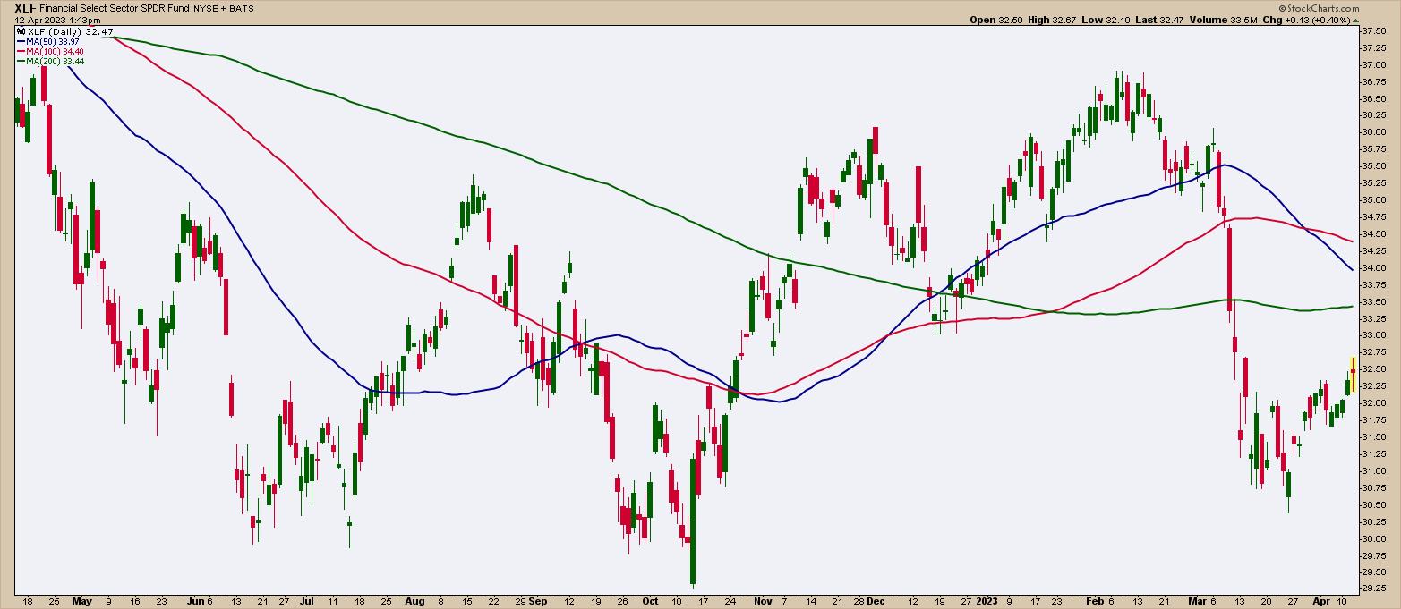
CHART 2: IS THE FINANCIAL SECTOR STABILIZING? XLF looks like it may be stabilizing, but it's not enough to confirm a trend reversal. The 200-day moving average could be a strong resistance level.Chart source: StockCharts.com. For illustrative purposes only.
Further weakness in XLF and a rise in $MOVE could portend danger ahead. Since bonds are the backbone of the financial system, if XLF starts falling again, you can expect $MOVE and its partner $VIX to wear their dancing shoes and start grooving to "I Like To Move It."
Investors won't be grooving. They may shun away from US Treasuries, the US dollar could fall in value, and we could see a major correction in the equity market. Let's hope $MOVE and $VIX don't get over-excited, but it's good to know in advance if that excitement is stirring.

Disclaimer: This blog is for educational purposes only and should not be construed as financial advice. The ideas and strategies should never be used without first assessing your own personal and financial situation, or without consulting a financial professional.
Happy charting!