 I’m not sure when I heard this the first time but I’m quite sure it was a long time ago. “The markets go up most of the time,” or even to be more convincing, “The market goes up 40% of the time.” I never challenged that until I got into the money management business and had to answer client questions and deal with their often misguided perceptions and misbeliefs. So, like any good (or even average) engineer, I decided to calculate it. As always, when feasible I use daily data instead of the “modern finance” norm of monthly data. I’m going to sound like a broken record but I will never understand why one would ignore over 95% of the data.
So how does one determine the percentage of time the daily Dow Industrials has spent making new all-time highs since 1885. First create a method (Highest High indicator) for following the movement of the Dow Industrials when it is moving upward, but when it is moving downward, that indicator only moves sideways. In other words it only goes up with the Dow or sideways, never down. The green line in Chart A (top plot, which also shows the Dow Industrials) does that. The next plot (blue spikes) shows every instance in that 129 years (35,684 days) in which the green line was moving upward (Close of today greater than the close of yesterday). The third plot has two lines; the blue one counts the number of days being analyzed by looking at all days in which the close <> zero (<> means not equal). The second line (green) counts the number of blue spikes in the second plot (C <> 0). And finally, the percentage of the values in the green line to the values of the blue line, yield the percentage of days that have made new all-time highs. Got all that? If you look closely at the black line in the lowest plot in Chart A, you can see that the percentage of times the Dow Industrial Average was making a new all-time high ranged between 1.5% and 4%. Further observation on Chart A shows that the percentage rises during bullish periods and declines during bearish periods. Just as expected, but also serves to help validate the process.
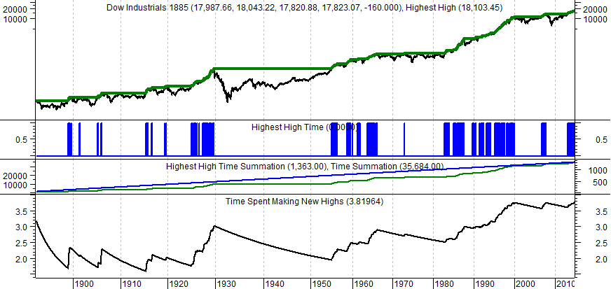
Chart A
Chart B is the same as Chart A; just that it shows only 6 years of data so the graphics are clearer. As of 12/31/2014, the percentage of time making new highs is at 3.81964%. That is a long way from the 40% or just about any number you have ever heard from the mainstream Wall Street crowd. In fairness, if looking at the ubiquitous monthly data, that percentage would be 16.54%.
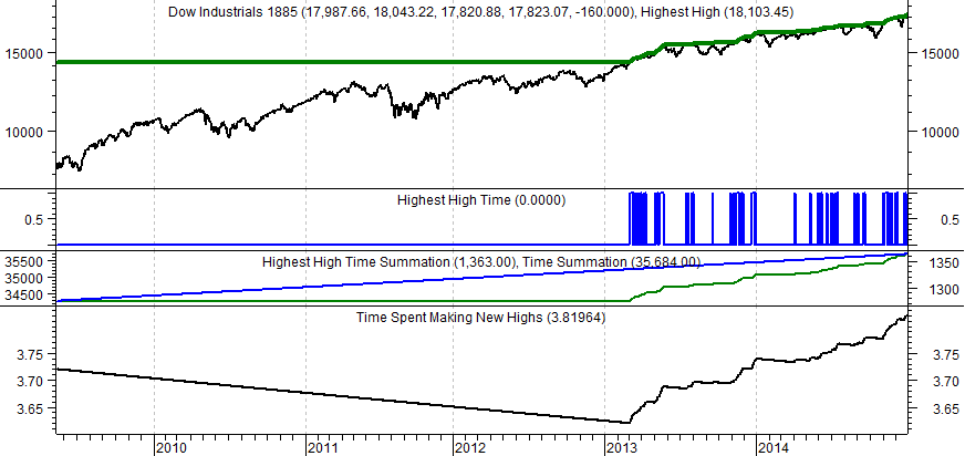
Chart B
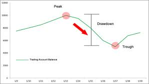
All good analysts should try to validate their analysis by backing into the situation from a different direction. Let’s look at Drawdowns (see graphic at top of article) for the daily Dow Industrial Average since 1885. Table C shows all of the Drawdown Durations in various percentage ranges. Drawdown duration is the time spent in a state of drawdown, from the first day of decline until a full recovery (all the way down and all the way back up). If you wanted to just look at bear markets which are drawdowns of 20% or greater the Drawdown Range column shows drawdowns from -100% to -20%, which are the bear markets. You can see all of the bear markets in the Dow Industrial Average since 1885, accounted for 72.74% of the time. If you wanted to count the bear markets (-20%) and the corrections (-10%), the amount of time spent below -10% would be 81.04% (72.74 + 4.07 + 4.23) of the time. The total amount of time the Dow Industrial Average has spent in a “state of drawdown” from 2/17/1885 to 12/31/2014 is 96.18% of the time.
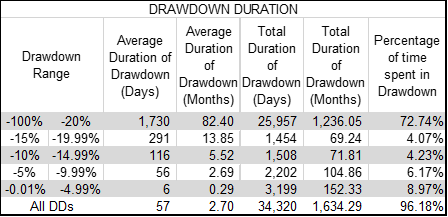
Table C
Okay, so we know from Chart A and B that the Dow Industrials made new all-time highs only 3.82% of the time on a daily basis. From Table C we know that the Dow Industrials was in a state of drawdown for a total of 96.18% of the time (100% - 96.18% = 3.82%). The arithmetic checks out; the Dow Industrials was making new all times highs only 3.82% of the time which means the complement of that is 96.18%, which is the amount of time spent in a state of drawdown.
I would suggest you study Table C as it shows bear market percentages (-100 to -20), corrections (-10 to -14.99), and pullbacks (-5 to -9.99). The -0.01 to -4.99 is considered daily volatility. The other range of drawdowns (-15 to -19.00) doesn’t have an official name, but I would name it “the area when all the talking heads and story tellers are calling for a bear market.” The other thing to try to get a feel for is the duration columns. This is the amount of time on average spent in those various drawdown ranges. For example the Average Duration of Drawdown (Months) for the bear markets (-100 to -20) is 82.4 months; folks that is 6.86 years, and that is a really long time to hold onto losers and hope they recover.
Table D is exactly the same as Table C except that the bear market (drawdown) from the great depression data has been removed. It clearly makes things look better, but making things look better does not change the facts. Without that depression era bear the Dow Industrials was in a state of drawdown for 75.7% of the time. Still a number much greater than the people other than Stockcharts.com users would have guessed. The average duration when the depression bear is removed drops to 63.43 months, or 5 years and 3 months on average. This again can be devastating to one who is minimally capitalized for retirement and is withdrawing money to live on. Most times, in those cases, there is never a recovery.
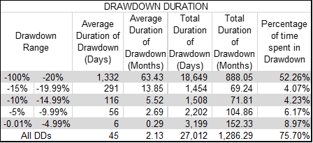
Table D
So what is the message of this article? The markets do not move to new highs all that often, a huge percentage of the time is spent trying to get back to where they had previously been. Something to keep in mind when the buy and hold salesmen are pounding at your mind. I need to know if you enjoy this type of data and analysis on the markets; leave a comment. Thanks,
Trade with knowledge,
Greg Morris