 When I was doing research on my book, I found that many places that offered performance data often did so in a manner that was specific for what their intended message was or tied to what they were selling. Having a strong understanding of market performance over time is important; not for making investment decisions, but for keeping that distance between your ears in check. Sort of like golf, isn’t it? This article is going to cover some performance charts on the Dow Industrial Average back to 1885. In addition to that I think showing the distribution of performance is important and will explain more as we go. I will utilize monthly data from the Dow Jones Industrial Average. Daily data for this type of analysis is problematic as there are not always the same number of trading days in a year, disasters can close trading for a period of time, etc. Doing really long term analysis generally is restricted to the S&P 500 and the Dow Jones Industrial Average. Both of these indices have changed since their beginning; here is a little history on the two.
S&P 500 – my series began December 30, 1927. From the beginning until March 3, 1957 it was the S&P 90. There is, however, older data produced by the Cowles Commission back to 1871. Robert Shiller provides this online.
Dow Industrials – my series began February 17, 1885, but records show that Charles Henry Dow began the series on July 3, 1884. While Charles Dow began publishing his series in 1897, he maintained the data from 1885. Following the introduction of the 12-stock industrial average in the spring of 1896, Dow, in the autumn of that year, dropped the last non-railroad stocks in his original index, making it the 20-stock railroad average. Initially the data was known only as the Dow Jones Average. In 1916, the industrial average expanded to 20 stocks; the number was raised again, in 1928, to 30, where it remains today.
Seems the world is focused on the S&P 500, but I’m going to use the Dow Industrials. Why? Simply because I have 42 more years of data. Yes, I understand the arguments about using only data after the depression or after WWII, but those arguments are often tied to a specific message. My message is simply to understand how the markets have behaved in the past. Chart A shows the Dow Industrials using a 10 year rolling return. Let me explain all that. Let’s assume we are dealing only with years (instead of months), with the first year being 1885. Then the first data point on the chart would be the 10 year return from 1885 to 1895, the second data point would be from 1886 to 1896, the third data point would be from 1887 to 1897, and so on. Hence, pick any point on the chart and that is the return for the previous 10 years.
You can see that the returns are all over the place over this 129 year time frame; highs were around 15% and lows during the Great Depression were in the -7% to -10% area with later lows being around -3% to -4%. Let’s put that into perspective; if you have bought the index and held it for 10 years, those are the ranges of returns you received. If you were retired, minimally capitalized for retirement, and withdrawing money from your account, some of these periods would have been devastating.
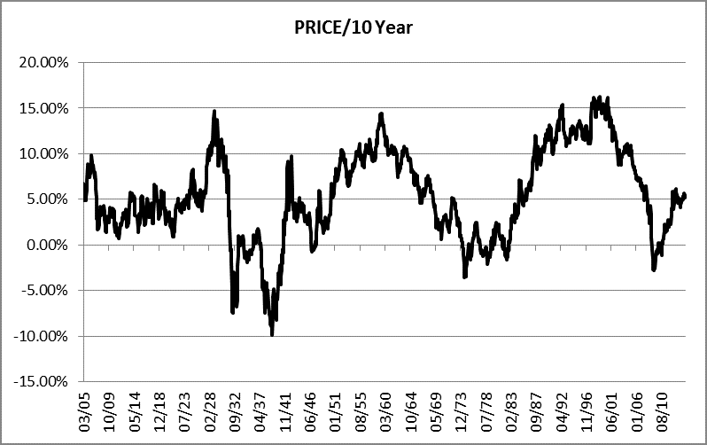
Chart A
Chart B shows the same data but using a 20 year rolling return. Clearly there is a somewhat similar picture with returns generally higher as you would expect since you are holding twice as long. When I was discussing performance with a client back in my money management days, I used to always refer to 20 year charts because I strongly believe most people really only have about 20 years to sock it away for retirement. Based upon personal experience I know I didn’t have a lot of “extra” money when I was in my 20s and 30s, and it wasn’t until in my 40s that I was really saving and had maximum input into 401k plans and IRAs. So from here on I’ll keep focusing on the 20 year charts since you should always strive to use a time frame consistent with your time frame.
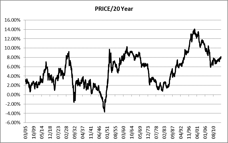
Chart B
Table C shows the various returns’ average and median for various rolling periods. I know there is no one who uses StockCharts.com that needs this refresher, but for those others the average is the mean. You remember, add up all the data points’ values and divide by the number of data points. The median is the middle data point irrespective of the movement of the data. The difference between the average (mean) and the median can offer insight into the direction the distribution is skewed. I’ve found that the median often better represents the distribution when there are not many data points.
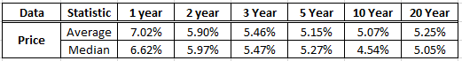
Table C
Chart D shows the distribution of the 20 year rolling returns. Let me explain Chart D. The first vertical bar which says 43.38% on top and <4% on the bottom means that 43.38% of the rolling 20 year returns were less than 4% over the 129 year period. The small bar on the right says that only 4.03% of the 20 year rolling returns were greater than 12%. The two middle bars should be easy to interpret now. So when the salesman tells you the market returns 8% on average, this charts shows that over 77% of the time the 20 year rolling return is less than 8% (43.38 + 33.64 = 77.02). In fairness they are usually talking about the average annualized return over 85 years. They are correct, however there were many 20 year streaks where the returns were horrible, and you don’t have 85 years to be invested.
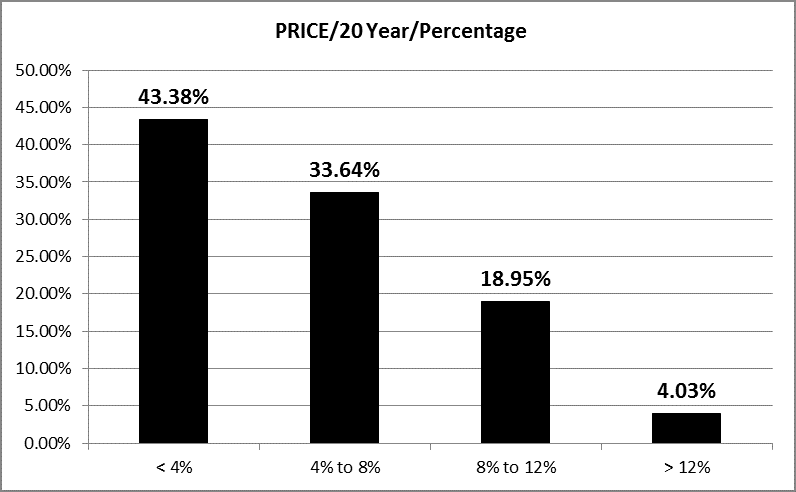
Chart D
Chart E is a distribution that is quite different. It is the percentage of returns that fall into the deciles. A decile is one of ten groupings containing an equal number of data points. Each of the bars in Chart E represent 10% of the data; the data being the 20 year rolling returns for the past 129 years. The range of returns is determined by the difference between the minimum and maximum returns in the series, then divided by 10 to create 10 equal groups. For example, in Chart E, 26.33% of the returns fell into the fourth decile. The highest 10 percent of the returns (20 year) were 3.96% (tenth decile). So on this chart, where would the median fall? Between the 5th and 6th deciles.
Note to Statisticians: You will note that this is a little different than a statistical distribution of deciles.
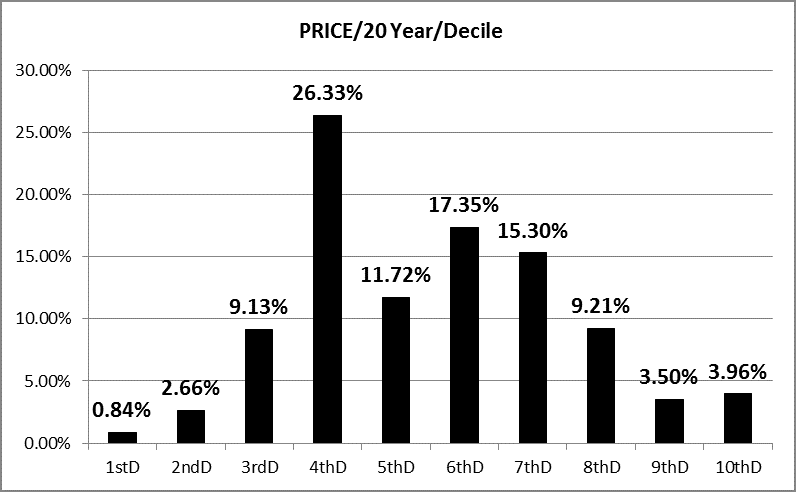
Chart E
And finally (I can almost hear the sighs), Chart F shows the distribution of the 20 year rolling returns based upon standard deviation (sigma). Okay, Lucy you got some splainen to do. Remember that sigma is the variance of the data from its mean. The two middle bars each represent 34.1% of the data (68.2 percent total) that is one sigma from the mean which is the way it is normally referred as. Remember it goes in both directions from the mean. You can then see that the two bars on the left side represent 50% of the data that was to the left of the mean and were 50.91% of the returns (fairly symmetrical). If I had used 10 year rolling returns there would have been much more asymmetry.
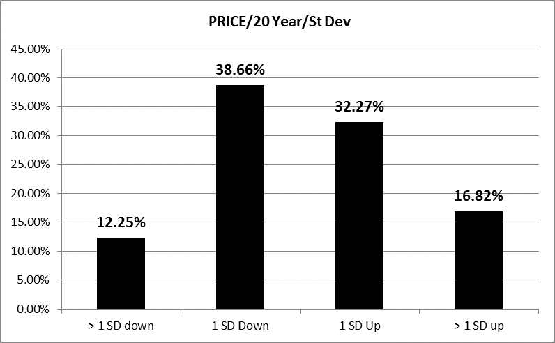
Chart F
If you have not had statistics or don’t remember much about them, this is probably all very confusing. However, the message is reasonably simple. Buy and hold investing can offer you some really horrible 20 year returns on your money. Likewise it can give you some really good ones. It all just depends upon when you are investing and that is often determined by when you were born. Hence, stick with technical analysis. And just one more comment while I’m discussing return distributions. You might recall I find it odd that Modern Finance thinks the market is random and normally distributed. I do believe monthly return series are somewhat normally distributed. Where this does not serve technical analysts is that most of us use daily price data instead of monthly return data and I do not believe price data is random. If someone ever tells you they are a trend follower and that prices are random – just politely walk away.
At times I’ll try to answer questions posed in the Comments with the usual disclaimer that my response is an opinion. A couple of questions were asked about volume-based indicators. I stopped using them in the 1990s as did not find them valuable enough in trend following (key word – trend following). However, I do think volume based indicators work better on individual stocks because the volume is more meaningful. Volume on indexes I think has too many unknowns. I do use breadth volume as up volume and down volume used in a difference or ratio at least somewhat neutralized any outside affects from overall volume. Up and down volume breadth indicators will be covered in a future CGMBI article.
I'm going to take a little break here, back in a couple of weeks. Trade well.
Greg Morris