 This is the second part of the Technical Analysis Magic article published a while back – click here. I wanted to wait to see if there were any remaining readers. Apparently I did not offend everyone. Some of the introductory material is the same as last time just in case someone did not read the first article.
There are a few things that have attached themselves to technical analysis that bother me. Actually, they really don’t bother me; what bothers me is when I hear someone talk about what great tools they are. It is very clear to me then, that they don’t use real money in their work. Warning! This article is loaded with my personal opinions and I’m positive will cause some to be upset. Please don’t; this does not mean I am right and you are wrong, it is just my opinion. You can tell that this concerns me when I spend the first few paragraphs apologizing ahead of time. Guess that just comes with age. As an old fighter pilot I am amazed at myself for caring so much. <grin>
As I have stated earlier I believe technical analysis is much more art than science; the science part is more related to the process of research than the actual analysis. A lot of esoteric analysis has attached itself to technical analysis, probably because they involve numbers or charts. Before moving forward with this section, I adamantly want to state that with technical analysis being essentially an art; then almost anything goes as long as the user is comfortable with it. Bottom line is that if it works for you, go for it. I guess the engineer in me wants to ensure the methods I use are based upon sound and reasonable principles and at most, don’t violate any principles of analysis that I believe in. Isaac Asimov was one of my favorite authors, scientists, and researchers. In an article entitled, The Relativity of Wrong, he used the curvature of the Earth to help explain how differences in perceived facts should be held.
“When people thought the Earth was flat, they were wrong. When people thought the Earth was spherical, they were wrong. But if you think that thinking the Earth is spherical is just as wrong as thinking the Earth is flat, then your view is wronger than both of them put together. The basic trouble, you see, is that people think that "right" and "wrong" are absolute; that everything that isn't perfectly and completely right is totally and equally wrong.” - Isaac Asimov
In Nate Silver’s book, “The Signal and the Noise,” he shows concern about the honest evaluation of the performance of predictive models. We keep being bombarded by stories of data mining, when the facts show that most statistical models have high rates of error, especially true in modern finance. This does not mean they are not useful, but they have a quantifiable chance to fail. If someone is mathematically inclined such as an engineer or a scientist, then I think the probability of them using technical analysis in its purest form (first order) is more likely than when someone from the arts uses it. While the following comments on various elements of technical analysis (second order) cause me concern, it shouldn’t bother you if you disagree on my interpretation of their merits, only the realization that you and I disagree.
Analysis vs. Reporting
I see hundreds of charts with analysis on the internet, newsletters, and many are sent to me for feedback. More often than not, I see a beautiful example of the analyst unknowingly utilizing the remarkable and always correct technique of hindsight. A beautiful chart with some indicators is presented and the analysis discusses the signals from the indicator or an obvious divergence between the prices and the indicator, but sadly all that took place a few days or weeks ago or more. Identification of chart patterns, whether classical or candlestick, usually only occur sometime after they have matured and often too late to act upon. Real analysis is accomplished at the cold hard right-hand edge of the chart. Reporting is the analysis that is accomplished elsewhere on the chart. Hindsight is great for observable information about how markets and techniques reacted in the past, but it never works for tomorrow. Learn from the past, just don’t trade from it.
Polls and Surveys
With the internet and 24/7 media, there are polls and surveys for everything imaginable. Rarely are the actual questions presented to the viewer, only the results with an error probability, which I think they just make up to add to the credibility of the poll. If you have ever tracked the polls over time, you know that rarely is there any timely information, and certainly there is never any actionable information. If you see the results that you do not like, change the channel or go to another website. Poll and survey questions can be constructed in a way to generate the answers that the pollster desires. This is called framing; here is an example: How do you pronounce the capital of Kentucky? Is it Lewisville or Louieville? The question has just been framed. Look up the answer and you will never forget this piece about framing.
Using Technical Analysis Techniques on Inappropriate Data
Can you do technical analysis on a time series that does not trade? Of course you can, however, you are wasting your time and showing that you do not understand the premise behind the analysis. Chart A is the US Housing Starts. I put a moving average on it and also some trendlines. What do they tell you? Can you forecast housing starts from this? Here is a little hint: US Housing Starts does not trade, it is not PRICE data, it is just a time series of data. Technical analysis is the analysis of PRICE. When I present this at seminars I get a lot of shocked faces and resistance. Last time I was told that because housing starts data is reported periodically it could be used to forecast. Seriously! Okay, how about a chart of the 3pm temperature on the first observation deck on the Empire State Building in New York City? Let’s say the chart trends upward during the time from spring until late summer. Is that uptrend tradable? The primary tenant of technical analysis is the analysis of PRICE, not data. PRICE is determined by the forces of supply and demand in the auction market. Data is just collected and displayed so you can see where it has been. From it, some think they can make projections. I haven’t seen anyone yet do that successfully other than lucky guesswork.
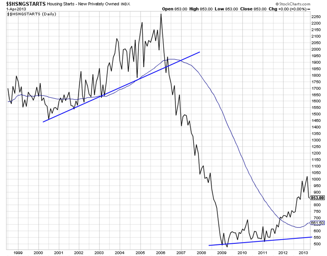
Chart A
Visual Correlations / Analog Charts
I’m not sure when this started but it seems to be almost totally out of hand. And I have no idea where the term for it came from. Analog for an engineer means the physical values change continually as opposed to digital signals. Anyway, the technique I’m talking about here is the display of one time series against a different time series. They can be totally unrelated or the same but using different periods of time. Chart B is an example I found on the Internet. Okay so both lines rise from the left side to the right side. Whoopee! Is the implication that a crash is near? Fear sells, even when the basis of fear is nonsense. Stealing a phrase from Milton Friedman, correlation is ever and always a mathematical process.
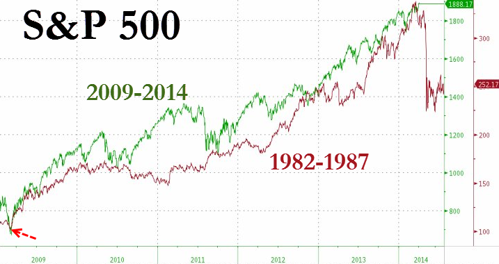
Chart B
A short review of correlation. A correlation of 1 means the data points are perfectly correlated. A correlation of 0 means they are not correlated at all, and a correlation of -1 means they are inversely correlated. I wrote an article about alpha and beta and how they are useless without knowing the correlation – click here to read Linear Analysis, Alpha, and Beta.
Quiz time. Chart C shows two lines. What is their correlation?
1 - Closer to 1
2 - Closer to 0
3 - Closer to -1
4 - Can’t tell
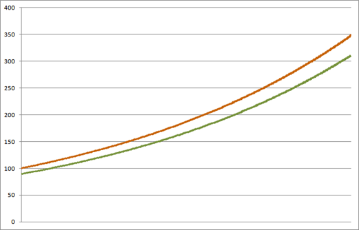
Chart C Courtesy of Adam Grimes
The two lines in Chart B are inversely correlated (-1). Most will say they are correlated because they are doing it visually and not mathematical.
Day 1: Series A: +1.0%, Series B -0.5%
Day 2: Series A: -0.5%, Series B + 1.0%
If you zoom in you can see this in Chart D.
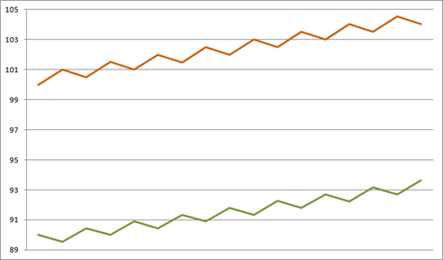
Chart D Courtesy of Adam Grimes
Over any period of multiple days, both series advance, but they do so in perfect inverse daily correlation. Now that was a trick as daily correlation is of little value. If I had done the correlation over many days, they would have been more correlated. Bottom line, visual correlations are a game, not an investment process. I have newsletter writing friends who show analog charts, but they are usually only pointing it out and not making a market call on it.
I just cannot resist…
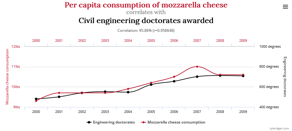
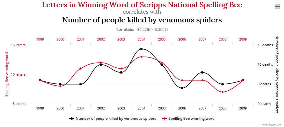
Spurious Correlations website is here: http://www.tylervigen.com/spurious-correlations
Miscellaneous
There are a number of analysis techniques that have attached themselves to technical analysis that I do not use. I have spent a lot of time in the early days studying them, and decided they were not for me as they involve entirely too much subjectivity in their process. While I think some analysts use them beneficially, I think most will never be able to do so. Some have to be restated more often than earnings reports. Here are some questions for those who believe full moons affect investors: When is the moon not full? If the sky is overcast, is it still a full moon? If it is a full moon in Texas, is it a full moon in India? A full moon is solely based upon the relationship of the observer and the light of the Sun shining on it. In other words, you must know where you are on Earth in order to know when there will be a full moon. Ironically, the most perfect full moon is when it is in a lunar eclipse, an event in which the Earth blocks the Sun from illuminating the Moon. Just something to think about! And to correlate market events to full moons is downright scary; a classic case of mistaking correlation with causation.
And finally, no indicator is right all of the time; fortunately you don’t have to be right all of the time. You just need to ensure that you do not hold onto losers and keep your emotions out of the game. Choose some good reliable indicators and stick with them. Learn how they respond during different market environments and master the interpretation of them. And remember, when your favorite indicator fails you, avoid thinking that this time is different, it probably is not.
The capital of Kentucky is Frankfort.
Trade with Understanding,
Greg Morris