 This is an attempt to help validate new high and new low data and, to be honest, is still a “work in progress.” If you consider the facts relating to new highs and new lows, you will see the necessity for this. A new high means that the closing price reached a high that it had not seen in the last year (52 weeks). Similarly, a new low is at a low not seen for at least a year. Note: This makes them very different than Advances, Declines, Up Volume, and Down Volume, which are based upon the difference over the previous day. These indicators try to identify when the new high or new low is determined to be good or bad using the following line of thinking.
Consider that prices have been in a narrow range for over a year. Something then triggers an event that causes the market to move out of that trading range to the upside. This will immediately cause almost every stock that moves with the market to also become a new high. New highs are generally the force that keeps good up moves going. The new lows in this scenario will dry up, as expected. Now consider that the market has had a steady advance for quite some time. The number of new highs will generally continue to remain high as most stocks will rise with the market. Of course there will be drops as the market makes it corrections on its path to higher prices. When the number of new highs starts to dry up, you will probably notice that the number of unchanged issues starts to increase slightly because a lot of stocks will just cease to participate in the continuing rise. New lows will not happen for some time because the market is just starting to form a top. The number of new lows will increase as the market forms its broad top, while the number of new highs gets smaller and smaller. It will be the time frame of this topping action that determines when the new lows will start to kick in. Remember, you cannot have a new low until an issue is at a new low price over the last year.
When the market declines and you start to see fewer new lows, it means the market is losing its downside momentum. Why is this so? It is because some issues have already bottomed and are not continuing to make new lows. This is tied to the rotational effect, sometimes caused by various market sectors hitting bottoms at different times.
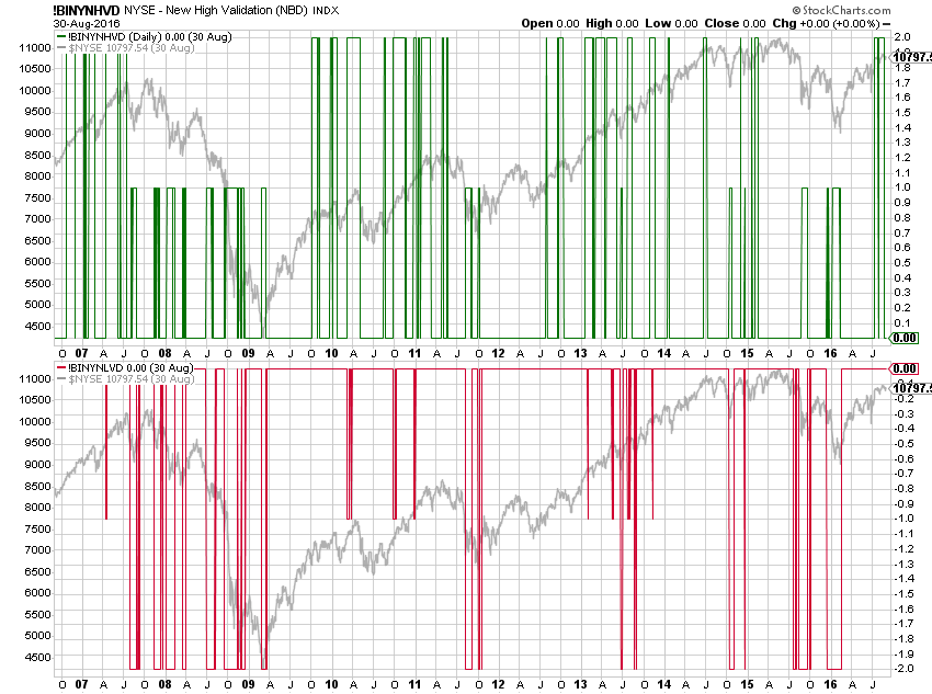
Chart A is an attempt to show this visually. Up spikes (solid green line) equal to +2 represent good new highs. Up spikes (shorter green line) equal to +1 represent bad new highs. Similarly, down spikes (solid red line) at -2 equates to good new lows and -1 (shorter red line) equates to bad new lows. You might read that again since it is not obvious. I wanted to keep the new highs as the up spikes and the new lows as the down spikes. Short up spikes are bad new highs and short down spikes are bad new lows. Bad, in this case means they did not conform to the theory talked about above. The NYSE Composite index is the gray line behind the upper and lower charts.
 Chart A NY High Low Validation
This method of trying to determine when the new highs and new lows are truly good ones, involves the rate of change of the market, a smoothed value of each component relative to the total issues traded, and their relationship with each other. For example, if the market is in a rally (rate of change high) and the new highs are increasing, any new lows that appear are not good ones.
Sales Pitch: Much of this type of analysis can be found in my 2nd Ed. of The Complete Guide to Market Breadth Indicators available on Amazon. StockCharts.com also has a ChartPack that includes every indicator in the book for the New York Stock Exchange, NASDAQ, and Toronto Exchange; over 500 breadth indicators; all updated each day.
StockCharts.com Symbols:
NYSE: !BINYNHVD, !BINYNLVD
NASDAQ: !BINANHVD, !BINANLVD
TORONTO: !BITONHVD, !BITONLVD
Trade with Breadth,
Greg Morris


