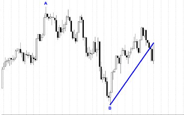
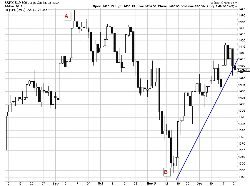
 The Pullback Rally Analysis is not a ranking measure but a technique for determining the relative strength of issues by looking at the most recent rally from a previous pullback. Measure the amount of the pullback in percent, then measure the current rally up to the current date in percent. The concept is fairly simple, those issues which dropped the least in the pullback, will probably outperform in the following rally. This concept measures the percentage move during the pullback, the percentage to date of the current rally, and the percentage to date from the beginning of the pullback. This is a great method to see strength outside of the snapshot of the ranking measures. Chart A shows an example on how to determine the dates for the beginning and end of the pullback. From the chart you can see a peak at point A with a pullback down to point B. The rally is then measured from point B to the current date.
A ratio of the percentage move of the current rally to the percentage move of the previous pullback is calculated. Another calculation is percentage the current price is from the beginning of the pullback (previous high). This data, when ranked, will help you determine strength in the rally as compared to the previous pullback. Often the stronger issues in a pullback are the leaders during the rally.
 Chart A
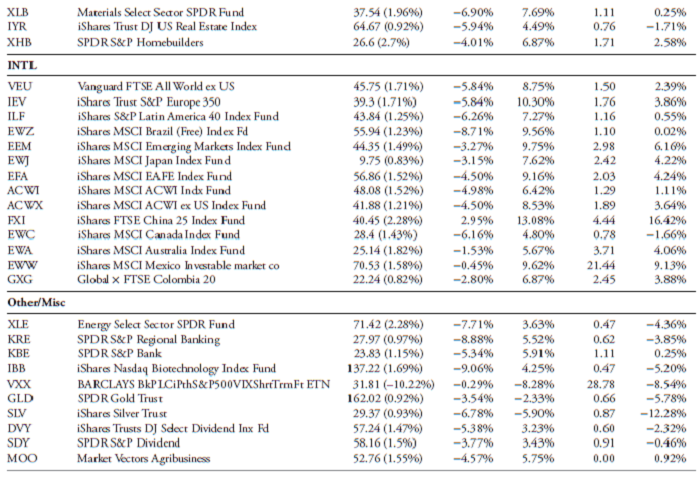
Tables A and B (this was a single graphic and had to be split into two for use in this article) show the data for the Pullback Rally Analysis. From these tables, even a quick glance shows that the international ETFs are outperforming, not only in the rally phase (% Rally) but also are now almost all above where the previous high (beginning of pullback) began (% Prev. High). The iShares FTSE China 25 Index Fund also performed well during the pullback phase with the only international ETF with a gain for that period of 2.95%, while the others were losses. The Ratio column shows the ratio of the percent of rally compared to the percent of pullback. The pullback is completed so only the extent of the rally is unknown. This ratio will show ETFs that performed in a couple of ways. One is that if the ETF did not decline much during the pullback AND rises quickly in the rally, it will have a large ratio. For example, in the Broad category, the SPDR S&P MidCap 400 ETF Trust (MDY) has a ratio of 1.40, highest in that category. This is because it was the best performer (least decline) in the pullback phase and ranked third in performance in the rally phase. This would indicator that MDY is a strong performer and a candidate to consider for buying. The last column, % Previous High will also show you which ETFs are making new highs from the beginning of the pullback. This method of selection shows which issues are strong on a relative basis. In fact, it will also tell you which sectors and styles are strongest if you use ETFs that are tied to those strategies.
 Table A
 Table B
The method gives you another process that can be used in the selection of issues for trading. While this article could be part of the “Building a Rules-Based Trend Following Model,” it also can stand alone. I want to thank my good friend Ted Wong for sharing this idea with me a long time ago.
Dance with the Trend,
Greg Morris


