 I spent a great deal of time working on an asset commitment model using the Chande Trend Meter (CTM) and believe I have something worth sharing. Tushar defines ranges for CTM based on the degree of trendiness and I have assigned Asset Commitment percentages to those pre-defined ranges. Table A shows the asset commitment levels for the ranges used by CTM.
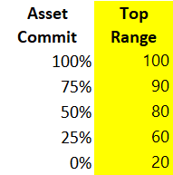 Table A
Chart A shows the Nasdaq in black, the CTM in blue and the digital asset commitment in green. This chart is for the period that encompassed the bear market from 2007 – 2009. The Asset Commitment percentage is how much to deploy in the portfolio you have dedicated to this model. For example, if you set aside $100,000 for this, it would be easy to figure; Asset Commitment of 75% would mean $75,000 is invested and $25,000 remains in cash. To trade this, you would just follow the green line and ensure your asset commitment percentage of your total portfolio was invested in a Nasdaq related vehicle; such as QQQ or ONEQ. Don’t get too excited, there are some serious deficiencies in the model; discussed below.
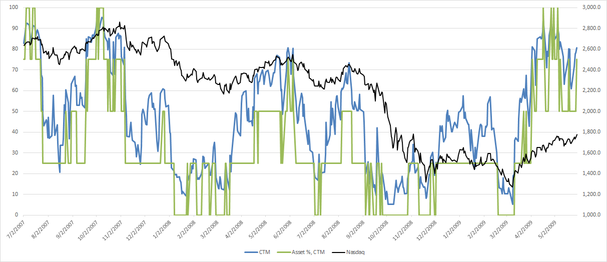 Chart A
Chart B shows the same as Chart A except it is for the bear market from 2000 – 2003. I show the performance over bad times as this is when a trend model will provide you with its best trait - asset protection.
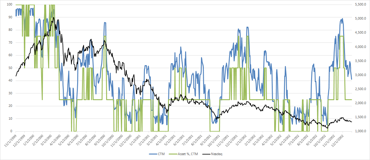 Chart B
Chart C shows the CTM Equity curve using this simple model. Now let me explain everything that is wrong with this model. It trades entirely too much. There are no rules. There are no stops. And personally, I could never use it because of those missing elements. I did however go over all of those earlier in the “Building a Rules-Based Trend Following Model.” This data is for over 38 years of trading.
Cumulative Return = 831.3%
CAGR = 23.99%
 Chart C
Chart D shows the most recent data I have which is up to late July 2018. You can see it kept you invested during most of the past 3 years.
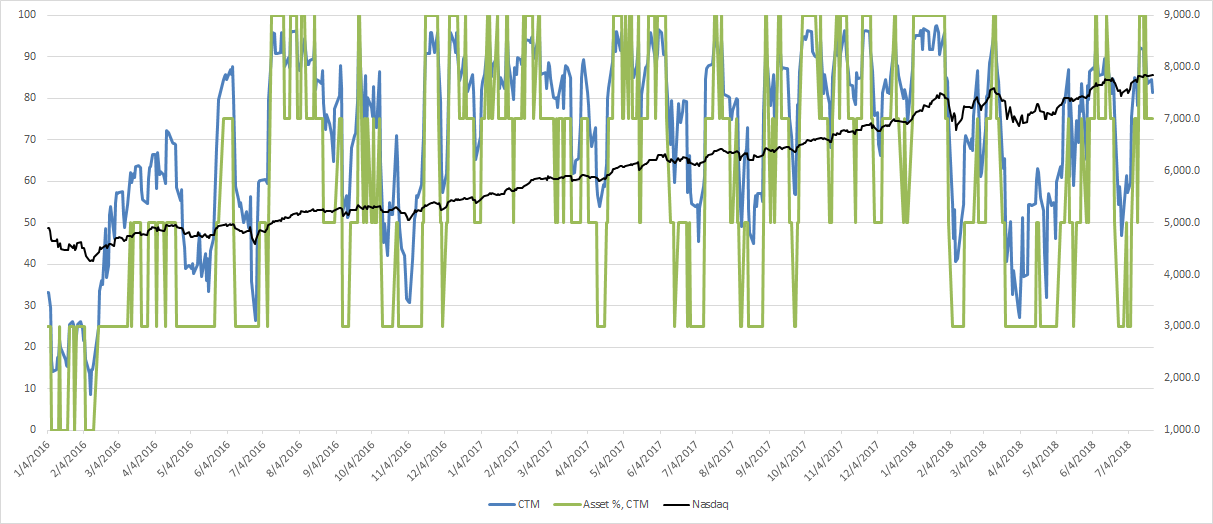 Chart D
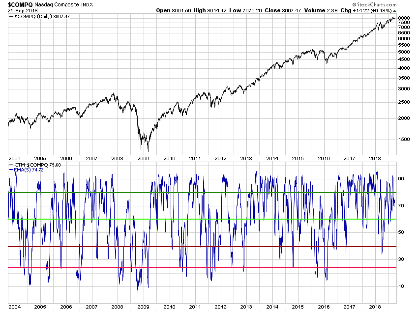
Using StockCharts.com SharpCharts, I created Chart E showing the Nasdaq Composite in the top plot and the 5-day exponential moving average of CTM in the bottom plot. I also put lines showing my preferred ranges for the asset commitment levels. Note: these are different than in the previous examples. The dark green line is at 80 and is 100% invested whenever the 5-day EMA of CTM is 80 or greater. The lighter green line is at 60 which means asset commitment of 75% whenever the 5-day EMA of CTM is between 60 and 80. The dark red line is at 40, meaning asset commitment is at 50% when the 5-day EMA of CTM is between 40 and 60. The bright red line is at 25, meaning the asset commitment is 25% when the 5-day EMA of CTM is between 25 and 40. When the 5-day EMA of CTM is below 25% you are in cash or cash equivalents. Let me put all that in an easier format:
80 – 100 100%
60 – 80 75%
40 – 60 50%
25 – 40 25%
0 – 25 Cash
You can click on Chart E and it will take to StockCharts.com’s chart called CTM w AC.
Chart F shows the 5-day EMA of CTM in light blue, and my updated asset commitment digital in orange. In testing the performance of my preferred use of 5-day EMA of CTM and different asset commitment levels, I found that the CAGR was 28.68% and cumulative return was 554.61%, both lower than basic CTM and Tushar’s levels. Note: Remember his were not determined by asset commitment, but by degree of trendiness. However, the frequency of trading is considerably reduced but still too high. High frequency trading will wear you out. You can experiment with different levels of smoothing and reduce the trading considerable and probably not hurt the results. Remember, it is not just the destination, but the path to the destination.
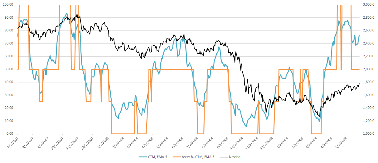 Chart F
This completes the series on “Building a Rules-Based Trend Following Model.” I was happy to wrap it up by giving you a trend-based measure that you can now apply stop loss levels, rules, and guidelines; all discussed in excruciating detail in this series. As my old friend Takehiro Hikita used to say, “Mr. Morris; dance with the trend.”
Dance with the Trend,
Greg Morris

