 To prove that I read all comments, here are some pair charts and data that is updated to 12/31/2018. First a review of what pair analysis is.
My pair analysis is accomplished on weekly data. Think of the ratio line like this: when it is moving upward it means the numerator (IJR) is outperforming the denominator (IEF). When the Rate of Change (ROC) goes below the -4% line, it means the numerator (IJR) is no longer outperforming the denominator (IEF). Hence, you want to rotate into the denominator (IEF); or sell IJR and buy IEF. Complementarily, when the ROC goes above the +4% line it means the numerator is now outperforming the denominator, so you want to sell IEF and buy IJR. Also, the signals are at the crossing of the + and – 4% lines, not at the peaks and troughs of the ROC.
Chart A is the IJR:IEF ratio pair. I'm showing this pair since it is the one I introduced in the first article on Pair Analysis. The Core for this chart is the S&P 500 Index. The gray background shading is the time when IJR is the investment since it is the numerator. Obviously (I hope), the white spaces are when the denominator is the investment, and in this case, it is IEF. This data and chart also smooths the ratio line with a 2-period simple moving average. While that process does not affect the performance that much, if any, it does reduce the number of trades. When dealing with a 1-period rate of change (ROC), you will have many sharp peaks and troughs outside of the 4% range; the 2-period smoothing eliminates many of them without great sacrifice in performance. Also keep in mind that this is NOT a robust analysis; it was an idea I had years ago and wanted to share with you. In fact, it was in early 2013, which is why the first article’s data ended about then.
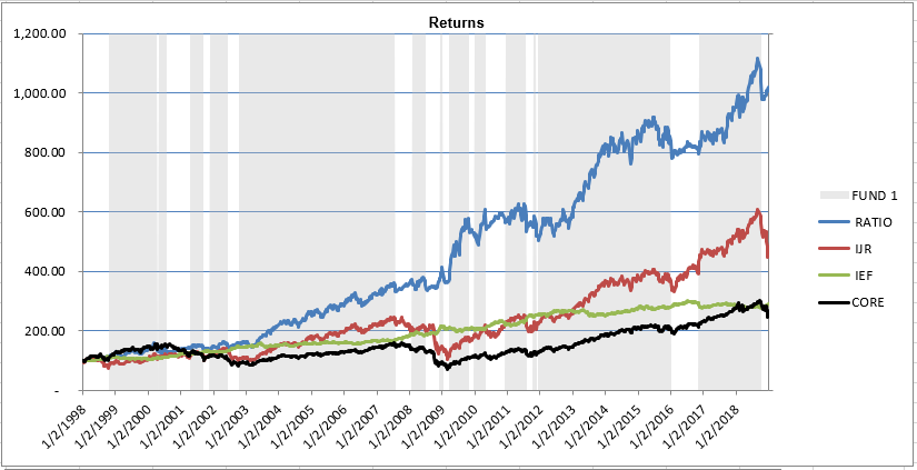 Chart A
Chart B shows the excess return of the IJR:IEF pair strategy to the S&P 500 Index. I must point out that this does not include commissions, slippage, and all the other potential issues that deal with live trading. It is just the raw results using the closing price on Friday (remember, this strategy is using weekly data). Viewing the excess return, you can see many flat areas where there wasn’t any improvement in return over the S&P 500. Of course, only in hindsight can you see that. Reference to "excess" means above the risk free return, which in most analysis is the 90-day T-bill rate.
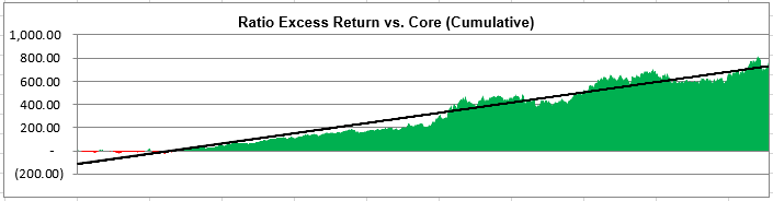 Chart B
Chart C is the cumulative drawdown for the S&P 500 Index (black) and the IJR:IEF Pair Strategy (cyan). The dotted lines are the average of those drawdowns. Low drawdown is of great value when you are actually trading with real money.
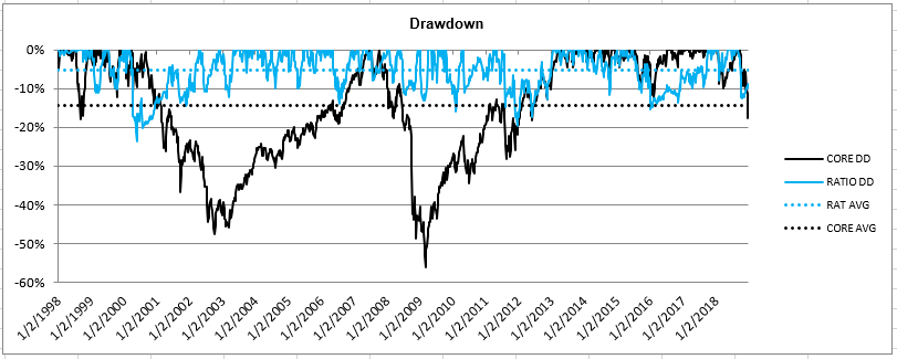 Chart C
Chart D is the 1 year rolling correlation of the IJR:IEF pair strategy with the S&P 500 Index. You can see it is not well correlated; with the average (orange line) being slightly negatively correlated. The bottom plot in Chart D shows the distribution of the 1 year rolling correlation. You can see from the distribution that more of the correlations were in the negative side. Basically, it says that the IJR:IEF pair strategy is not correlated with the S&P 500 Index.
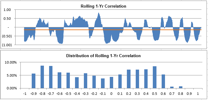 Chart D
Table A shows a bunch of statistics and performance data on the IJR:IEF pair strategy. UPI is the Ulcer Performance Index, which compares the issue with the core performance (UPI = (Total return - Risk-free return) / UI). Core refers to the S&P 500 Index. 1.24 trades a year is delightful. In Pair Analysis – 3, I’ll show you the information when the 2-period SMA is not used.
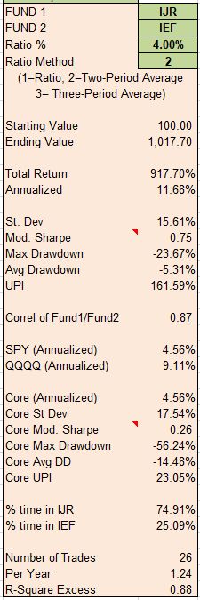 Table A
In Pair Analysis - 3, I’ll show Chart A for a few other pairs. Many work well, but some do not. Obviously, in showing you an example, I picked a pair that did. My analysis included over 700 pair combinations.
My long-time friend and superb trader, Linda Bradford Raschke has finally written a book about her life in trading. Folks, this is a great read that will offer so many tidbits of knowledge on trading you won’t be able to put it down. I was honored to read the draft and make comments. It won’t be on Amazon from a year, but you can order it HERE.
Dance with the Trend,
Greg Morris