This article will wrap up the presentation of various performance metrics for two of our trend following strategies.
The last few charts will focus on risk-adjusted returns, which attempt to measure how much risk a strategy takes in order to generate the returns. Looking at risk-adjusted returns is a very popular way to evaluate different strategies, especially if the strategies are taking a different approach to markets (passive, active, tactical, etc.). Investors should care about how much risk will be taken with their investment in order to generate a certain level of return. However, we find this is not always the case – we'll explain more at the end.
A very common risk-adjusted return measure is the Sharpe ratio, shown in Chart A.
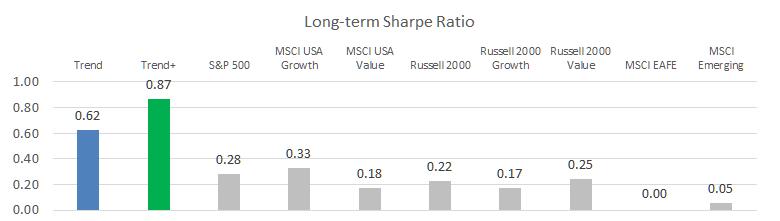
Chart A
Most readers will be familiar with the Sharpe ratio, which measures an investment's excess return, above the risk-free rate, divided by its standard deviation. This is a popular performance metric, especially for those in the modern portfolio theory camp that believe risk is volatility.
We labeled this chart with "long-term" because it covers the entire period from 1997 through September 2019 (including 2 bear markets) that we've been presenting in this series of articles. Many websites publish 3-year, 5-year, or 10-year Sharpe ratios. As of right now (near the end of 2019), those timeframes only include one bull market in U.S. equities. It is very rare for a 10-year historical period to not include at least one bear market, but that's where we find ourselves today. If you are using Sharpe ratios to compare different investment options, you need to understand what historical timeframe the ratio covers and how the strategies might behave differently in other market environments. Strategies that move defensive in bear markets are likely to have a much better Sharpe ratio than buy & hold approaches when compared over full market cycles.
Another, more nuanced, risk-adjusted return metric is the Return Over Max Drawdown (RoMaD), shown in Chart B.
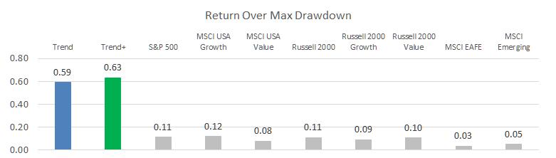
Chart B
RoMaD takes the annualized returns earned over a time period divided by the maximum drawdown that occurred. This measures how much drawdown pain you had to endure to earn the returns. Over the time period from 1997 through September 2019, the S&P 500 saw returns of 6.3% a year and went through a max drawdown of -56.78% (RoMaD = 6.3 / 56.78 = 0.11). Our trend strategy however saw returns of 13.4% a year with a max drawdown of only 21.22%, resulting in a much higher RoMaD. This is the value of generating good returns while avoiding big losses in your portfolio.
The last chart we'll present is the RoMaD since the start of the current bull market, which began when the S&P 500 bottomed on March 9, 2009.
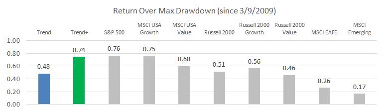
Chart C
The S&P 500 has returned 15.1% a year since the bottom in 2009 and the largest pullback was in 4th quarter of 2018, where it almost dropped into bear market territory, with a drawdown of -19.78%. Our trend strategy has achieved 10.8% a year with a max drawdown of -14.54%; nearly keeping up with the S&P 500 on a risk-adjusted basis, even during this strong bull market.
Some investors will see this chart (or similar ones published on other sites) and say that the S&P 500 is the best performer on a risk-adjusted basis, so one shouldn't pay fees for active management. This seems reasonable on the surface, but fails to consider the timeframe being covered, and how the strategies might perform in a market environment that is not being evaluated. Chart B paints the full picture, but unfortunately the various sites used to do research on investment options rarely provide enough information to evaluate this correctly. I guess if you put your head in the sand, and don't think we'll experience another bear market in the future, passive could be the way to go. (A previous article discussed the frequency of bear markets.)
One final comment on risk-adjusted returns. We have found most prospective clients are very interested in risk-adjusted returns when comparing different investment options, whereas existing clients tend to forget about risk management and focus more on relative returns (relative to the S&P 500, typically). We think this is normal human behavior as it's hard to see or feel "risk," but it is very easy to see the returns on monthly statements. If a client is mentally comparing those returns to the S&P 500, the relative performance is what causes an investor to be happy or not with their investment decision. This is even more pronounced during a very long bull market (i.e., today). On the way up, many investors will abandon a risk-managed strategy to chase S&P 500 returns, and this may even be one of the reasons that a bull market continues – more and more investors piling into the market. At some point though, there is no one left to buy, and those investors who stayed focused on risk management will be rewarded.
Dance with the Trend,
Greg Morris