 This is a continuation of the previous article. The Dow Jones Industrial Average, also referred to as The Dow by the financial media, is a price-weighted measure of 30 U.S. blue-chip companies. The Dow covers all industries with the exception of transportation and utilities, which are covered by the Dow Jones Transportation Average and Dow Jones Utility Average. While stock selection is not governed by quantitative rules, a stock typically is added to The Dow only if the company has an excellent reputation, demonstrates sustained growth, and is of interest to a large number of investors. Maintaining adequate sector representation within the indexes is also a consideration in the selection process.
The following data is from the Dow Jones Industrial Average, not adjusted for dividends or inflation, over the period from February 17, 1885 through December 31, 2012.
Note: If you have not read the previous article on Bear Markets and Drawdowns, much of the terminology used here will be easier to understand.
Table A is focused only on the percentage decline of the various drawdowns. The columns in the table are defined as follows:
Drawdown Range – this is the percentage of drawdown decline, it is divided into various ranges which make of the rows in the table. The top row of data is for drawdowns with declines greater than 20% and the bottom row is the data for all drawdowns.
Average Max Drawdown – this is the average of all the drawdowns for the percentage decline in the first column.
Average Days in Decline – this is the average number of market days that the drawdowns were in the decline whose percentage decline is defined by the first column.
Average Months in Drawdown – this is simply a calculation of dividing the average market days in decline by 21, which is the average number of market days per month, which yields calendar months.
Total Days in Decline – this is the sum of all the days the particular decline range was in decline.
Total Months in Decline – this is the total market days in decline divided by 21.
Percentage of time spent in Decline – this is the percentage of time that the declines were in a state of decline based upon the total number of market days for the period of analysis.
Drawdown Decline - Dow Jones Industrial Average
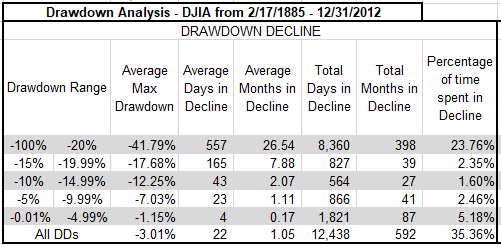 Table A
From Table A you can see that all drawdowns greater than 20%, which are also called bear markets, were in a state of decline for almost 24% (23.76%) of the time, in other words bear market declines accounted for 24% of the total time from 1885 to 2012. The bottom row in the table above shows that all drawdowns, no matter what their magnitude spent over 35% (35.36%) of the time declining.
Drawdown recovery is the term used to define the time spent from when a drawdown bottoms (hits its absolute lowest point and greatest percentage of decline) and completely recovers (gets back up to where the drawdown began). The columns in Table B are similar to the Drawdown Decline table in Table A; I am just discussing the last portion of the drawdown here instead of the first portion.
Drawdown Recovery - Dow Jones Industrial Average
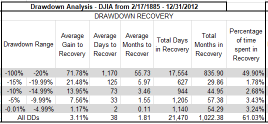 Table B
We can see that Drawdown Recoveries, where the magnitude of the drawdown was greater than 20%, took almost 50% (49.90%) of the total time to recover. Remember that recoveries from declines always take longer than the declines. This is generally defined by the fact that declines (selling) are more emotionally driven so usually are quicker and more abrupt. There is a new column in the Drawdown Recovery table, and it is called Average Gain to Recovery. This is the percentage of gain (recovery) needed to get back to where the drawdown began. This was discussed in more detail in previous article. From the Table B you can see that for drawdowns greater than 20%, on average it takes a gain of over 71% (71.78%) to be get back to even. Remember we are dealing with averages in these tables.
Drawdown duration is shown in Table C; this is the total amount of time that a complete drawdown occurred. The previous two tables dealt with the decline and the recovery, this table is the total of those two.
Drawdown Duration - Dow Jones Industrial Average
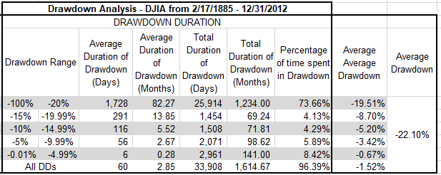 Table C
Drawdowns of greater than 20% averaged 1,728 days, which is over 82 months, or almost 7 years. The total number of days of all drawdowns greater than 20% was 33,908 market days. Now the real eye-catcher in this table is the last row that shows all drawdowns regardless of the percentage decline. It shows that the market from 1885 to 2012 was in a state of drawdown for over 96% (96.39%) of the time. In other words, the market was making new all-time highs less than 4% of the time. Finally, the last column shows the average of all drawdowns at -22.1%.
Chart A shows all drawdowns that were greater than 15%. You can see that for the period from 1927 to 2012, the S&P 500 had 5 drawdowns in the 15 – 19.99% range, 2 in the 20 – 24.99% range, etc., for a total of 20 drawdowns of magnitude greater than 15%.
Distribution of Drawdowns - Dow Jones Industrial Average
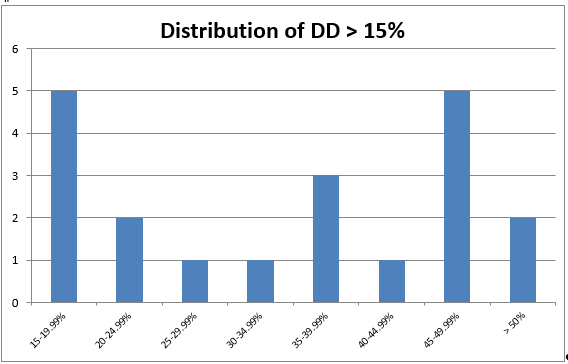 Chart A
Chart B shows all drawdowns no matter how small. You can see that there were 566 drawdowns, with 496 of them less than 5%. Five percent declines are generally considered just noise and part of the market pricing mechanism. Drawdowns between 5% and 10% are considered pullbacks; there were 37 pullbacks during this period. Corrections are drawdowns between 10% and 20%, you can see that there were 18 (total of 10-14.99% and 15-19.99%). There were 15 drawdowns of 20% or greater. Also notice that Chart A is also reflected in Chart B, just that 3 more distribution percentages were added to the left end.
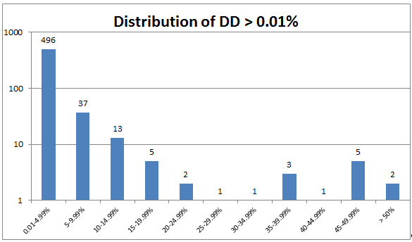 Chart B
Chart C shows you a visual of all drawdowns during the analysis period. The 1929 Drawdown is clearly exceptional not only in magnitude of decline but also duration; so much so that it skews the visual effect of the remaining drawdowns.
Cumulative Drawdown for Dow Industrials
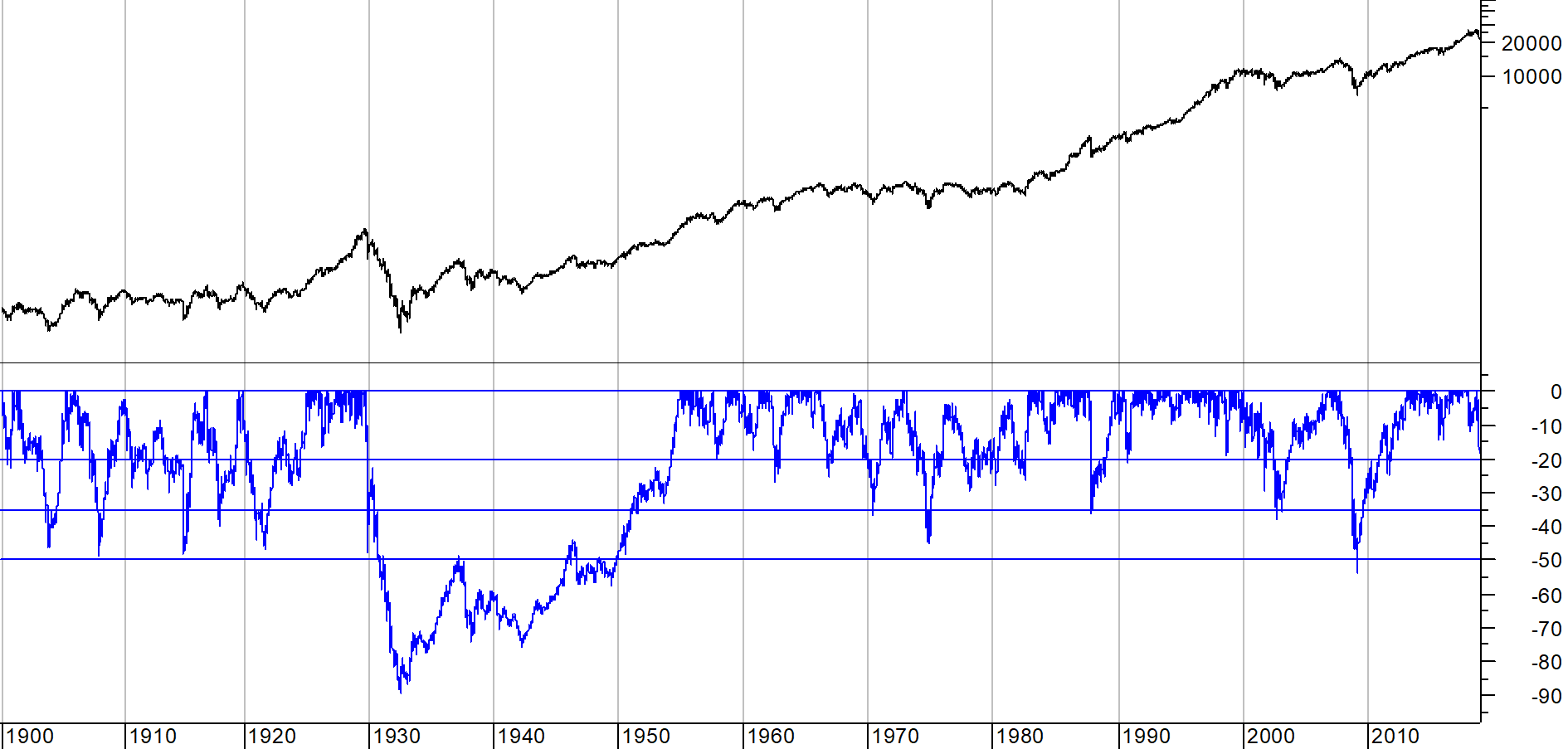 Chart C
These last two articles on Bear Markets and Drawdowns presented a lot of data. Since I strongly believe that risk is loss of capital which is also drawdown, I feel it necessary that you understand the past history on drawdowns (risk). I rarely use the Dow Industrials for analysis, but it does offer over 30 years more of daily data.
Warning! Sales Pitch to Follow: My book, Investing with the Trend, has data and charts similar to these, but not only just for the price, but also includes data without the bear markets, total return analysis, and much more. Plus it does all that not only for the Dow Industrials, but also the S&P 500, Gold, Japan's Nikkei 225, Copper. Pick up a copy, I need a new set of golf clubs. Thanks.
Dance with the Trend,
Greg Morris


