I thought this article that I wrote over three years ago on January 11, 2019 is quite appropriate for today. If you have read my blog you know that I use the Nasdaq Composite as my measure of the market and it is down significantly as I write this. Enjoy!
The month of December 2018 was a bad month for the market; the rally in the last week of the month was nice but small compared to the month's decline. 2019 has so far continued the upward move, so I thought it was time to show some data on market drawdowns. If you have been reading my scribblings for long you hopefully recall that I view drawdowns as the best measure of risk. Unlike modern finance that says volatility is risk and volatility is defined by standard deviation. Hey, if you use standard deviation, then you are also agreeing that the markets are random and normally distributed. In other words, they can be measured using Gaussian statistics and distributions. If you truly believe that, you must not believe a thing I have ever written in this blog. Furthermore, that belief is also aligned with believing that investors are rational, and all investors always agree on returns, risk, and correlations. Again, this is just the nonsense of modern finance and hopefully a good technical analyst will understand why.
The following describes the nomenclature used in Chart A. Drawdown Magnitude is the percentage that price has moved down from its previous all-time high. Drawdown Decline is the amount of time the market declined from an all-time high to the trough. Drawdown Duration is the amount of time that it took the price to recover to is previous all-time high. Drawdown Recovery is the time it took from the trough to get back to an all-time high.
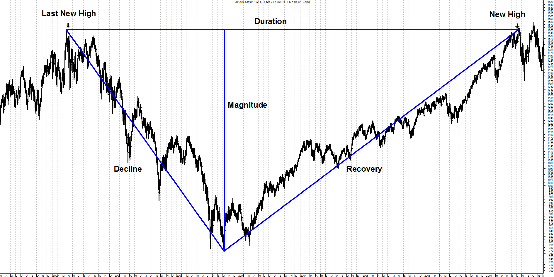 Chart A
While the terminology for drawdowns is subjective, I'll stick with the ones that Sam Stovall (Standard and Poors) uses, as they are as good as any. I have often thought one more term for bear markets greater than -40% would be good, such as Super Bear, but I have other battles to fight.
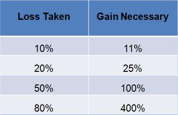
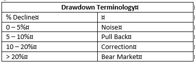 Table A
Recovering from a severe drawdown takes an extraordinary return just to get back to where you were. This is sometimes referred to as equivalent return and is represented by this formula:
Percent Drawdown / ( 1 – Percent Drawdown)
If you don't have a calculator or table handy, just divide the percent decline by its complement (100 – percent), and then mentally place the decimal in the appropriate place. This is best done in privacy and not on a stage in front of many people.
From Chart B you can see that if you lose 50%, then it takes a 100% gain to get back to even. When was the last time you doubled your money? A 100% gain is the same as doubling your money. The recent bear market that began on October 9, 2007 dropped over 55%, you can see that to recover it takes a gain of over 122% to get back to even. One thing the graphic clearly shows is that the larger the loss, the gain required to recover becomes even greater.
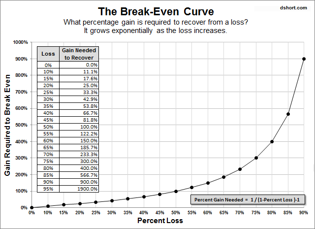 Chart B
Chart C is an example of cumulative drawdown. The line that moves across the tops of the price data (top plot) only moves up with the data and sideways when the data does not move up; in other words, it is constantly reflecting the price's all-time high value. The bottom plot is the percentage decline from that all-time high line. Whenever that line is at the top it means that price in the top plot is at its all-time high. As the line in the bottom plot declines it moves in percentages of where it was last at its all-time high price. In the example shown, a new all-time high in price is reached at the vertical line labeled A. The bottom plot shows that as prices move down from that point, the drawdown also moves in conjunction with price. The horizontal line that goes through the lower part of the drawdown plot is at -10%. You can't read the dates at the bottom, but it took almost 6 months before the prices recovered to point B and then moved above the level, they had reached at point A. This is an example of Drawdown that had a magnitude of -17% shown by the lowest point reached on the drawdown line in the bottom plot. The drawdown also lasted almost 6 months as shown by the time between line A and line B.
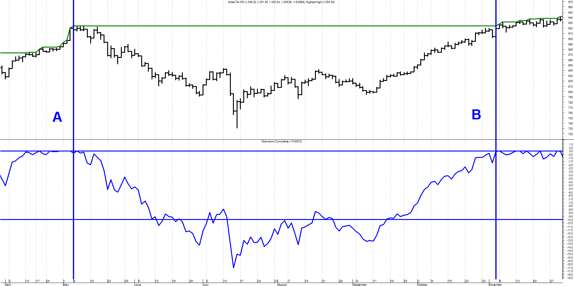 Chart C
Chart D shows the percentage of drawdown over the entire history of the Dow Industrials since 1885. The top portion is the Dow Industrial Average plotted using semi-log scaling and the bottom plot is the drawdown percentage. The darker horizontal line through the bottom plot is the mean or average of the drawdown over the full time period since 1885. Its value is -21.1%. The other horizontal lines are shown at zero (top line), -20%, -35%, -50%, and -65%, I think the things that stands out from this chart is that the period from 1929 through 1954 suffered an enormous drawdown not only in magnitude but also in duration. The low was on June 28, 1932 at -88.67%. The equivalent return to get back to even from that point was a gain of over 783%. That is why it took almost 25 years to accomplish.
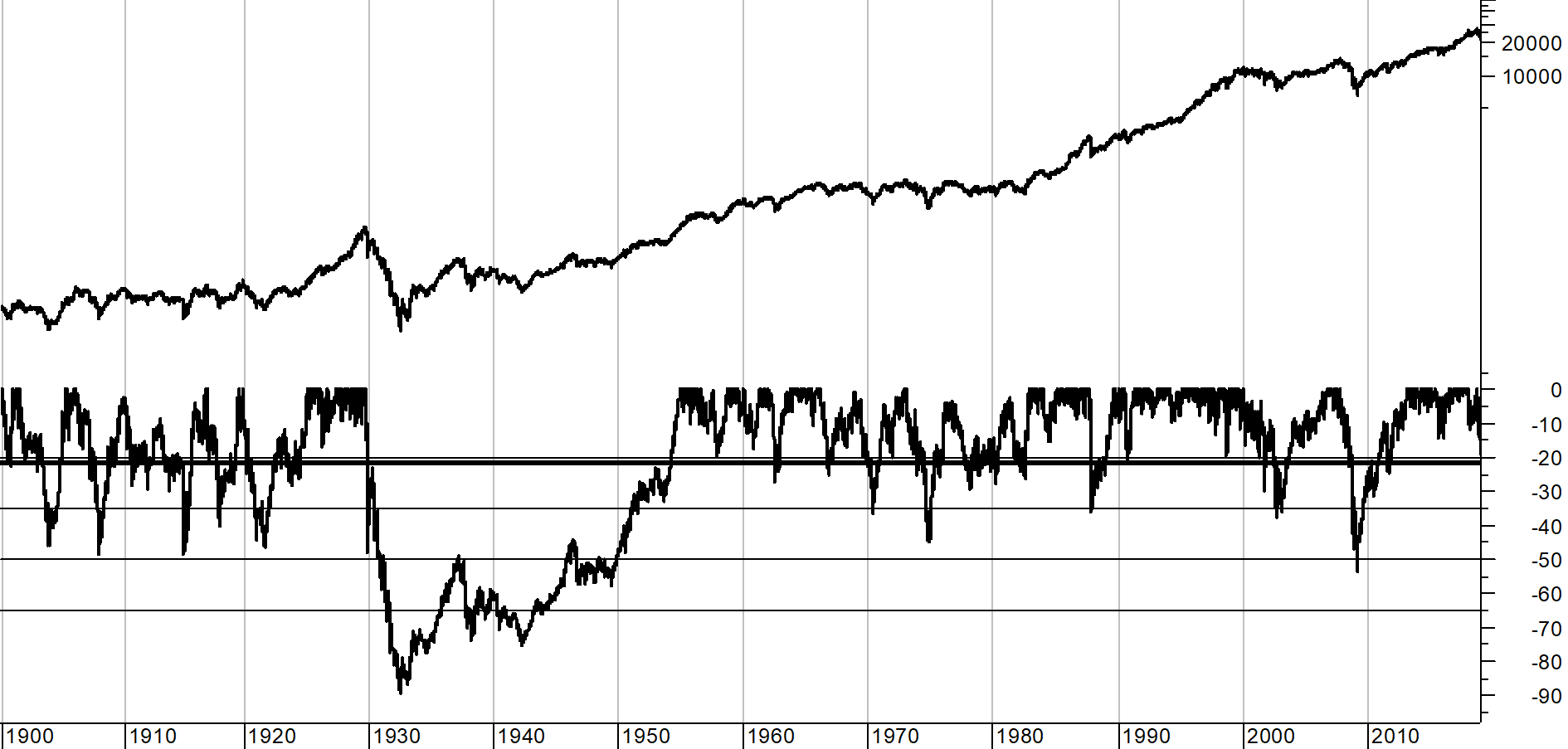 Chart D
Because the depression era drawdown distorts the other drawdowns, Chart E shows exactly the same data since about 1954, eliminating the scaling affect from the -88% depression era drawdown. The drawdown in 2008 clearly stands out as the biggest in modern times at -53.78% on March 9, 2009. It should be noted that all of the time that the drawdown line in the bottom plot is not back up to the top (0%), the market is in a "state of drawdown" which is noted by the duration, not just the amount of the decline which is the magnitude.
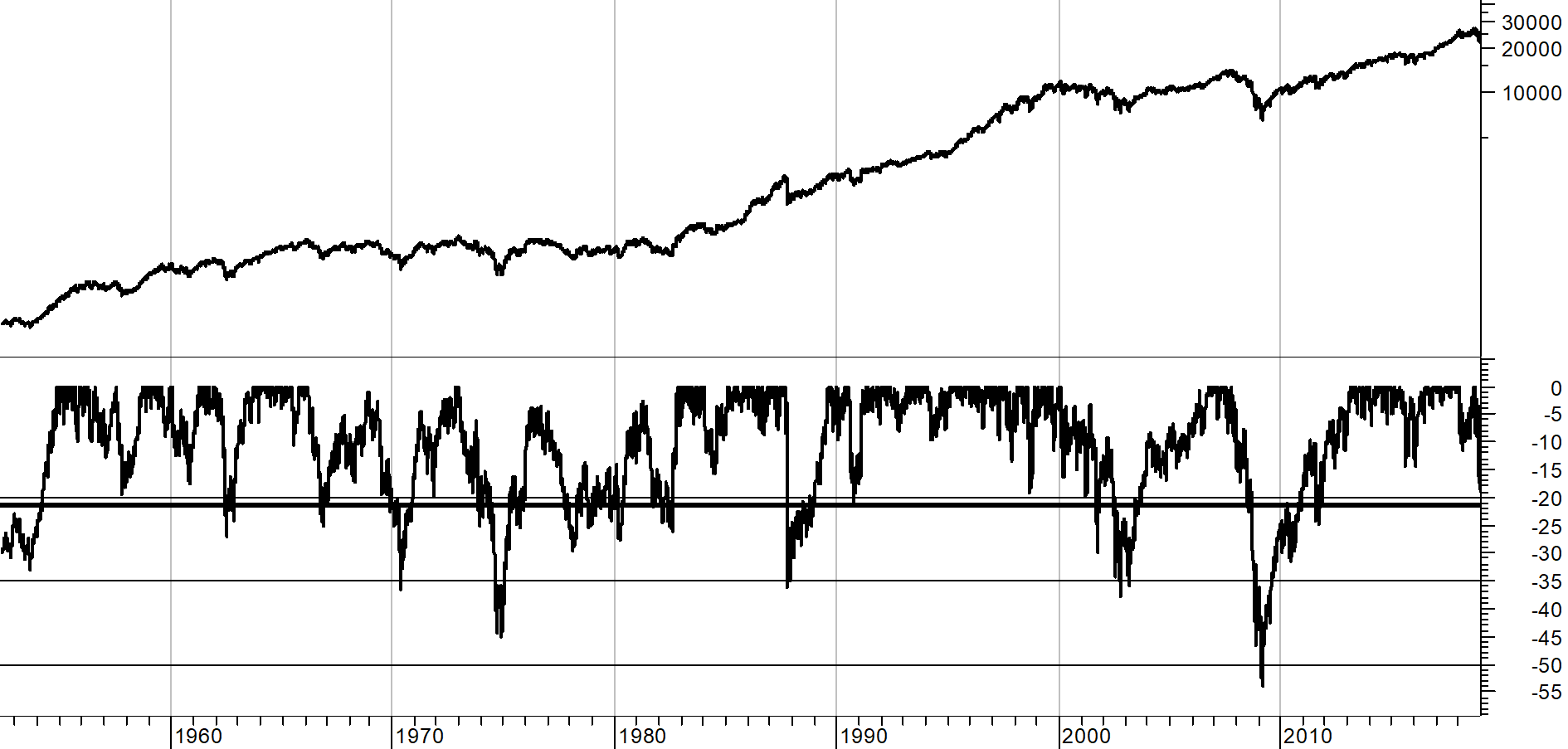 Chart E
Remember: Every bear market ends, but rarely when you are still trying to pick the bottom.
I'm sure many will think I'm writing about drawdowns and bear markets because I believe we are about to have a bear market. Well, no, but we are in a sizable drawdown.
I'll expand on this in a future article with more data, tables, and charts. I'm not a big fan of the Dow Industrials for analysis, but it does offer the most daily data – back to 1885.
Dance with the Trend,
Greg Morris