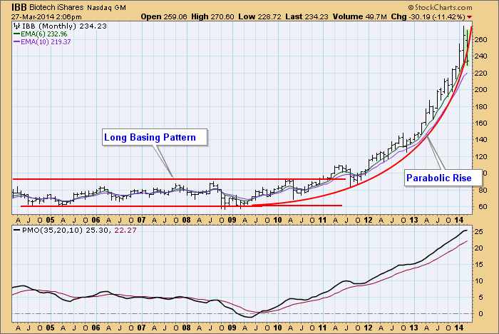
This morning on one of the business channels the moderator was asking guests if there was a bubble the Biotech Sector, and at the same time a three-week line chart was displayed on the screen. Pretty frustrating, but it did tickle my curiosity, so I made a 10-year monthly bar chart on the StockCharts.com charting workbench. In my opinion, the answer is, yes there is a bubble and it appears to be bursting.
This chart gives us a perfect example of a parabolic rise, which is how a bubble looks. It begins with a long basing pattern, during which time accumulation takes place. Then a breakout occurs and price begins to curve upward at an ever accelerating pace. Eventually, the near vertical rise cannot be sustained and price breaks down through the parabolic curve. This has just happened this month.
The normal expectation at this point is that price will fall rather quickly back to the level of the base. Another possibility is that price will fall back partially, then begin to base at a higher level -- this is called a high-level consolidation. In any case, Biotech looks pretty dangerous right now.
The main point I would like to make is that long-term charts are essential for giving current price action the proper context.
Watching the windsock,
Carl


