The Investment Company Institute (ici.org) compiles statistics on mutual funds and publishes them monthly. There is a one month delay between the end of the month being reported and publication, so the data on the charts below, while being updated this week goes through Feburary. Amounts shown on the charts are in billions. Using these statistics to measure sentiment is similar to reading the Rydex Assets and Cashflow charts. These charts tell us the psychology of investment managers by measuring not what they are saying as in a typical poll, but by measuring where they are actually placing their money.
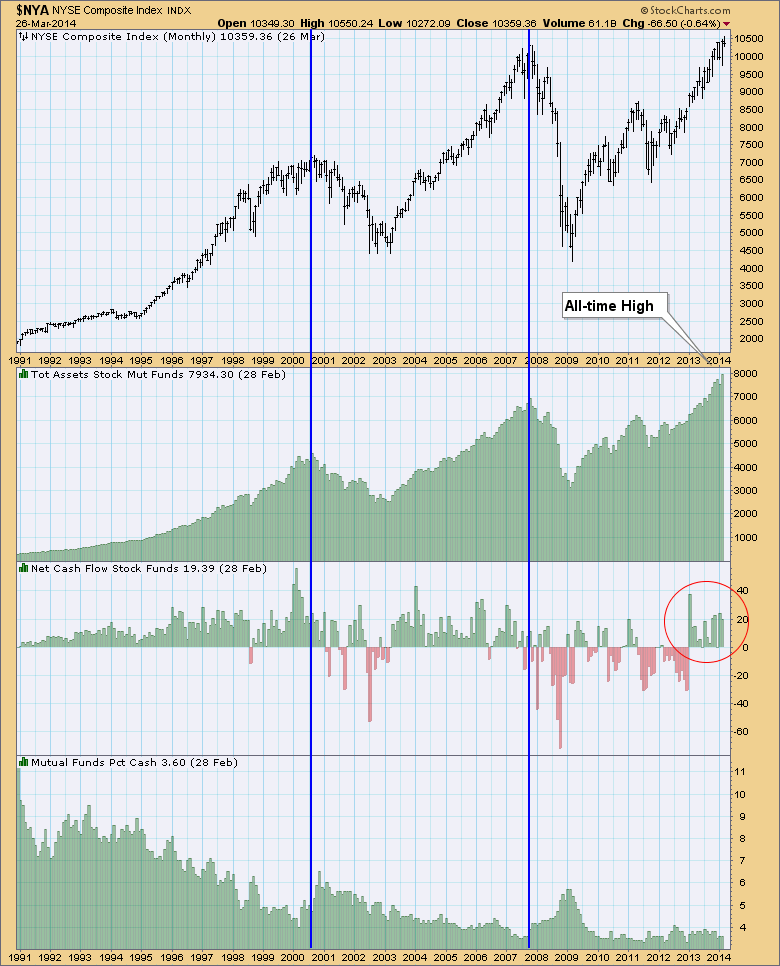
The first chart shows that total assets in Stock Funds has reached an all-time high. This represents extreme bullishness. We can see that when assets have peaked, so has price. While assets have reached an all-time high, they have not peaked, but I suspect at the end of March we will see this number go down given the March pullback.
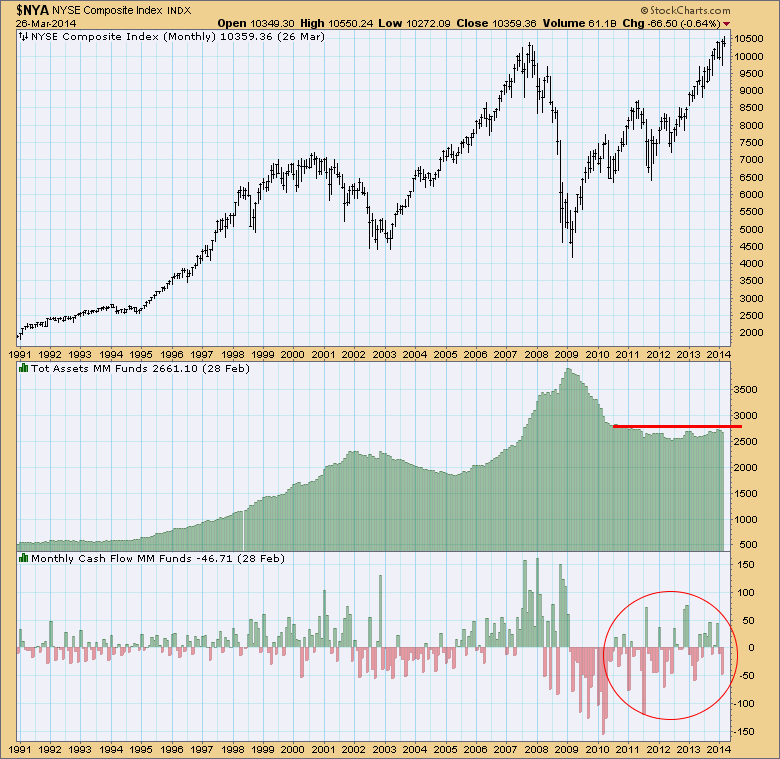
The second ICI statistics chart shows us the state of money market fund assets and cashflow. What's interesting here is seeing that after the 2008 crash, assets in money market funds have remained mostly stable and at an elevated level in comparison to pre-2008 crash. Now, I am only guessing, but I suspect after being burned, a lot of investors and their money left the market, moved into cash and has mostly remained there. Looking at the cashflow, we see that it has definitely fluctuated during that time, but ultimately the amount of assets has been steady over time.
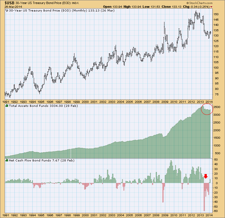
The last ICI mutual fund statistics chart is the bonds chart. During the price correction on bonds in 2013, there was plenty of negative cashflow. After that, while there are fewer assets in the bond funds, they are still high.
What do these three charts tell us? My interpretation is that the new high in asset accumulation in stock funds demonstrates that managers are extremely bullish. We can see that when this happens, price tops occur. Additionally, these charts are telling me something interesting... there is still a large amount of money in cash and bond funds even while stock fund assets have been rising to new highs. It seems to me that much of the money that was pulled completely out of investment accounts after the 2008 crash is coming back in. More money in investment accounts and stock funds means managers and investors alike, are extremely bullish. Unfortunately sentiment is contrarian, so overall this is very bearish.
Happy Charting!
Erin

