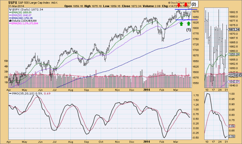
Ah, the bull market that wouldn't die. The DP Chart Gallery revealed some interesting charts today, starting with the SP500 Daily Chart. What appeared to be a bearish double-top formation is now looking like a bullish double-bottom. Maybe it is time to chalk it up to being a trading range as I have heard discussed by technicians recently.
As soon as price bounced off of support drawn at the double-top neckline (1), that formation was voided. That bottom has formed the second bottom in the double-bottom formation. Now we wait to see if the double-bottom formation neckline (2) will be penetrated...or do we simply see more sideways consolidation?
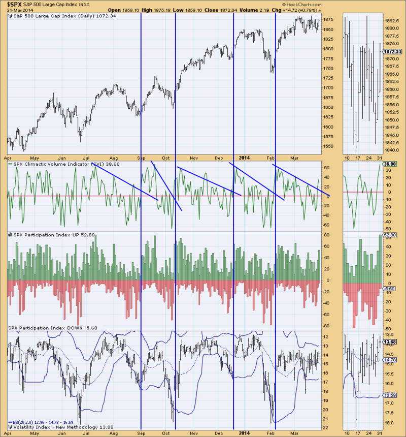
The CVI is pointing to a possible breakout and execution of the double-bottom formation. Notice that when the CVI pops up through declining tops resistance, we generally see a price bottom. The somewhat climactic behavior on the Participation Index - UP also looks like an initiation climax.
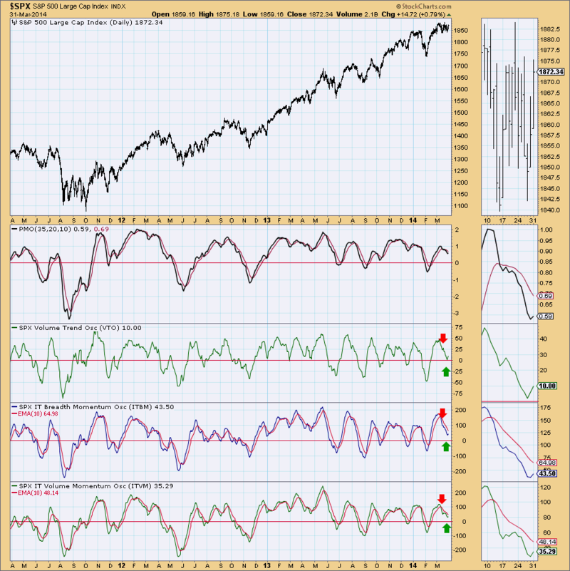
The PMO, ITBM, ITVM and VTO all turned up which is good, but I also note we got a "false positive" at the time of the last price bottom when all four turned up and then fell again.
Indicators are leaning toward a positive outcome for the bullish double-bottom formation, but looking at past price behavior, we could see more price consolidation when resistance is hit at the top of the trading range of the last few weeks.


