Really? Something interesting about mutual funds? Well, I had to put some kind of hook in the title, because the subject matter doesn't normally induce a rapid pulse rate, but there are some interesting things to be known. For example, total assets in bond funds is showing a negative divergence against bond prices. Prices are moving higher, while total assets has remained flat.
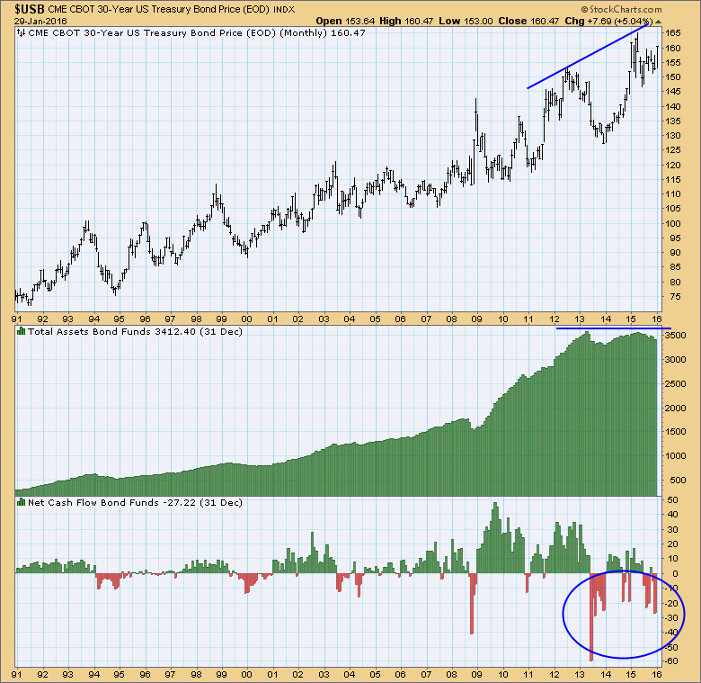
The bottom panel shows that there have been substantial net outflows over the last three years, so the chart paints a bearish long-term picture for bonds.
The Investment Company Institute (ici.org) is the source of the data used for these charts. Monthly data are published one month in arrears. For example, December data was published at the end of January.
The next chart shows total assets and net cash flow in stock mutual funds. The asset peaks in 2000, 2007, and 2015 confirm the matching price peaks, but it is troublesome that the huge price advance from the 2009 low is not accompanied by a proportional increase in assets. Note the large net cash flow out of stocks in the last half of 2015.
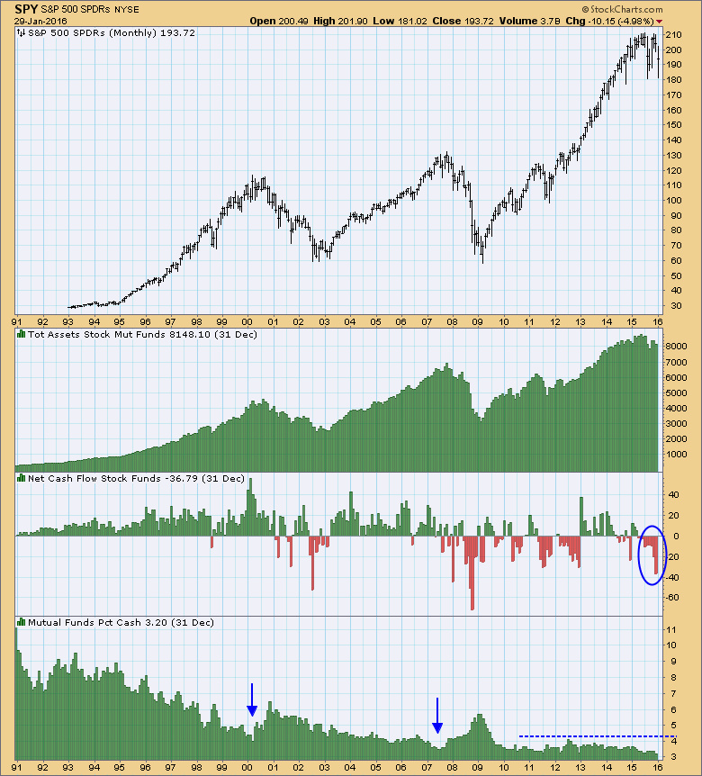
The bottom panel shows the percentage of mutual fund assets held in cash. This used to be a useful sentiment indicator because low levels of cash often coincided with important market tops (see 2000 and 2007); however, this indicator stopped working in the last six years in spite of record low cash levels.
On the chart below money market fund assets increase during market declines, as we can clearly see during the decline into the 2009 price low. It should be noted that the net cash flow histogram is opposite from what we normally see in that the green bars are bearish, indicating money coming out of stocks and into cash. Red bars are bullish because they show money leaving cash to buy stocks.
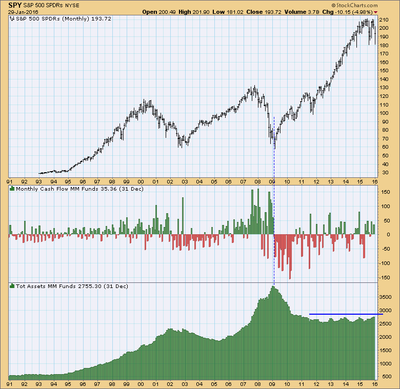 It is strange that total money market assets have been flat for five years, in spite of a major price advance. I am not sure what to make of that.
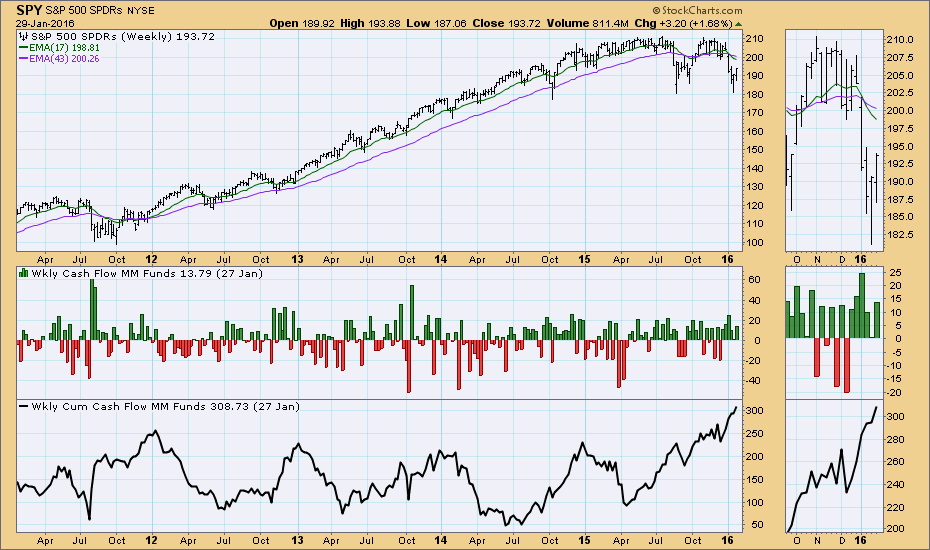
Below we can get a shorter-term look at money market fund net cash flows with the weekly data. Note that cumulative cash flow into money market funds (bottom panel) has been increasing since April, in spite of the late-year rally. (Remember, on the cash flow charts green is bearish and red is bullish. Rising cumulative cash flow is bearish.)
 Conclusion: There is a lot to be learned from a review of ICI mutual fund data because they cover over 8,100 mutual funds. By tracking asset levels and net cash flow we can get a sense of how investment cash is moving over the long term.
Technical analysis is a windsock, not a crystal ball.