 The Price Momentum Oscillator (PMO) is mostly bounded oscillator. The PMO can be calculated for any stock, index, ETF, etc. Interestingly, each of them have their own "normal" ranges. The PMO is particularly useful in determining overbought and oversold conditions, but you can many times be fooled as to whether the PMO is actually at the top or bottom of its range, especially on a daily chart. Let me show you a few examples of how you can get caught thinking that the PMO is not overbought or oversold. I'll also show you the technique to avoid missing what the normal range is for a stock, ETF, etc.
The latest examples of possible misinformation are below. I've included the one-year daily chart for each and a long-term daily chart so you can see where you can get into trouble. It is important to realize when you are in a unstable situation. If you believe the PMO is at the top or bottom of its range when it isn't, you could make a bad investment decision.
Gold has taken off. Based on the short-term daily chart, we would surmise that the PMO is not at all overbought right now. However...
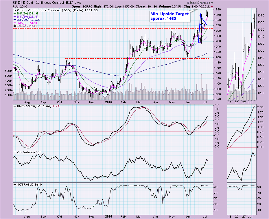
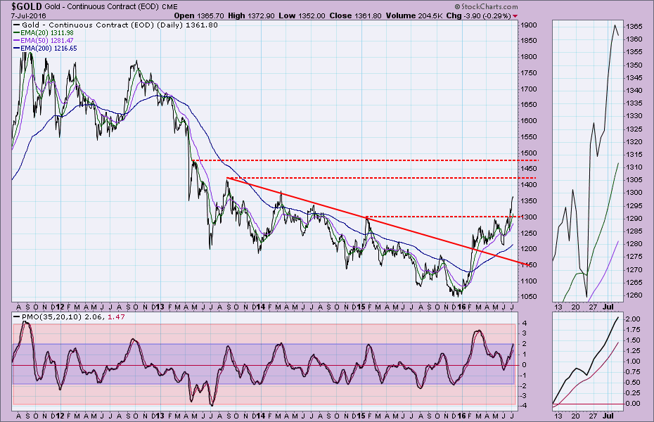
If you broaden the time period on the daily chart to 5 years, we see that the Gold PMO is actually very overbought in relation to its normal range. Should we be concerned about Gold right now? Well, in extreme rallies or corrections, the PMO can expand the range. In the case of Gold right now, I believe the PMO is overbought, but given the unusual rally and strength of Gold right now, the range will likely expand. However, we need to be cognitive of the fact that the PMO is at the top of its normal range.
USO has the opposite problem. The PMO appears to have plenty of distance to travel before it is oversold, right?
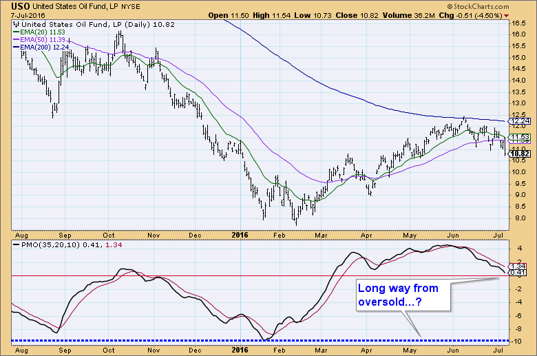
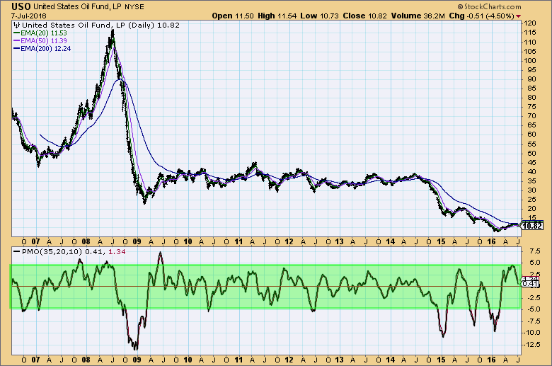
In actuality, the normal range for the PMO on USO is between -5 and +5. While the PMO does have some distance to travel before reaching the bottom of its range, we need to be aware that an opportunity could appear before it reaches a reading of -5.
The last example is Facebook. It is an unusual case, but one to remember when you watch the PMO on young or new stocks. Looking at the daily chart below, it appears that +4 is the top of the range which implies FB has momentum that could push it well past its May high.
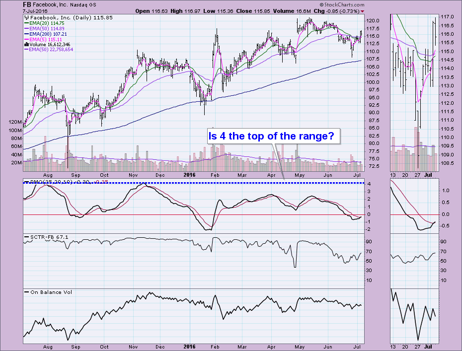
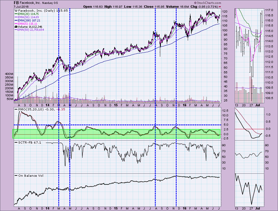
However, a look at a three-year chart and we see that the typical PMO range is between -2.5 and +2.5. It took some time for that range to gel as the IPO and consequent rally stretched the PMO into readings well past 12.5. It is best to determine the normal range of the PMO about a year after an IPO.
Conclusion: The PMO is a powerful indicator, but you must know the normal range in order to determine when a possible price reversal is possible or likely. Don't forget to look at a long-term daily chart if the PMO readings seem out of whack or even if they appear in a normal range. Your analysis could be flawed without this insight.
Come check out the DecisionPoint Report with Erin Heim on Wednesdays and Fridays at 7:00p EST, a fast-paced 30-minute review of the current markets mid-week and week-end. The archives and registration links are on the Homepage under “What’s New”.
Technical Analysis is a windsock, not a crystal ball.
Happy Charting!
- Erin