First, thank you to all of the live MarketWatchers LIVE webinar viewers! You've been making writing my blog articles easy by posing excellent questions in the chat room during the live show. Today's question was how I determine if a Price Momentum Oscillator (PMO) is overbought or oversold. There can be some confusion because I do point out "near-term" overbought and oversold conditions which can be confused with the overall PMO range in the longer term which will have different thresholds. Properly confused? Great! Let me explain.
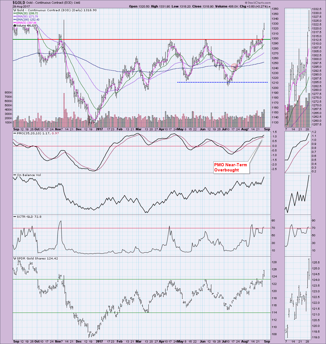
This blog is really an expansion of the already excellent ChartSchool article on the Price Momentum Oscillator (PMO). I'm going to concentrate specifically on how to determine if PMO conditions are overbought or oversold. First, let's look at the daily chart for Gold. This was when the question appeared during the webinar, so I'm pretty sure this is the chart that caused some confusion.
First of all, GREAT breakout on Gold yesterday and today, right? I'm glad that I went with bullish on Gold during the MarketWatchers LIVE "Agree or Disagree" segment! However, I was hesitating going bullish for a couple of reasons. If you look at the PMO on the daily chart, you'd have to agree with me that it is overbought. But is it really?
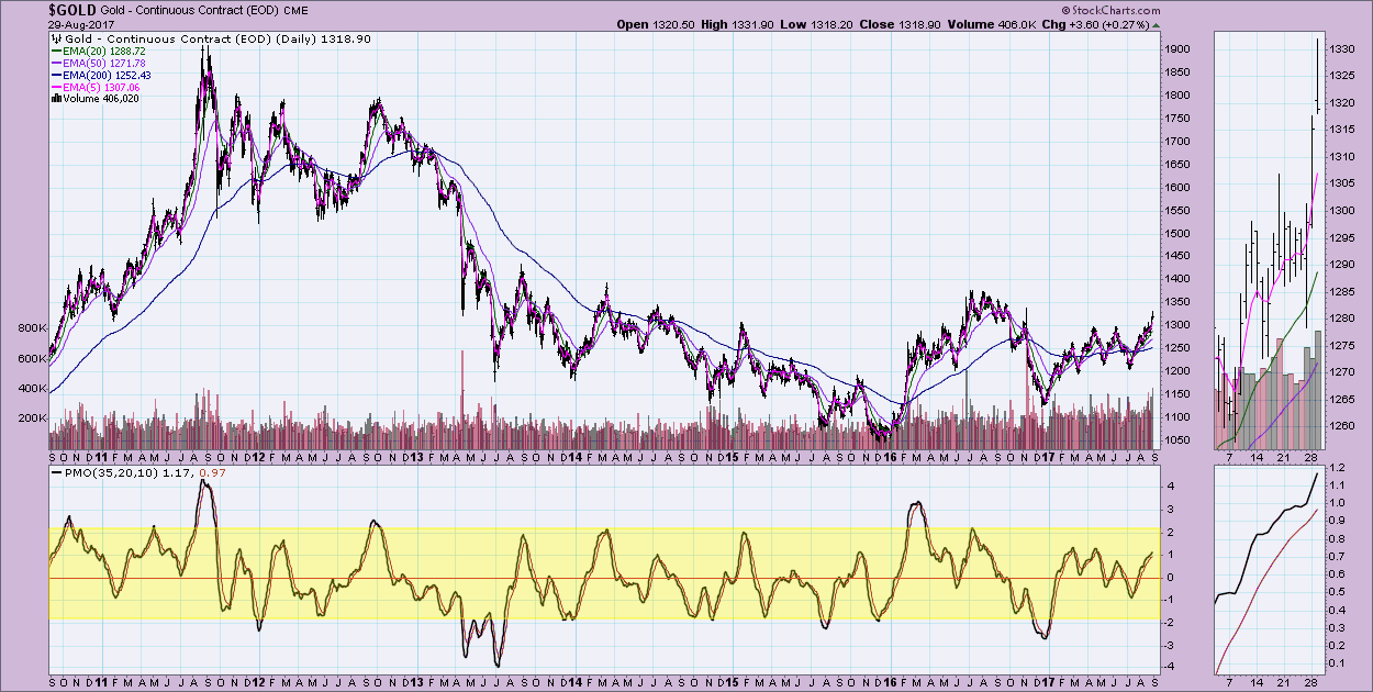
The best way to determine a stock's PMO range is to take your daily chart out about 5 to 7 years. The PMO range will become quite obvious in most cases. Take a look at Gold's PMO range. It ranges typically between -2 to +2, so a reading of 1.17 isn't that overbought in the intermediate to longer term.
Conclusion: The PMO currently for Gold is "near-term" overbought based on last year; however, it isn't intermediate or longer-term overbought when you consider its "normal" range. The follow-on question is likely, "Which is more important? Near-term or longer-term?" My answer would be to determine what your time frame is and take all of the information into account. Looking at the long-term daily chart, I can see that the recent declining PMO trend has been broken which is bullish in all terms now. Given the solid price breakout, I would pull out and look at the longer-term daily chart as I did above. Given that we aren't at the peak of PMO readings and there was a break from a declining trend, the shorter term looks more bullish. This wasn't apparent when looking at only one year on the daily chart so this article was instructive to you and to me!
Helpful DecisionPoint Links:
DecisionPoint Shared ChartList and DecisionPoint Chart Gallery
Price Momentum Oscillator (PMO)
Swenlin Trading Oscillators (STO-B and STO-V)
Technical Analysis is a windsock, not a crystal ball.
Happy Charting!
- Erin
**Don't miss DecisionPoint Commentary! Add your email below to be notified of new updates"**


