 I decided to review the Sector Summary, Sector CandleGlance Charts and our DP Sector Scoreboard to see which sector(s) were "winners." In all honesty, depending on the timeframe, various sectors rein supreme. However, there is one particular sector that has performed well across all timeframes.
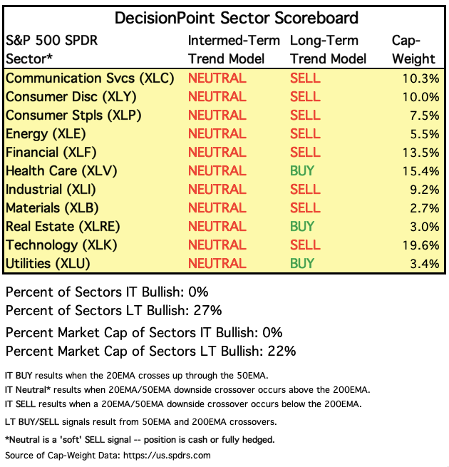
Let's start with the DP Sector Scoreboard, where we can see the intermediate- and long-term Trend Model signals. The only three holding onto long-term BUY signals are the defensive sectors - Real Estate, Utilities and Health Care. Having a long-term Trend Model BUY signal means that the 50-EMA is above the 200-EMA. We also designate stocks, ETFs, etc. where 50-EMA > 200-EMA as being in a "bull market" configuration.
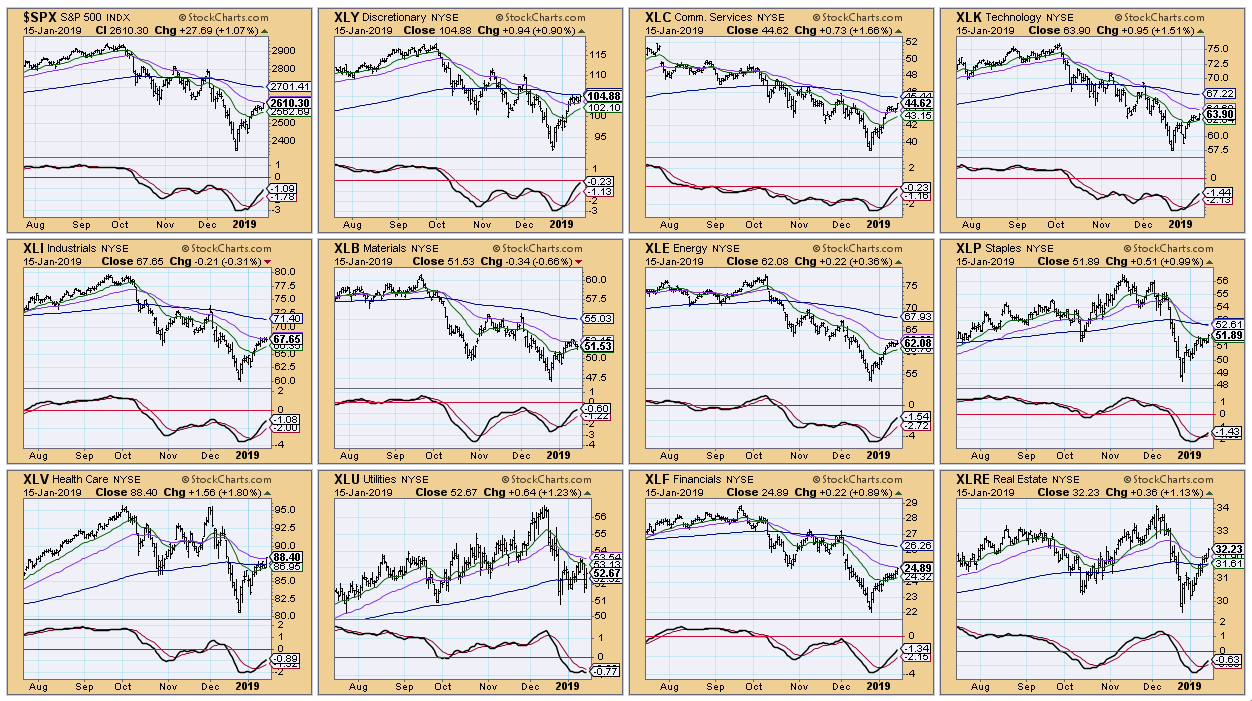
 The CandleGlance of the sectors below illustrate that the 50-EMA is above the 200-EMA. From a distance, we can see that all of the sectors are on PMO BUY signals, but not all of them show a rising 50-EMA like XLY, XLC and XLRE.
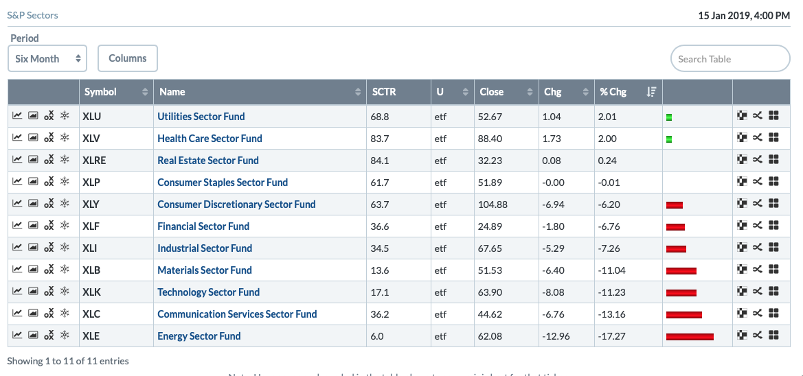
 Looking at the intermediate-term Sector Summaries below, we see that, in the past six months, the leaders were XLU, XLV and XLRE. Makes sense that defensive sectors are carrying their weight.
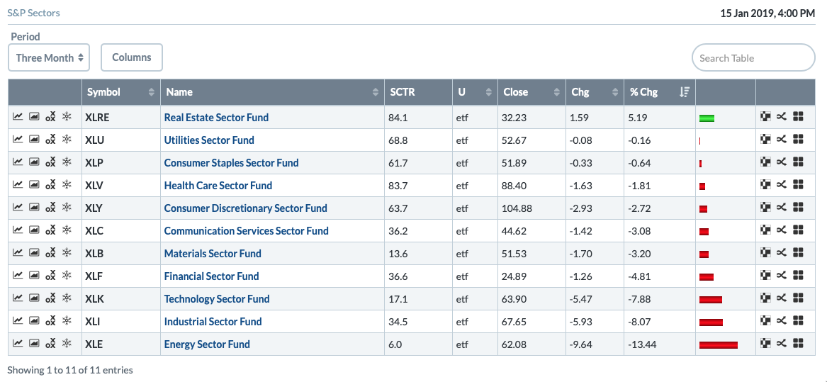
 In the past three months, the Real Estate sector was the clear leader. It was the only sector that had positive gains, and I don't mean just a paltry gain... I mean an over 5% gain.
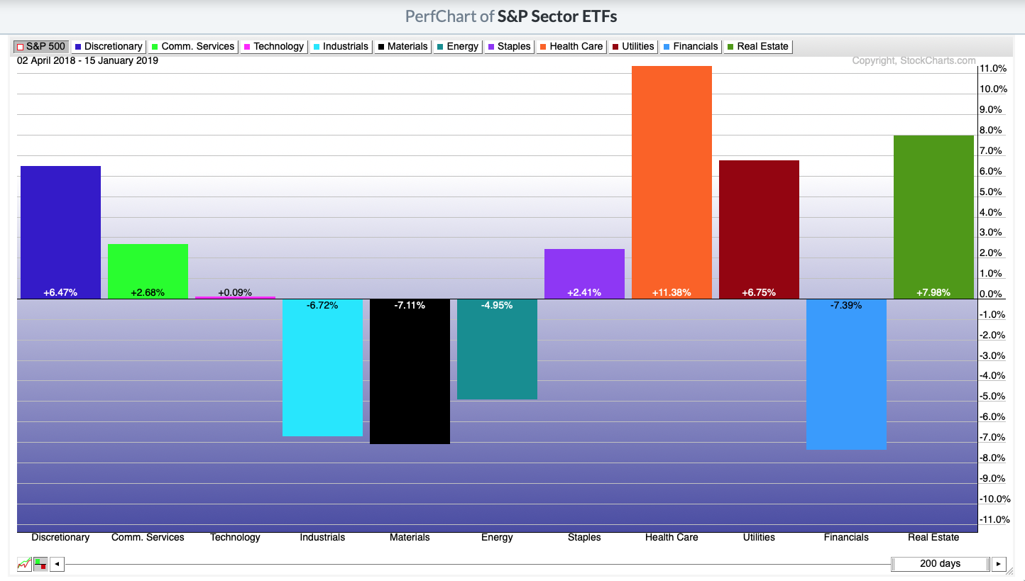
 Below is the Sector Performance Chart. Note that the big winner over the past 200 trading days was the Health Care sector, with the runner-ups being Real Estate, Utilities & Consumer Discretionary.
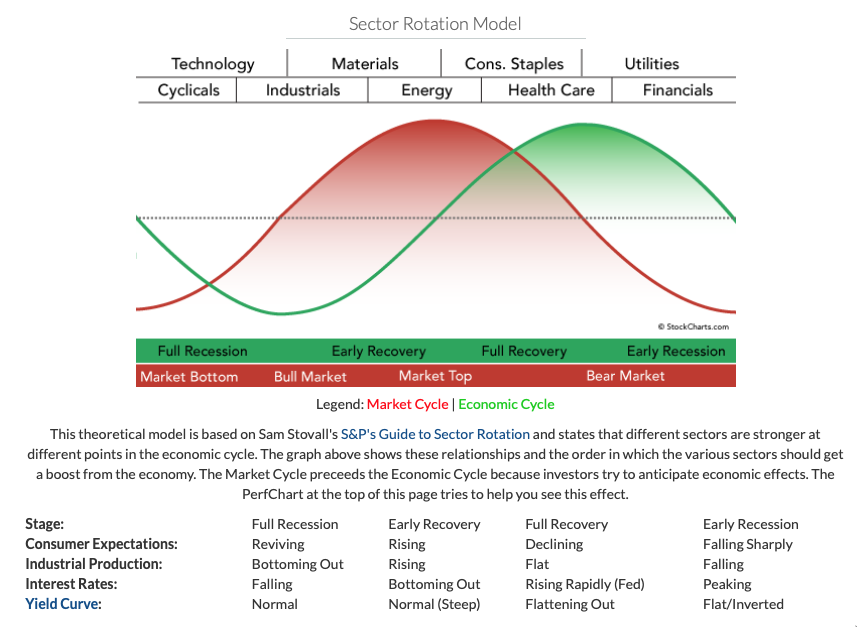
 Talk is that we are headed for a recession. Looking at the green sine curve, that early recession starts with strength in the Health Care, Utilities and Financial sectors. Note that Real Estate used to be in the Financial sector before it was split into its own sector. Note also that, in the bottom of this graphic, a flat or inverted yield curve is also part of an early recession. It also should be noted that when Health Care, Utilities and Real Estate lead, it is part of a bear market.
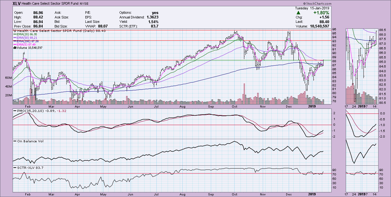
 So which is the winner? I vote for Health Care. It has the healthiest chart (pun intended) and was mentioned in every category that I outlined. The only possible issue with XLV is the overhead resistance at the bottom of the August-September trading range. There is a PMO BUY signal that is clean and in oversold territory. OBV looks healthy and the SCTR has made it into the "hot zone" above 75.
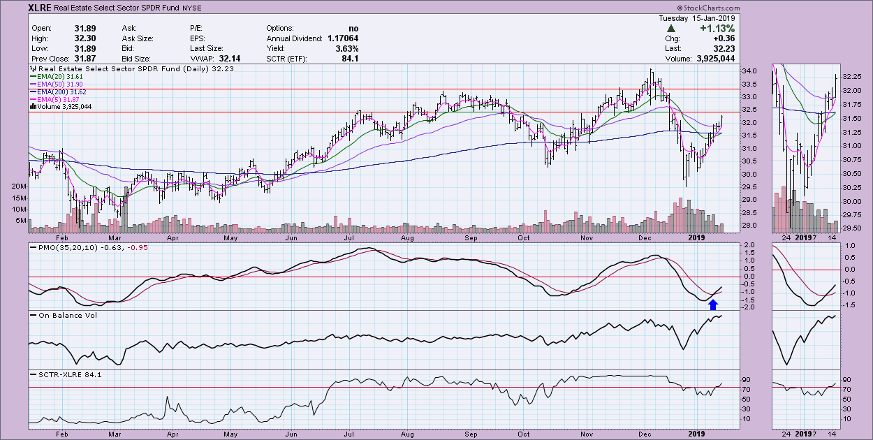
The "runner-ups" would be Real Estate and Utilities. XLRE may be hitting overhead resistance along the November/December lows, but given it is in the defensive area, I suspect we will get the breakout. This is the first time since early December that price moved above the 50-EMA.
 This sector comes in third. While it has shown relative strength, I'm seeing a bearish rising wedge. This pattern would suggest a breakdown below the rising bottoms trend line. The PMO has turned down below its signal line.
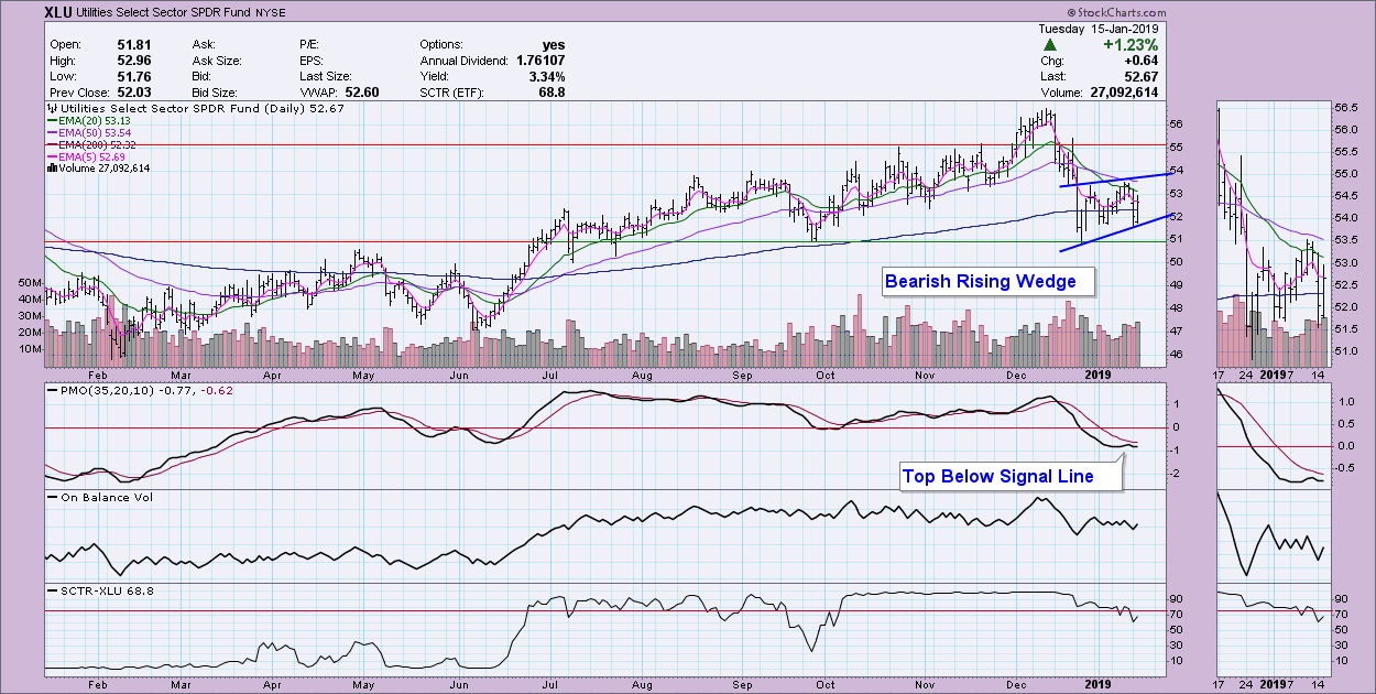 Conclusion: The top sector in the past 3-6 months is XLV, but XLRE has also shown strength. XLU could be getting slammed by the woes of electricity providers PG&E (PCG) and Edison (EIX) who are embroiled in the California fire lawsuits.
Watch the latest episode of DecisionPoint on the StockCharts TV YouTube channel here!
Technical Analysis is a windsock, not a crystal ball.
Happy Charting!
- Erin
Helpful DecisionPoint Links:
DecisionPoint Shared ChartList and DecisionPoint Chart Gallery
Price Momentum Oscillator (PMO)
Swenlin Trading Oscillators (STO-B and STO-V)
**Don't miss DecisionPoint Commentary! Add your email below to be notified of new updates"**

