I have a theory about the market that I'm thinking of tuning up for submission to the Nobel Prize committee. It goes like this: (1) Things get better and better until they are as good as they are going get. (2) Then they get worse and worse until they're as bad as they are going to get. (3) Repeat cycle. The only problem with this theory is that we never know for sure where the extreme limit for the current cycle will be, but it is still useful to keep in mind as we listen to news about how really good or really bad things are at a given time.
In his Thoughts from the Frontline last week John Mauldin included a chart of the unemployment rate versus the stock market. I thought it tied in nicely with my Nobel idea, and StockCharts.com has the data I need. Note how market tops tend to occur when unemployment is low -- both stock prices and unemployment are as good as they're going to get. The reverse is true when unemployment is high, but it is particularly difficult to know how high unemployment will get in a particular cycle.
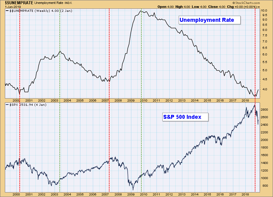
The point here is that we appear to be in the negative side of the cycle, where unemployment will work its way higher and stocks will move lower. To clarify, I do not think that unemployment drives stock prices, or vice versa, but a low unemployment rate does give us a clue as to when things are about as good as they are going to get.
The DecisionPoint Weekly Wrap presents an end-of-week assessment of the trend and condition of the stock market (S&P 500), the U.S. Dollar, Gold, Crude Oil, and Bonds.
Watch the latest episode of DecisionPoint on StockCharts TV's YouTube channel here!
SECTORS
Each S&P 500 Index component stock is assigned to one, and only one, of 11 major sectors. This is a snapshot of the Intermediate-Term and Long-Term Trend Model signal status for those sectors.
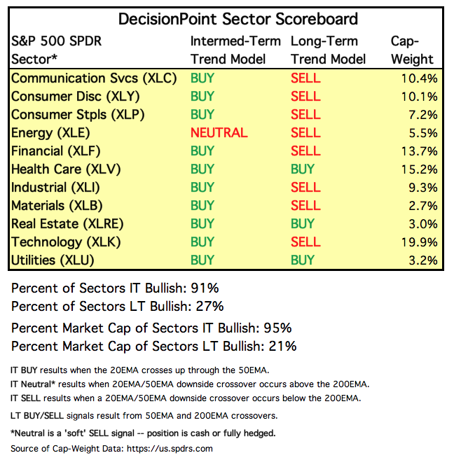
STOCKS
IT Trend Model: BUY as of 2/1/2019
LT Trend Model: SELL as of 12/14/2018
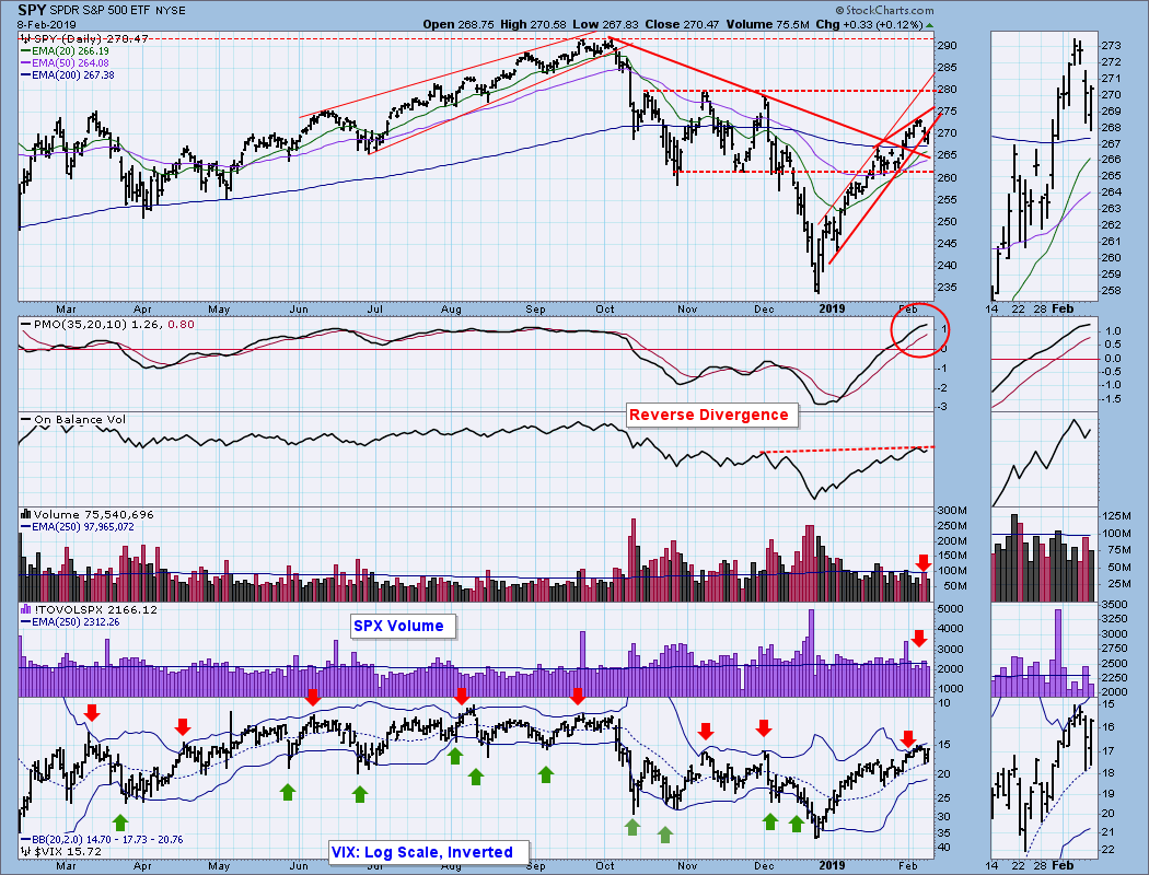
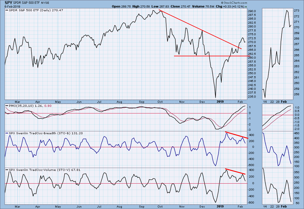
SPY Daily Chart: Note that the recent rally failed to reach the top of the rising trend channel and a rising wedge was formed. The wedge broke down today, price rallied and closed right back on the rising trend line. Volume was a bit thin this week. The daily PMO topped intraday today, but the late recovery left the PMO still rising.
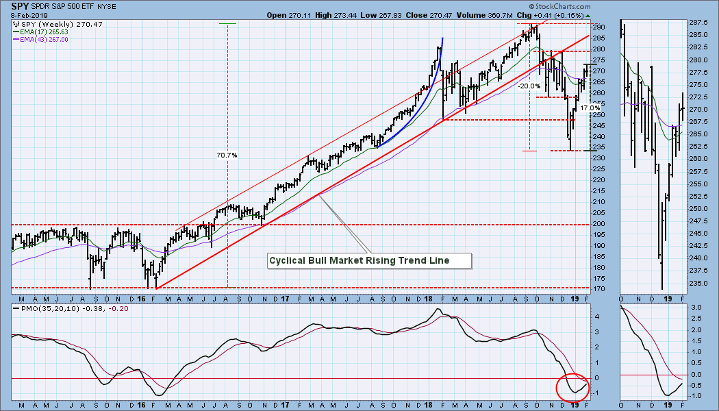
SPY Weekly Chart: Price barely changed this week.
Climactic Market Indicators: The VIX hit the top Bollinger Band last Friday, giving us warning of a probable price top soon, and the top arrived on Tuesday. Note how Net A-D and Net A-D Volume bars are narrowing -- a sign of low volatility.
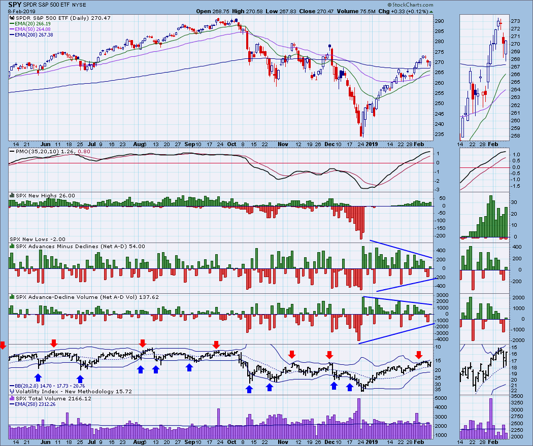
Short-Term Market Indicators: STO-B and STO-V negative divergences have developed.
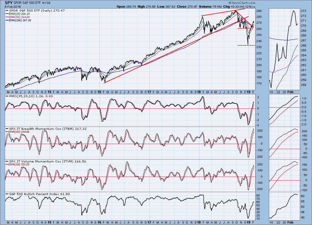
Intermediate-Term Market Indicators: The ITBM and ITVM have made a long, steady move from oversold to overbought. I tend to interpret that as bullish, but let's see what a longer-term chart tells us.
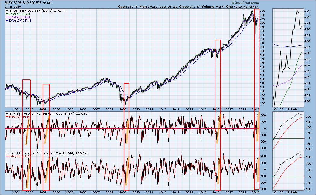
 Looking back 18 years I see four other instances where the ITBM/ITVM have behaved similarly. Three of those marked initiation climaxes for new bull markets, but one, 2001, was just a shakeout rally leading to more selling into the final low in 2002.
CONCLUSION: The market is still behaving in a bullish manner. A pullback is due, but the market tries to sell off, but it just won't give much to the downside. Intermediate-term indicators are very overbought, and they have topped, so I have to believe that some genuine corrective action is coming soon.
Next week is options expiration, and there is a tendency for the market to be relatively quiet toward the end of the week. No guarantees, but that is what to look for. It is not an end-of-quarter expiration, so there should be no volume spike associated with with the expiration. If there is a volume spike, look for some other cause.
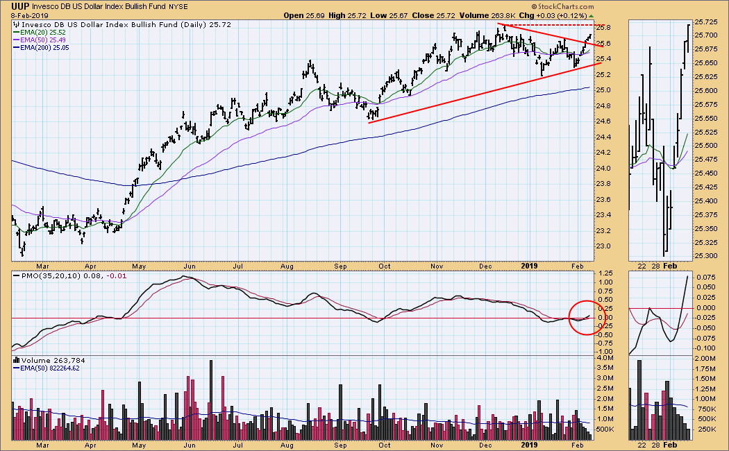
DOLLAR (UUP)
IT Trend Model: BUY as of 2/7/2019
LT Trend Model: BUY as of 5/25/2018
UUP Daily Chart: Price has broken out of a triangle formation, and the next resistance is at 25.85.
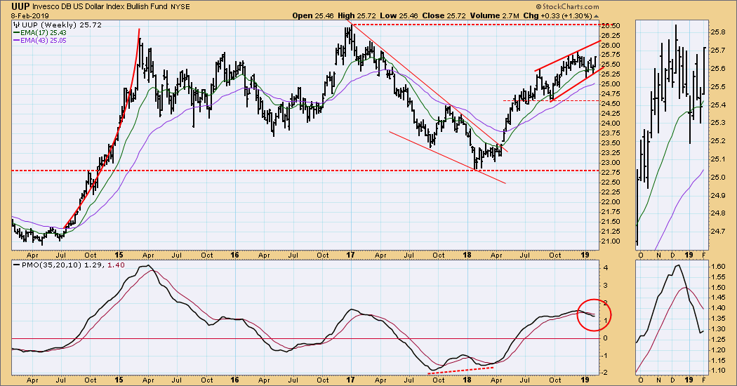
UUP Weekly Chart: Price is in a rising wedge, but it is not a very tight formation. The weekly PMO has turned up, so perhaps a run to long-term resistance at 26.50 is possible.
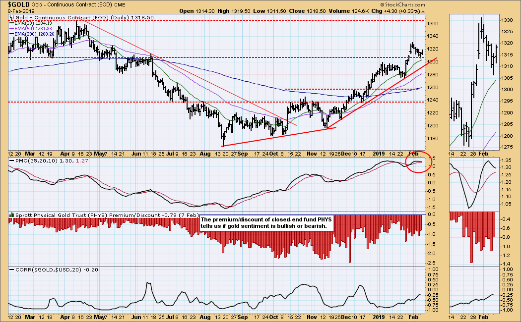
GOLD
IT Trend Model: BUY as of 10/19/2018
LT Trend Model: BUY as of 1/8/2019
GOLD Daily Chart: Gold seems to gave found support on horizontal support, but the concern here is that the daily PMO has topped.
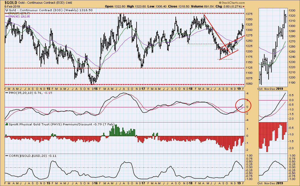
GOLD Weekly Chart: Gold is in a rising trend, and the next resistance is at 1375. I would like to see that resistance penetrated and for sentiment to turn positive.
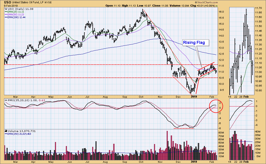
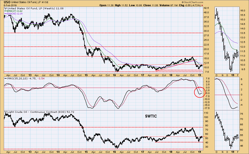
CRUDE OIL (USO)
IT Trend Model: NEUTRAL as of 10/29/2018
LT Trend Model: SELL as of 11/23/2018
USO Daily Chart: The rising flag is a weak structure, and we expect it to break down. In fact, this week it broke down for the second time this month. The daily PMO has topped, so more of a correction may be expected.
USO Weekly Chart: I still think that the chart pattern over the last several months looks like a bullish reverse head and shoulders; however, the weekly PMO looks as if it may top below the signal line, which would be very negative.
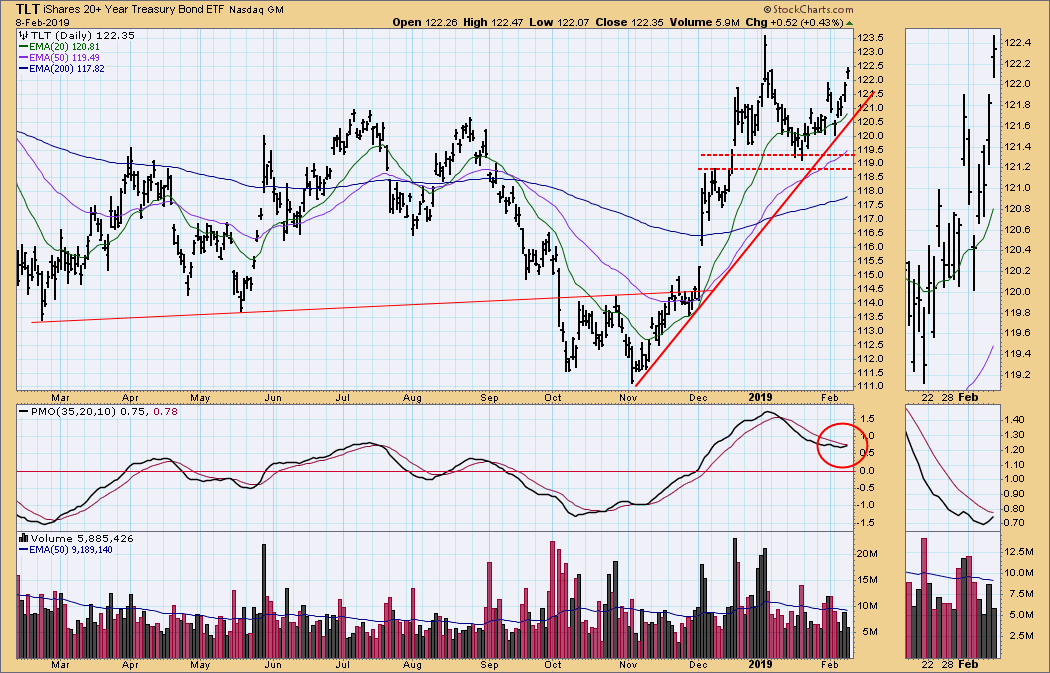
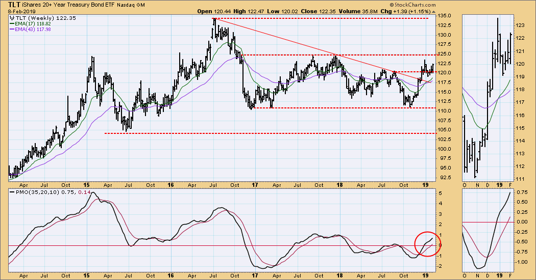
BONDS (TLT)
IT Trend Model: BUY as of 12/6/2018
LT Trend Model: BUY as of 1/2/2019
TLT Daily Chart: Last week I thought that the price structure from mid-December was looking a bit like a head and shoulders setup, but this week's advance diminishes that possibility. The next possibility is a double top, but the daily PMO bottom hints that it could go higher.
TLT Weekly Chart: In this time frame the horizontal channel dominates, and the weekly PMO is positive.
**Don't miss any of the DecisionPoint commentaries! Go to the "Notify Me" box toward the end of this blog page to be notified as soon as they are published.**
Technical Analysis is a windsock, not a crystal ball.
Happy Charting!
- Carl
NOTE: The signal status reported herein is based upon mechanical trading model signals, specifically, the DecisionPoint Trend Model. They define the implied bias of the price index based upon moving average relationships, but they do not necessarily call for a specific action. They are information flags that should prompt chart review. Further, they do not call for continuous buying or selling during the life of the signal. For example, a BUY signal will probably (but not necessarily) return the best results if action is taken soon after the signal is generated. Additional opportunities for buying may be found as price zigzags higher, but the trader must look for optimum entry points. Conversely, exit points to preserve gains (or minimize losses) may be evident before the model mechanically closes the signal.
Helpful DecisionPoint Links:
DecisionPoint Shared ChartList and DecisionPoint Chart Gallery
Price Momentum Oscillator (PMO)
Swenlin Trading Oscillators (STO-B and STO-V)