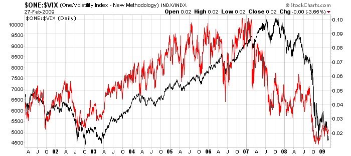
The VIX is the Volatility Index published by the Chicago Board Options Exchange (CBOE). It measures the "implied volatility" of a hypothetical SPX option created from a weighted average of several actual SPX options. (For all the gory details, check out our ChartSchool article on the VIX.) Typically, the VIX is interpreted as an "inverse" market indicator - i.e., down is bullish and up is bearish. In the chart above, I've plotted the reciprocal of the VIX with the ratio symbol "$ONE:$VIX" (Note: $ONE is always equal to, you guessed it, one.) That allows me to then compare it to a chart of the actual market. Looking back at the past couple of years, you can see that the VIX did an uncanny job of indicating "trouble ahead" for stocks. Just like when it started moving up before the market did in 2002, the VIX started moving down in 2007 and the market followed dramatically in 2008. Definitely, don't ignore this chart!

