
Click here for a live version of this chart.
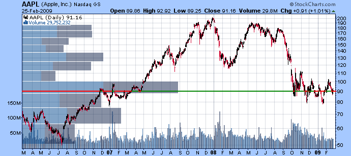
Apple has been bouncing around $90 since October. Is that support going to hold? One way to gauge the strength of a support level is to use the "Vol by Price" overlay - the horizontal histogram on the left side of this chart. It adds up all the volume for any days on the chart that close within the bars price range. The bars in two colors - one for volume when the stock closed up and the other for when the stock closed down. In the case of AAPL, the long horizontal bar shows that lots of volume has occurred in the $90 - $100 range and that is the most important support level on the chart right now. It also shows that the volume on "up" days (gray) is almost equal to the volume on "down" days (light blue). The Vol by Price overlay clearly shows that 90 is
the battleground for AAPL right now. With AAPL oscillating around $90 (possibly in a triangle pattern), the battle is getting very heated and is worth watching closely in the coming days.

About the author:
Chip Anderson is the founder and president of StockCharts.com.
He founded the company after working as a Windows developer and corporate consultant at Microsoft from 1987 to 1997.
Since 1999, Chip has guided the growth and development of StockCharts.com into a trusted financial enterprise and highly-valued resource in the industry.
In this blog, Chip shares his tips and tricks on how to maximize the tools and resources available at StockCharts.com, and provides updates about new features or additions to the site.
Learn More


