Click here for a live version of this chart.
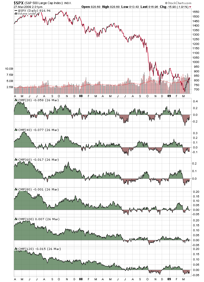
Often we get asked "What settings should I use on my indicators? What's the best?" and our answer is the always infuriating "It depends." The chart above shows why "It depends" is always going to be our answer.
I've added six different versions of the Chaikin Money Flow (CMF) indicator to this chart of the S&P 500. Notice the different frequency with which the CMF lines cross the zero line and turn red. The shorter the frequency, the more often (in general) the CMF turns red.
What's interesting on the chart above is all the whipsawing done by the 80-day CMF between July 08 and February 09 - and by tge 100-day CMF in March 09. Very unusual.

About the author:
Chip Anderson is the founder and president of StockCharts.com.
He founded the company after working as a Windows developer and corporate consultant at Microsoft from 1987 to 1997.
Since 1999, Chip has guided the growth and development of StockCharts.com into a trusted financial enterprise and highly-valued resource in the industry.
In this blog, Chip shares his tips and tricks on how to maximize the tools and resources available at StockCharts.com, and provides updates about new features or additions to the site.
Learn More


