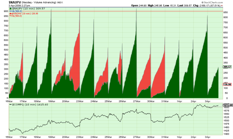
Click here for a live version of this chart.
"Wow. That doesn't look like any financial chart I've ever seen before."
I agree, that is one strange looking chart. What the green area shows is the total amount of "Up" volume - i.e. the total volume of all stock that are currently higher than their previous close - the "Advancers' volume." Similarly, the red area shows the "Decliners' volume." Both numbers reset to zero at the start of each day which is why they usually make the kind of triangular shape you see above.
By plotting $NAUPV in "area" mode and underlaying $NADNV on the same chart, we can see at a glance whether today is an "up" day or a "down" day at a glance.
(Note: There is a subtle danger however - $NAUPV and $NADNV are plotted on different scales. See how the red and blue Horizontal Lines at 900 don't match because of the scale differences? In general, that's not a big deal, but it could be a problem if you are comparing the magnitudes of the red and green areas directly.)

About the author:
Chip Anderson is the founder and president of StockCharts.com.
He founded the company after working as a Windows developer and corporate consultant at Microsoft from 1987 to 1997.
Since 1999, Chip has guided the growth and development of StockCharts.com into a trusted financial enterprise and highly-valued resource in the industry.
In this blog, Chip shares his tips and tricks on how to maximize the tools and resources available at StockCharts.com, and provides updates about new features or additions to the site.
Learn More


