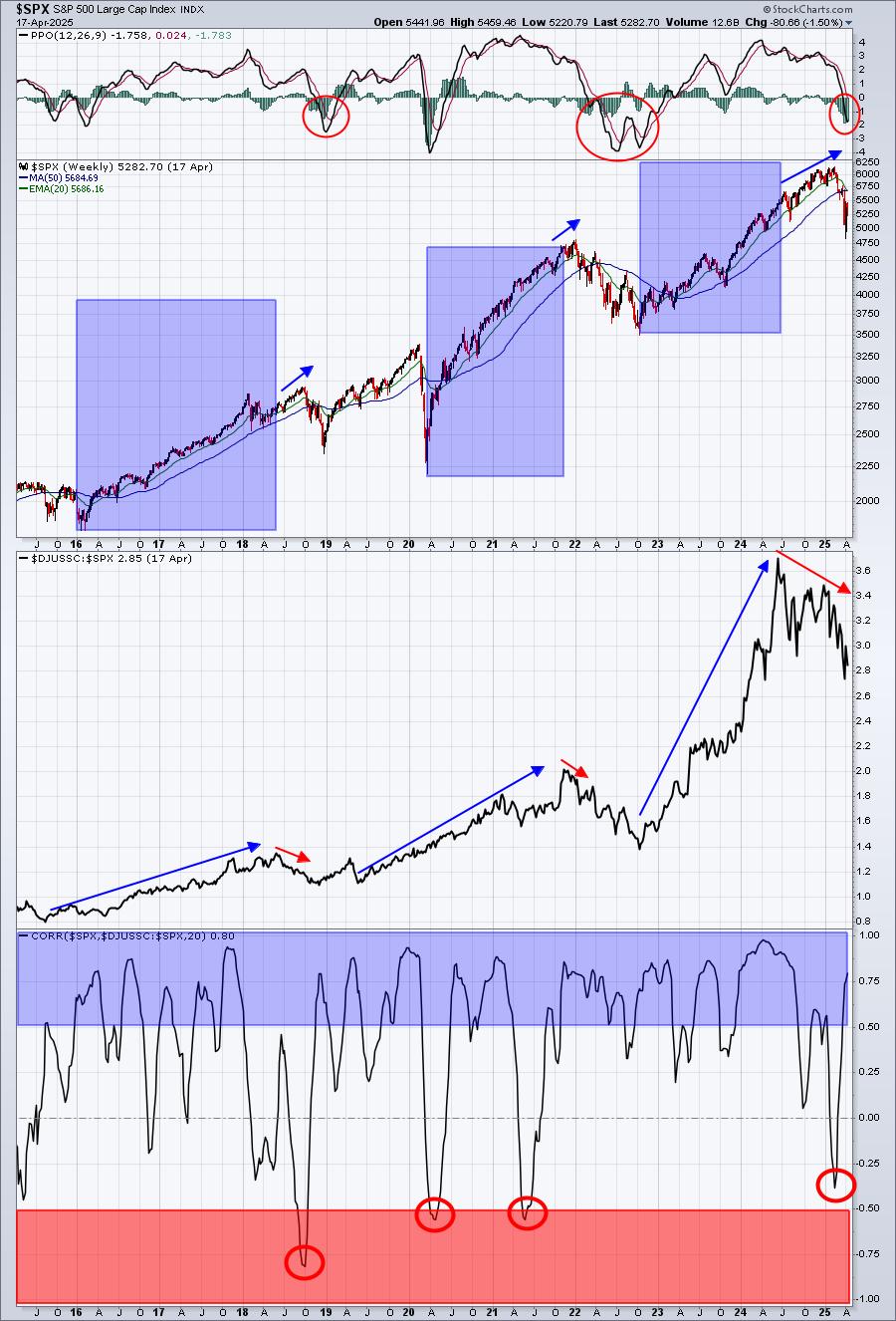
Weekends give us the time to flip through a lot of random charts. One of my favorites is ratios of different asset classes. This one has been very informative. SOme would say the trend lines are to steep. Look at the chart and then we can decide.

Whether we use the trendline or the red moving average (20 WMA), this chart has indicated a very good place to be aware of sharp declines.
I'll be watching for the move up in equities to run out of steam. Somewhere around the 1810 area is a good technical level, but maybe it has more power than I imagine. This chart is a great warning chart and we should at least be aware that the clues are lining up for a weaker summer trend. If nothing else, the uptrend is under attack.
Good Trading,
Greg Schnell, CMT