I was looking through the charts last night and came across this gem.
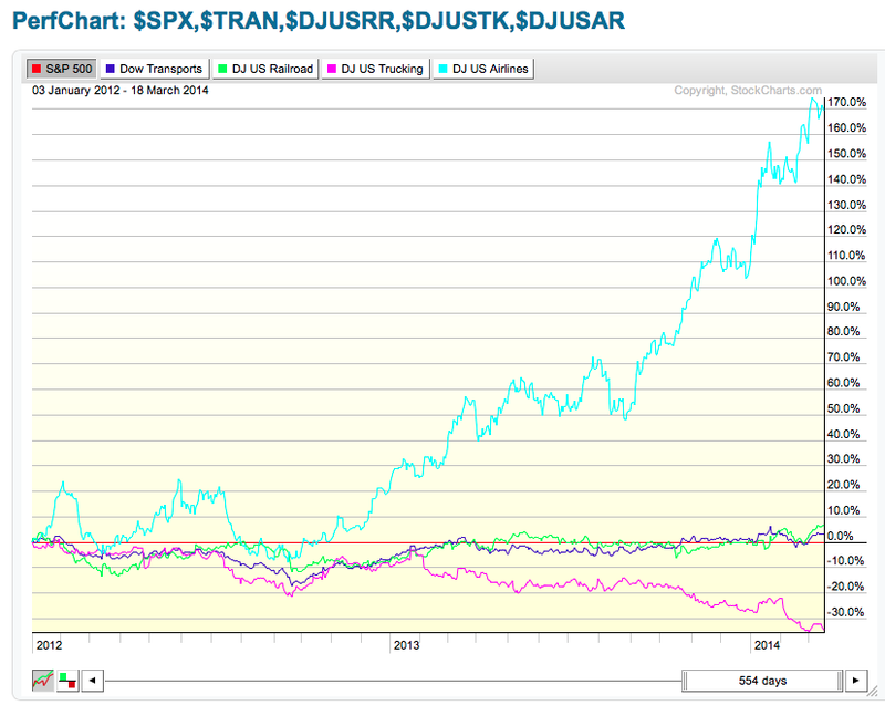
It is a chart of the Transportation Indexes.
I have set the slider to cover off two years of data. I wanted to show the relatively flat trend of all the transports in 2012. Then, almost shockingly, the airlines have taken off. We have been talking about the great performance in the rails and the airlines. But it is not even close.
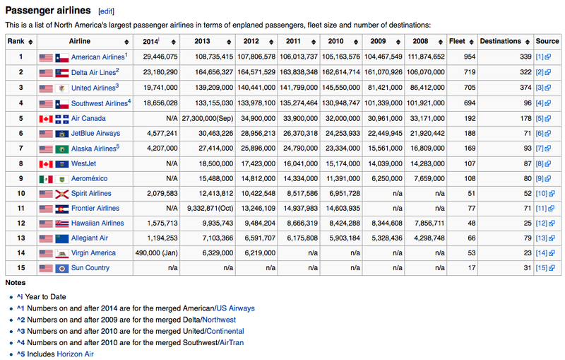
Since 2012, or even January 2013, the trucking index is behind in performance by 30%. The rails and the index have kept par with the $SPX. The $SPX is the flat red line. But the airlines have literally gone ballistic. Was it the baggage fees? Probably not. It might just be that the airlines are getting down to a strong oligopoly with American, Delta, United and Southwest dominating the skies.
From Wikipedia,
Good trading,
Greg Schnell, CMT


