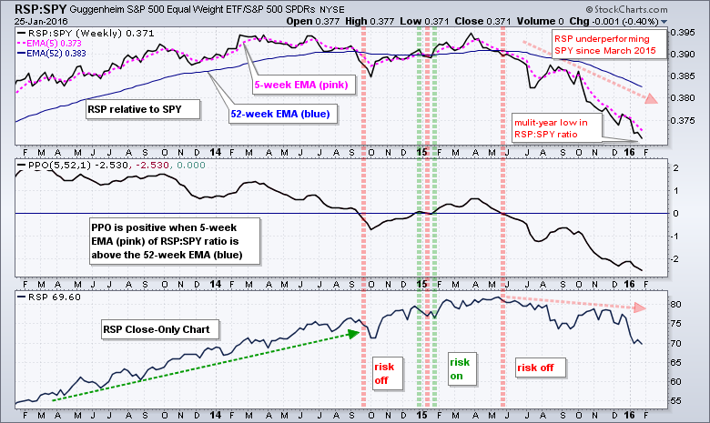
Among other ways, chartists can measure the risk appetite in the stock market by comparing the performance of the Equal-weight S&P 500 ETF (RSP) with the S&P 500 SPDR (SPY). RSP represents the average stock in the S&P 500 and the performance of small and mid caps. SPY represents large-caps in the S&P 500 and the performance for the largest stocks. Note that the top fifty stocks in SPY account for 48.77% of the ETF.
Chartists can compare performance by using a ratio chart (RSP:SPY) and adding indicators to define the trend. The main chart window shows the RSP:SPY ratio with the 5-week EMA (pink) and the 52-week EMA (blue). The trend is up when the 5-week EMA is above the 52-week EMA and down when the 5-week EMA is below the 52-week EMA. An uptrend in this ratio means the small and mid caps are outperforming the large caps in the index and this shows a strong appetite for risk in the stock market. A downtrend means small and mid caps are underperforming and this reflects a weak appetite for risk. Notice that this ratio has been falling since May 2015.
The middle window shows the PPO(5,52,1) applied to the RSP:SPY ratio. This makes it easier to quantify the trend and identify moving average crossovers. The PPO is positive when the 5-week EMA is above the 52-week EMA and negative otherwise. Notice that the PPO has been negative since May 2015. Also notice that the PPO is at its lowest level in over 3 years, as is the RSP:SPY ratio. Even though this downtrend in relative weakness appears extended, it is a strong downtrend and it reflects risk aversion in the stock market.
****************************************
Thanks for tuning in and have a good day!
--Arthur Hill CMT
Plan your Trade and Trade your Plan
*****************************************


