Just about one year ago, StockCharts.com unveiled a "dividend indicator" to allow you to plot the history of dividends on a particular U.S. or Canadian stock. For those who are income-oriented, it's a great way to review the history of dividends that a company has paid. To illustrate, let's look at Deere & Co (DE):
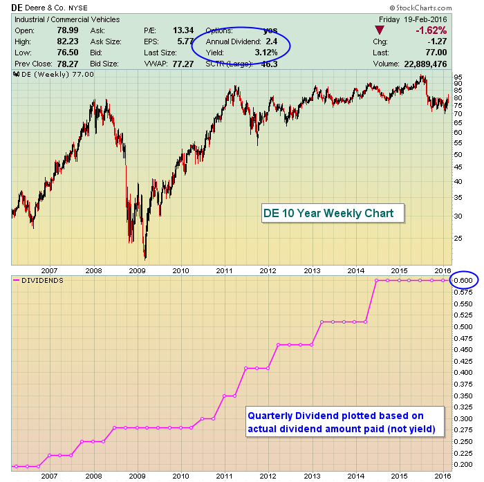 Under chart attributes, if you choose "full quote", you'll be given all the information at the top of the chart, including the "annual dividend" and "yield" (blue circle at top). The dividend indicator allows you to quickly see the rate of actual dividend growth and you can also study the technical price action of the stock simultaneously. While DE's stock price is roughly unchanged from where it was five years ago, you can see that the dividend has been increasing steadily to now provide a nice 3.12%, close to double the 10 year treasury yield ($TNX). By owning DE, however, you are subject to the fluctuations of the stock price, which has swung wildly in the past based on its results and business outlook.
You can click on this chart to view the settings.
Happy trading!
Tom


