In order to determine the sustainability of market rallies, following the rotation between certain sectors or indices can be quite helpful. The chart below shows red shaded areas to highlight warning signs that appeared at the end of the prior bull market in 2007 and also warned of the 2011 correction. Currently, the S&P 500 is in the midst of a very solid rally off the February 11th bottom. The rally in February was supported by rotation to "risk on" areas of the market. The March rally, however, has lost its luster in terms of relative ratios as money has turned more cautious. It doesn't mean we can't go higher, but it perhaps lowers the odds in my opinion. Take a look at the chart:
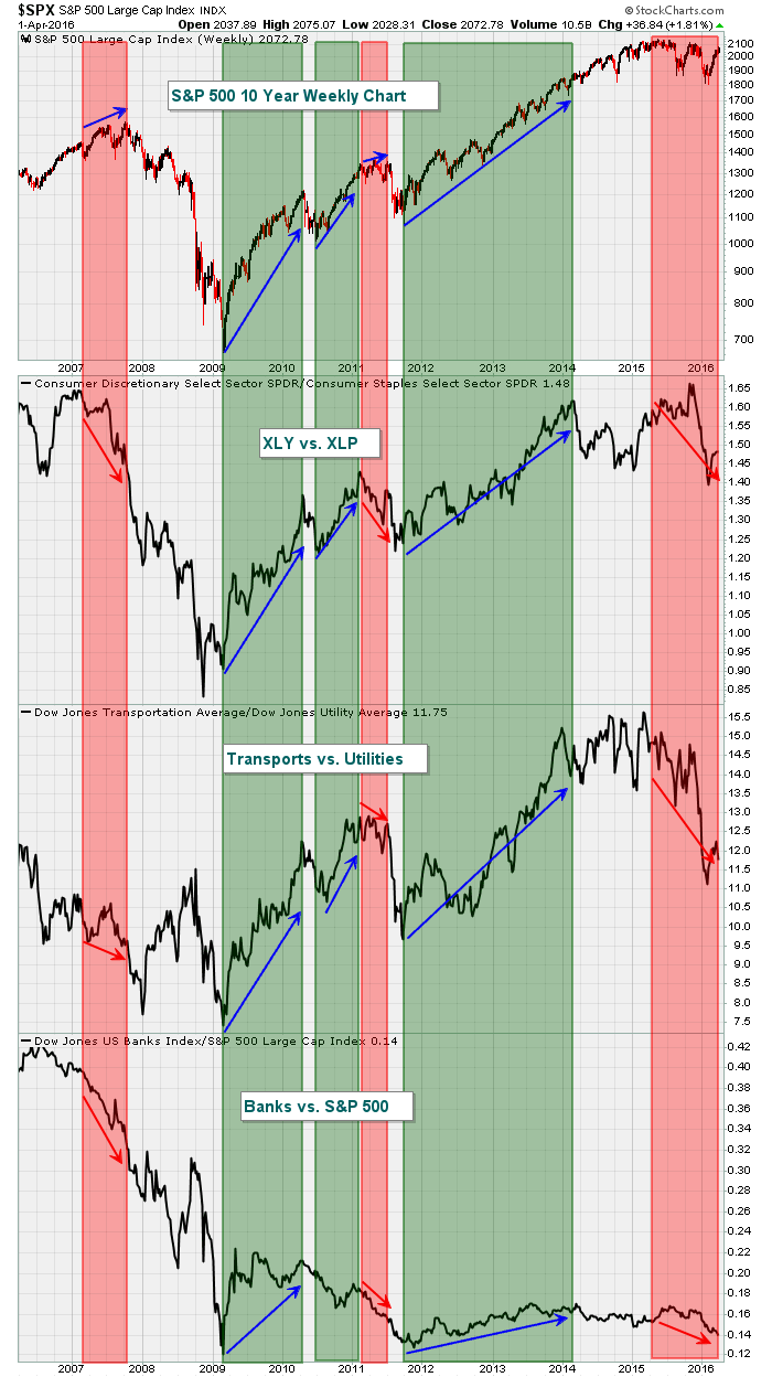 The strongest S&P 500 rallies have occurred during those green shaded areas when money has rotated to aggressive areas. When the S&P 500 rallies and those relative ratios drop, it tends to mark significant market tops.
Happy trading!
Tom


