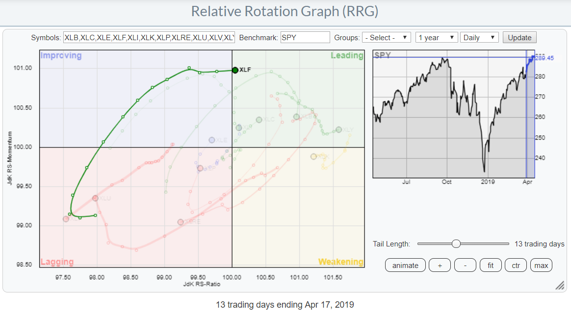
 At yesterday's close, the Financials sector (XLF) crossed over into the leading quadrant on the daily Relative Rotation Graph.
The tail of the sector started to curl upward inside the lagging quadrant roughly two weeks ago, before then proceeding to travel higher on both the Jdk RS-Ratio and Jdk RS-Momentum scales. The sector traveled from lagging into improving and has now entered the leading quadrant.
The increase on the RS-Momentum axes has stalled over the last three days and is now flat. This indicates that relative momentum is now stable/flat, pushing XLF into the leading quadrant at a steady pace.
We have to keep in mind that, on the weekly RRG, this sector is still inside the lagging quadrant; however, it has been making some very irregular and sharp hooks over the past 30 weeks, which makes this chart a bit hard to read at the moment. The daily rotation shows a lot more stability, making it probably more reliable.
The fact that the (somewhat irregular) rotation on the weekly is supporting the strength on the daily RRG is illustrated by the manner in which it is moving closer to the 100-level on the RS-Ratio scale. What we are looking for is a continuation of strength on the daily RRG that can get the weekly RRG to pick up as well.
Bringing It Back To The Price Chart
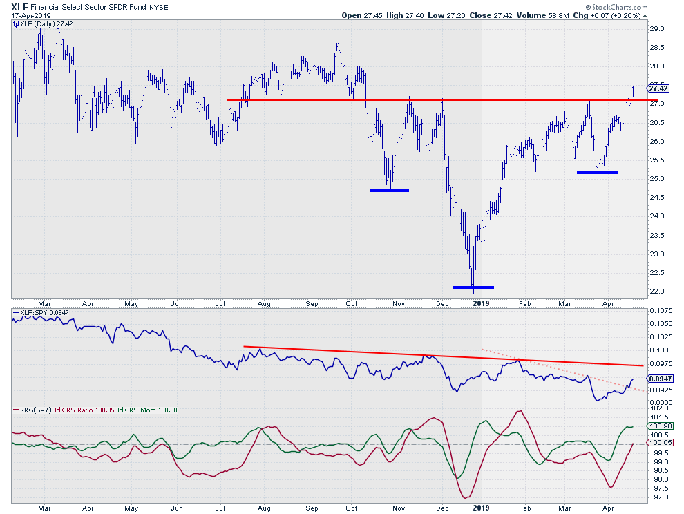
 Above is the daily price chart of XLF in conjunction with its relative strength against SPY. The wide swings are clearly visible. The chart also shows the absence of a real trend, up or down.
A couple of observations can be made on this chart, starting with the price (bar) chart. I'm pretty sure that a lot of people will be jumping on this chart to call for an inverse H&S formation that just broke out to the upside. I have to admit that I am not one of them.
IMHO, many people are very trigger-happy when it comes to calling certain chart-patterns just because they look like one. The problem that I have with this "H&S formation" is that one of the most important requirements for an inverse H&S to be legit is that it needs to be formed at the end of a trend; with a pattern that stretches over a period of seven months, that would have to be a big (down-) trend. That is not the case here.
Nevertheless, I'm happy to acknowledge the improvement for XLF because of the upward break of horizontal resistance near $27. That clearance of resistance opened up the way to the next intermediate resistance levels in the $28 to $28.50 range, where a few old highs are clustering. At the same time, the old resistance should now start to act as support for declines.
From a relative perspective, the big trend is still down, but the first signs of improvement are starting to become visible, especially in the RRG Lines that are now both above 100 (which is causing the crossover into leading ;) ).
All In All
What we are seeing here, IMHO, is an improvement on the daily timeframe for a very important heavyweight sector, which will need to be monitored for confirmation on the weekly timeframe to get into a longer-term turnaround and make that new relative trend sustainable.
My regular blog is the RRG Charts blog. If you would like to receive a notification when a new article is published there, simply "Subscribe" with your email address.
Julius de Kempenaer
Senior Technical Analyst, StockCharts.com
Creator, Relative Rotation Graphs
Founder, RRG Research
Want to stay up to date with the latest market insights from Julius?
– Follow @RRGResearch on Twitter
– Like RRG Research on Facebook
– Follow RRG Research on LinkedIn
– Subscribe to the RRG Charts blog on StockCharts
Feedback, comments or questions are welcome at Juliusdk@stockcharts.com. I cannot promise to respond to each and every message, but I will certainly read them and, where reasonably possible, use the feedback and comments or answer questions.
To discuss RRG with me on S.C.A.N., tag me using the handle Julius_RRG.
RRG, Relative Rotation Graphs, JdK RS-Ratio, and JdK RS-Momentum are registered trademarks of RRG Research.


