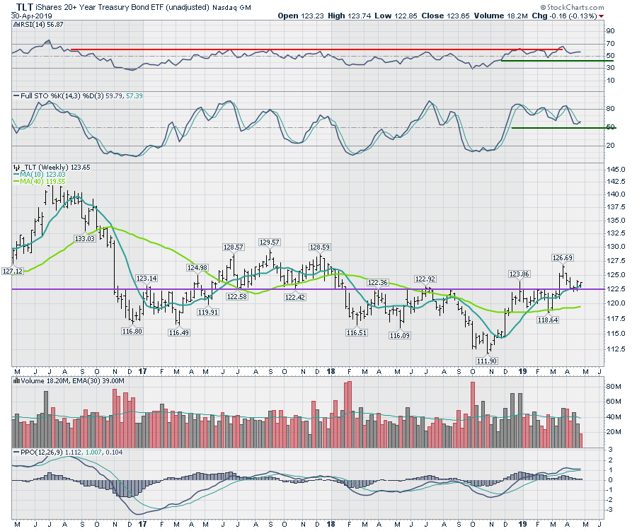
The bond market has narrowed itself into a tight range. Below is the TLT chart, with the yield payments removed from the price action. This chart allows us to see how the price is moving, and right now it is sitting at a particularly interesting junction. Bond prices started to rise after the Fed meeting on November 7-8th and have continued to rise since, but they now face an important decision point. Let's walk through what the chart is telling us.
 In a down market, the weekly RSI has trouble rising above 60. Back in March (2019), the market players pushed the RSI to the highest level since mid-2016. This was months after the stock market bottomed. However, from that point on, the stock market roared forward and the bond market price action pushed the RSI down into a major downtrend, where it dipped below 30. This marked a new bear market trend for bond prices. The RSI stayed low until March 2019. Now that it has moved above 60, I have placed a green line going back to it when it originally went above 40. So the real question is this: are we positioned for a new trend of higher prices, or is this the same response as we saw in 2016? At 56 on the RSI, it is halfway between 70 and 40 (so, about the center of the range). No real information there, but the last signal was for higher prices with the push above 60. So it seems we have a small, bullish price bias.
The next question mark is on the full stochastic, which typically stays bullish when turning up above the 50 level. It has just turned up and crossed the signal line, but today is only Tuesday. If the price action moves down assertively this week, it could take the full stochastic back below the signal line and suggest a move away from bonds. It couldn't be set up more delicately, but, as it sits today, it is leaning to the upside. That is a slightly bullish bond price environment.
Looking at the price pattern, price moved above the major support/resistance line around the last Fed meeting on March 20th. Now, it has pulled back to the support line. Will we see another surge in the price. or will support fail and the price drop back into a bearish pattern, pushing yields up? It is currently above both the 10-week and 40-week moving averages, so that is a bullish configuration. It is also holding above the support line, which is also bullish.
The PPO is also flat and just above the signal line. If this was going to roll over now, that would signal lower prices, higher yields. As it currently sits just above the signal line, that, too, is bullish.
A lot hinges on the Fed meeting tomorrow. The chart could not be more balanced. First, moves off of the Fed announcement can reverse Thursday, so a Friday close will probably be the best answer for the bigger picture of yields heading into June and July. At this point, the chart is slightly bullish, but it is not positioned as a one-way street higher.
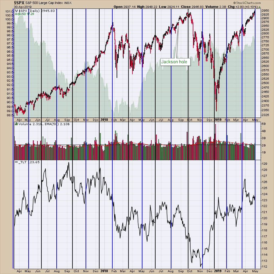
Here is a chart I keep of Fed meeting dates. Notice some of the major market pivots on Fed meetings and some big changes in interest rates. You can click on the chart and save it to your own ChartList. If you annotate it before saving it, it will keep all the lines I have marked on the chart. The black lines mark interest rate increases. Notice that it was 5 meetings between the January 2018 high and the September high.
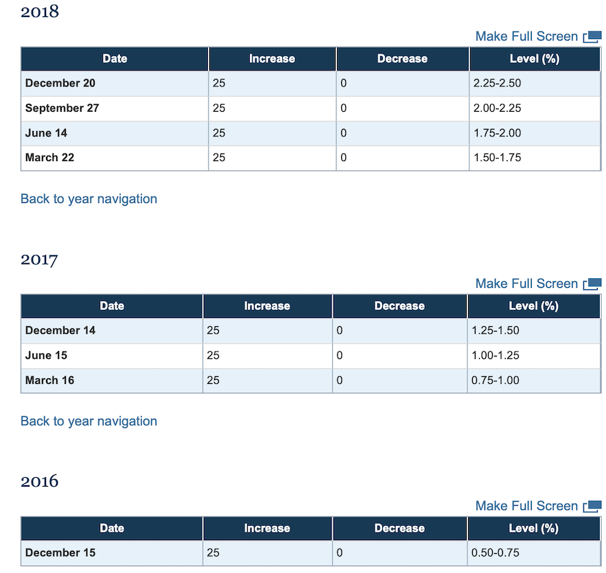
 The table below is from the Federal Reserve website. It details the dates of interest rate increases in tabular format.
 Tomorrow is an important date if the chart is going to change direction; interest-rate related sectors like financials are leaning towards lower bond prices. Will the chart break down?
Good trading,
Greg Schnell, CMT, MFTA
Senior Technical Analyst, StockCharts.com
Author, Stock Charts For Dummies
Want to stay on top of the market's latest intermarket signals?
– Follow @SchnellInvestor on Twitter
– Connect with Greg on LinkedIn
– Subscribe to The Canadian Technician


