 Many investors would be shocked to learn that what they thought was their prudent well-diversified portfolio of five different asset classes might be effectively no different than owning the same car in five different colors. If you fail to understand asset correlations, most of your portfolio could be essentially the identical make, model and year of car, just appearing different in five hues. As I’ve been preparing my upcoming seminar on Asset Allocation (set for October 17, 2015), I’ve realized that it’s a major challenge to simplify the topic of modern asset allocation strategy. It’s a subject that academics love to complicate and that Wall Street seems reluctant to make transparent for investors. Let me explain.
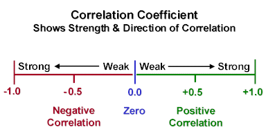
So, what is a correlation and why is it important? Mathematicians and statisticians refer to it as covariance. Wall Street refers to it as a correlation between asset classes (ETFs) or equities. A correlation calculator is a tool that calculates the historical relationship between two equities that happen to change together. It can occur over many different time periods and can be done based on daily, weekly or monthly prices. The degree to which the prices of two different equities or asset classes move together is expressed as a range between +1.0 down to -1.0. If the two equities’ prices move historically in the same direction, it’s a positive correlation with the mean value falling between zero and +1.0. If they move in opposite directions, it’s a negative correlation and readings range from zero to -1.0.
This is important because earnest diversification involves more than just allocating assets to different baskets. You only reap the benefits of reducing your risk if your portfolio is truly balanced in the correlations amongst the portfolio’s assets. It’s useful to think of it as a vertical spectrum where you have high correlations at the bottom that yield little diversification, while at the top you have low correlations amongst your assets – thereby yielding greater diversification.
Here’s a simple example that illustrates the concept and its impact on portfolios. Let’s suppose that Bill and Mary are siblings who have inherited the same assets from their parents. Both of them decide that they would rather invest their entire inheritances in a four asset baskets containing some sector SPDR ETFs and the S&P 500 (SPY).
Bill invests his inheritance as follows:
25% in the S&P 500 (SPY)
25% in Industrials (XLI)
25% in Consumer Discretionary (XLY)
25% in Technology (XLK)
Mary invests her inheritance as follows:
25% in the S&P 500 (SPY)
25% in HealthCare (XLV)
25% in Energy (XLE)
25% in Utilities (XLU)
Bill thinks he’s being prudent and responsible in his investing strategy, but in fact the ten year historical correlation for his assets works out to be 0.92 which means that Bill’s entire portfolio basically mimics the S&P 500. In other words, he owns four identical cars in four different colors. Despite all good intentions, he did not actually achieve the diversification and risk reduction he expected. Mary, on the other hand, has truly reduced her risk and achieved her diversification objective. Her assets turn out to have a much lower correlation to the S&P 500 at only 0.67 – a figure that reduces her risk significantly in comparison to her brother. You can check out the correlation tracker on the SPDR website.
http://www.sectorspdr.com/sectorspdr/tools/correlation-tracker
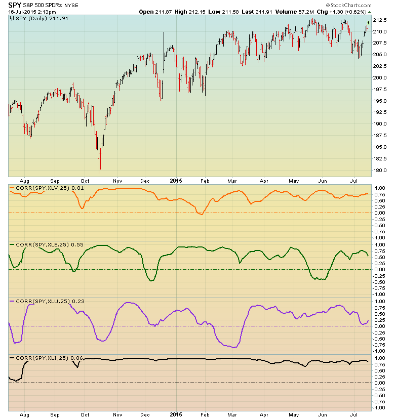
For those of you who would like to dig into the numbers or construct your own spreadsheet, there are YouTube videos to step you through the calculations, investopedia.com has articles on the math, and of course, StockCharts’ own ChartSchool has a wonderful write-up with good examples. StockCharts also plots the correlation coefficient. This is available in SharpCharts under “indicators”, but it maxes out at one year.
Check your brokerage websites as well. Most have a tool that will make suggestions as to how you might allocate your funds depending upon the risk profile you request. Implicit in the asset baskets they suggest is their own correlation calculations so as to provide true risk reduction and modern diversification, although it seems to me they don’t want you to do your own correlation calculations.
If you do a web search for “Stock Correlation Calculator”, you’ll come up with a number of sites that do the calculations for you. Fair warning, however: different sites yield slightly different results. Some vary just a bit, but others vary more than I think they should. Nevertheless, you’ll get a pretty good idea whether the assets are positively or negatively correlated and to what degree. I’d love to hear from readers about their preferences. If I do, I’ll share your comments for others to see as well.
Referring back to the Bill and Mary example above, don’t forget to include in your matrix the correlations amongst the individual sectors themselves – not just to the S&P 500. As individual investors, we should all make use of these modern and essential asset allocation tools. It’s a fact that since the mid-1990s, the variance performance amongst many different asset classes has significantly diminished. As a result, real diversification within a portfolio takes more effort to achieve. Fortunately for us, with new niche ETFs and a wide assortment of mutual funds, we can still achieve broad diversification and reduce our risks. I strongly advise you to redo all the correlation calculations for your portfolio holdings at least once a year using 10-year historical data for those calculations.
It should also be noted that, as you can see on the StockCharts example above, correlations will swing above and below the reported mean correlation which is the calculated representative number these calculators spew out and which S&P and the brokerages report.
Consider as well that these correlations are based on historical data. We can’t be certain that future correlations will look exactly the same as the past. This is another reason to recalculate your correlations on a regular basis and use at least ten years of data. They will fluctuate, and you’ll want to know how they are fluctuating. Your rebalancing efforts and how you adjust your asset baskets should be influenced by these shifting correlations.
The bottom line is that traditional asset allocation thinking is seriously outdated. Given the access that today’s individual investors have to non-traditional asset classes via ETFs and niche mutual funds, coupled with correlation calculation tools, we can harness the full benefits of mitigating downside risk, capturing healthy upside potential and enjoying the full benefits of prudent diversification.
Hope to see you at my Asset Allocation seminar in October where we’ll dig into all of this in much more detail.
Trade well; trade with discipline!
-- Gatis Roze
P.S. Click HERE for information on my future appearances & seminars.
October 17th, 2015- ASSET ALLOCATION WORKSHOP with Gatis Roze & Chip Anderson.
P.P.S. For both convenience & consistency, please click HERE to automatically receive my blog once a week as soon as it comes out.