 Visual Analysis on Steroids
I am a big believer that investing should be fun and need not eat up all my time. One element I’ve found that makes it more so is creating colorful and visually alluring charts. To this end, present ChartPack users will therefore notice that over 100 charts have been improved with more distinctive presentation and attractive colorization. You’ll want to spend more time looking and listening to what these charts have to tell you.
As is the case in all of these chartlists, the overall paramount objective when we first offered the ChartPack back in 2013 and continues to be true today with each update is to present ever more visually powerful charts that save you precious analysis time while maximizing your market insights.
With this update, we actually hired a professional investor to review the entire ChartPack for a fresh perspective but still keeping these specific goals in mind. His suggestions were insightful and are reflected in this update.
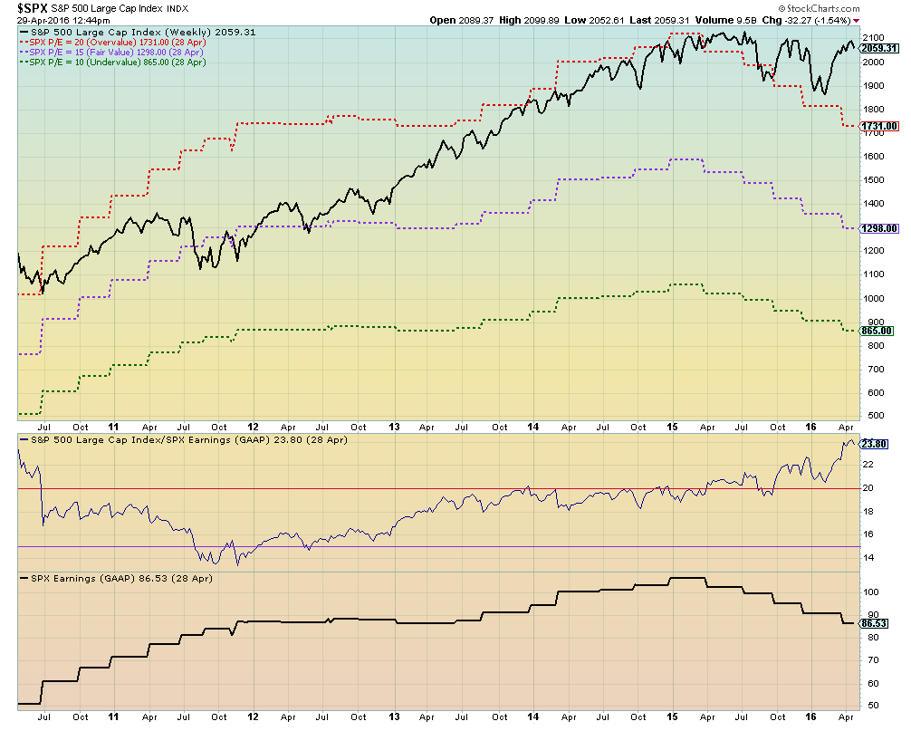
ChartList 10.4 – Permission to Sell Dashboard: Fundamentalists Rejoice! It is a fact that earnings drive the market. In 2001 and 2008, when the S&P 500 (GAAP) Earnings began to trend down, the market ($SPX) soon followed. Note: GAAP stands for generally accepted accounting principles.
I have to thank Bill Shelby of StockCharts.com and my fellow investor, Roger Shantz, for invaluable input on this new chart. Notice that the current value of the S&P 500 ($SPX) is above the red P/E-20 level which means that it is in historically over-bought territory. The purple line represents a P/E of 15 which historically has been fair value, while the green dotted line is undervalue representing a P/E =10. In the pane beneath the main chart, you can see the S&P500 over its earnings which is, of course, its P/E.
Back in 2000, the $SPX was clearly overvalued and the market subsequently crashed. On the flip side, in 2011 the $SPX was below the purple fair value P/E = 15 line and from that point, it produced a 90% uptrend.
Fair warning: this P/E analysis on the S&P500 is one thing. It’s another story with individual stocks. Based on P/Es, these three stocks seemed overvalued on these dates, but each had immense run-ups that began at these points.
- Edwards Life Sciences (EW): Feb 2016, P/E = 37
- Palo Alto Networks (PANW): May 2014, P/E = 187
- Facebook (FB): July, 2013. P/E = 45
ChartList 10.9 – Sample Chart Styles: To more accurately portray the relationships between two equities on one chart, we have converted the H6 Momentum Chart to a performance chart for both equities. Visually, this better shows the true relationships between the two. Since both are plotted on the same scale, they can be directly compared.
ChartList 105 – Master ETF Watchlist: There are a number of adjustments necessary to this chartlist as it generally maintains approximately 100 of the key ETFs within the present market largely based on trading volume. Derivatives and leveraged ETFs are mostly excluded. Among other additions this quarter, there are entities such as EWJ which reflects increased Japanese trading, BSV which reflects the market’s short-term bond orientation, and EEM which reflects emerging markets coming alive. I find it useful to sort this chartlist in the “summary” mode and format it based on one-week and one-month performance. The market preferences will immediately jump out at you. For example, this past month Real Estate and Oil Services clearly occupy opposite ends of the spectrum.
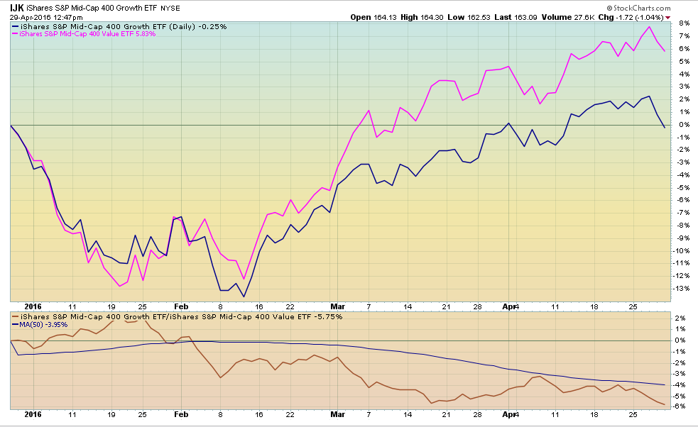
ChartList 120 – Growth versus Value: I’d like to use this chartlist to make a number of points about the ChartPack in general. The prime objective of this specific chartlist is to answer the key question: “Is the present market favoring growth stocks or value stocks?” The secondary question we will also see answered is whether the market presently finds large caps, mid caps or small caps to be the most appealing.
In this chartlist, the four individual charts are now standardized. You will see the following as you peruse the S&P 500, the Russell 3000, S&P Mid Caps or the S&P Small Caps:
- For easy comparison, all the charts are plotted in percentage performance. In other words, if both S&P 500 Growth (IVW) and Value (IVE) are up 3 to 5%, but S&P Small Cap Growth (IJT) and Value (IJS) are up 5 to 8%, then you know the market is favoring small caps.
- On all four charts, the value ETFs are the same color (purple) and the growth ETFs are a different color (blue). Scroll through the four charts and within five seconds you’ll know if the market is favoring growth or value.
- We’ve also added a price-relative pane below each chart to show you in percentage terms precisely how much the market is valuing one over the other. Think of it as a strength meter of the market’s present love for either growth or value.
- We added full description displays on all these ticker symbols. For example, it is no longer displayed as only “IJT” but is now shown as “IJT – S&P Small Cap 600 Growth”. This is done by using the “Legends” pull-down menu and clicking on “Verbose”.
- Finally, the fifth chart has three growth and three value ETFs all plotted together. As I write this, the three growth ETFs are up 1 to 4%, but the three value ETFs are up 5.5 to 8.7% over the past four months. I would guess that it would take a novice visual investor only ten seconds to look at this chart and see those same conclusions jump off the page.
ChartList 205 – Funny Money: This falls under the umbrella we’ve talked about in our book and DVDs. As an investor, you have to enjoy what you do. At the same time, prudent asset allocation is the law of the land. Having said that, we believe a small percentage of your portfolio could be allocated to a more actively managed growth objective. For example, ChartList 205 contains 56 country funds that we’ve reformatted to the performance mode. In other words, both the Index (Vanguard Total World – VT) and the specific country fund are plotted on the same chart and both represent percentage changes in their respective prices (Performance).
We believe this makes it visually easier to identify a country fund when it is relatively out-performing VT. This chartlist of country funds almost always has a handful of ETFs that significantly outperform. See for yourself. Sort the chartlist by performance over the past three, six or twelve months. You’ll be shocked. The beta will be much lower because these equities march to their own unique drummers, but the volatility will be higher therefore. This is when you put on your growth vest and trader’s hat. These are meant for trading and not a buy and hold for the long term. For example, the Indonesia Fund (IDX). If you pay attention, you can grow your money quickly in this arena, but don’t take your finger off the trigger.
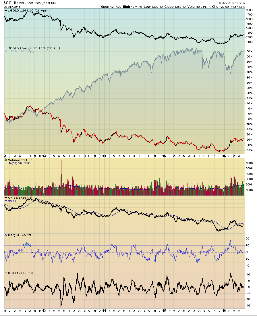
ChartList 217 – Gold: The Gold to VTI (Broad Market) chart has been converted to a performance chart so as to more accurately convey the relationship between the two equities. Note how the visual effect jumps off the page when plotting both an area chart of VTI and topping it with a thick line chart of VTI. The top chart shows the actual price of gold.
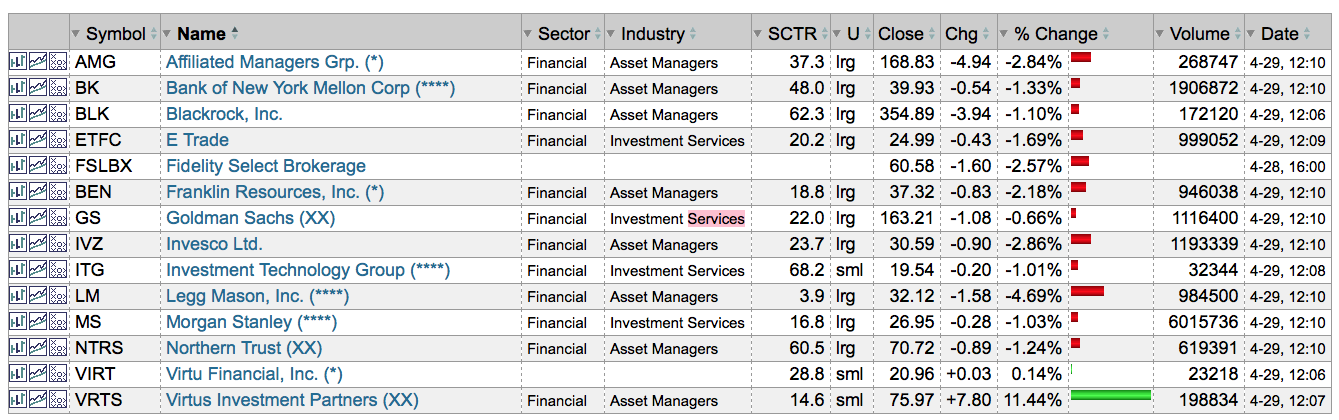
Fidelity Funds Latest Buys and Sells (ChartLists 420-12 thru 420-90): Given the ongoing uncertainty surrounding the Fed decisions, it is not surprising that the financial sector funds saw big changes. For example, in the Brokerage / Investment Management fund, one of the industry's largest investment services firms was dropped this past quarter.
Volatility in the energy market continues to dominate the headlines, and that turmoil is reflected in the energy sector funds. The Energy portfolio saw lots of changes in its top 10 holdings, as did the Natural Gas and Natural Resources funds.
After many months of price deterioration, Anadarko (APC), a major oil and gas exploration and production firm, was added to three separate energy-related funds. With big institutional support, the stock has been recovering nicely since February 2016.
A Silicon Valley sweat heart that straddles two separate industries was picked up by the Technology fund after falling out of its top 10 holdings just last quarter. The stock has seen significant volatility in recent months, but it is now clearly becoming a target among the institutions.
Over the course of the last two quarters, Boeing (BA) has clearly fallen out of favor with the Fidelity managers, disappearing from the top 10 holdings of multiple portfolios.
Reminder: Fidelity’s recent equity additions to its top ten holdings are coded in each chartlist with stars (*). One star (*) next to the name of the equity denotes that it was added in the first quarter of the year. Two stars (**) denote an addition I the second quarter, three stars (***) denotes a third quarter addition, etc. A double XX after an equity’s name denotes that the stock was sold out of the top ten holdings list during this quarter.
Trade well; trade with discipline!
-Gatis Roze, MBA, CMT
UPGRADE INSTRUCTIONS FOR EXISTING CHARTPACK USERS:
Important: If you have modified any of the charts in any of the ChartLists that start with “GR - ”, those changes will be deleted as part of the upgrade process. If you want to keep those changes, you need to copy those charts into a different non-"GR" ChartList before you upgrade!
To Upgrade the Tensile Trading ChartPack, follow these steps:
1. Log in to your account and then click on the "Your Account" link in the upper right corner of the web page.
2. Scroll down and find the "ChartPacks" area towards the bottom of that page.
3. Find the entry for the "Tensile Trading" ChartPack in the table that appears. (If you don't see it, that means that you didn't purchase it - click here to purchase it.)
4. Click on the "Re-Install" button next to the Tensile Trading ChartPack to start the reinstall process.
The download should take about 15 seconds. At that point, you can explore the new ChartLists and updates.
INSTALLATION INSTRUCTIONS FOR NEW CHARTPACK USERS:
If you are new and would like to add the Tensile Trading ChartPack to your StockCharts account, please Click HERE to get started.