 History matters because markets do indeed repeat themselves. John Kenneth Galbraith was interviewed in the PBS documentary, The Crash of 1929, and he observed that every 30 years or so we predictably have a major market correction because that seems to be the length of time it takes each generation to forget the lessons of the previous generation.
Over decades of trading, I’ve developed a keen understanding of how history gets repeated. I’ve absorbed the economics and history of the Roaring ‘20s from reading books. I lived through the late 1980s when Japan was thought to be the unstoppable new global economic powerhouse. I experienced the tech and telecom boom of the late 1990s when the revolution had supposedly transformed the rules of economics, permitting permanent rapid growth. A key lesson from these experiences and many more is that fundamentals don’t matter during an emotional crisis – only the charts matter.
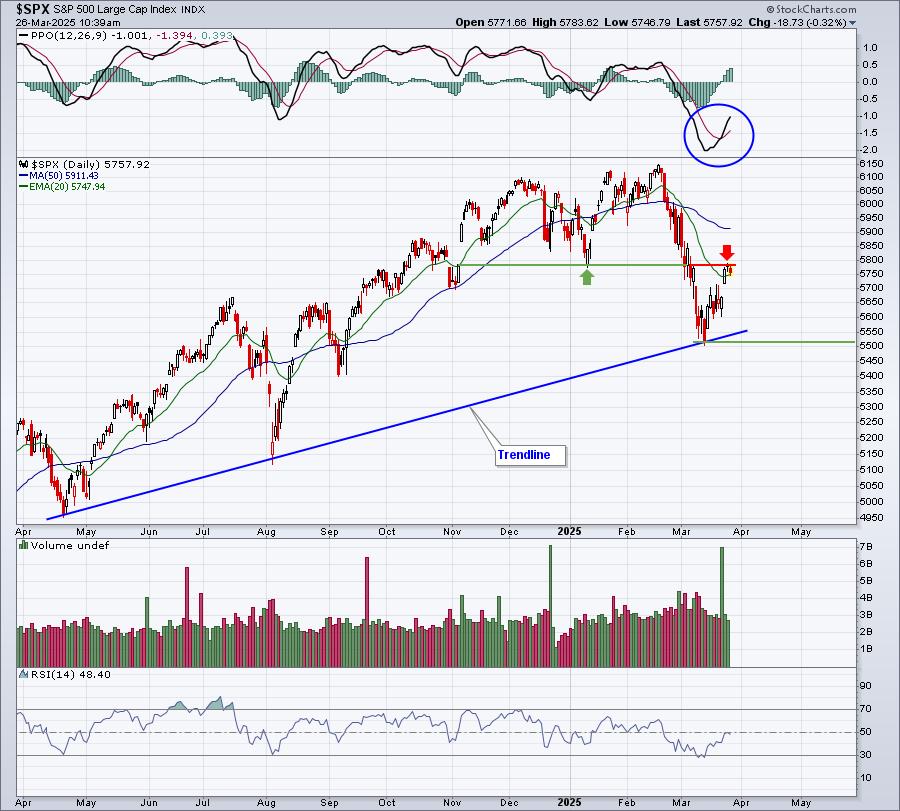
As the pendulum swings between the extremes of fear and greed, my charts accurately capture and quantify the collective psyche of millions of investors. My charts are exactly the same as yours, with the same vertical lines representing the days’ highs and lows and with the same boxes below representing volume. But what makes my charts more powerful is that I’ve watched, read and traded the pendulum swings enough times that these inanimate lines come alive to me.
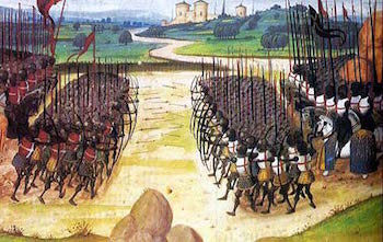
In my mind’s eye, I see crowds of wide-eyed buyers and sellers pushing each other back and forth on the battlefield of prices where the highs and lows of the day represent the battle’s boundaries for that particular day. The tiny horizontal hash marks on the price chart are in fact immense banners. The first banner erected on the battlefield represents the opening volley where the tug of war between buyers and sellers started on that day. The second banner – and this is critical – is erected at the end of the day’s battle somewhere along the continuum of the field to celebrate and acknowledge victory or defeat by one of the two warring factions. Some days the battlefield will be very narrow, representing an equilibrium or balance of sorts amongst these auction participants. If relatively few shots are taken, then the volume will be low.
It is the complexion of this daily battle that evolves with the fluctuating fear and greed of the auction participants, thereby offering clarity and insights into the true nature of my charts. I have come to acknowledge the fact that basic human emotions haven’t changed – whether I am studying the crash of 1929 or the recent housing bubble burst. The civics might be different and the players changed, but investors’ feelings of euphoria and greed, their tendencies to fall prey to the lure of easy money or “get rich quick” schemes, even when they know that past booms have always led to busts, predictably play out in repeatable cycles over hundreds of years.
Where others see simple price lines on a chart, I see human emotions and all the personal baggage that they bring to the table as investors. I grow to understand individual markets and equities as they develop a particular normal “personality”. As Jesse Livermore said, “Every stock is like a human being: it has a personality, a distinctive personality. Aggressive, reserved, hyper, high-strung, volatile, boring, direct, logical, predictable, unpredictable,. I often studied stocks like I would study people; after a while their reactions to certain circumstances became more predictable.” It is when a chart’s normal healthy personality starts to change that my radar is set off.
The time when I pay very close attention is when the battlefield starts to expand, when the daily banner placement upon the open and the close is no longer orderly, when the tug of war between buyers and sellers starts becoming one-sided. What unlocks key nuances and insights in my charts is simply this embellished vision in my mind’s eye of the battlefield and how these very real buyers and sellers are truly expressing themselves.
Try this exercise: Rent from Netflix the film The Crash of 1929, the 60-minute PBS documentary made in 2009. Watch the expressions of the participants as you track a price and volume chart in front of you through the year leading up to the crash. The result will be that you associate these persons’ real emotions to the price and volume charts of that day. The lesson I have learned is to look closely at the charts – to price and volume day-by-day – and to literally put faces on the players who are expressing their emotions by voting with their dollars. This is what allows me to get a glimpse into their souls. If you are able to embrace a similar metaphor, then you, too, will unlock deep timely insights within your charts.
Trade well; trade with discipline!
- Gatis Roze, MBA, CMT
- Grayson Roze
- Author, Tensile Trading: The 10 Essential Stages of Stock Market Mastery (Wiley, 2016)
- Presenter of the best-selling Tensile Trading DVD seminar
- Presenter of the How to Master Your Asset Allocation Profile DVD seminar
- Developer of the StockCharts.com Tensile Trading ChartPack


