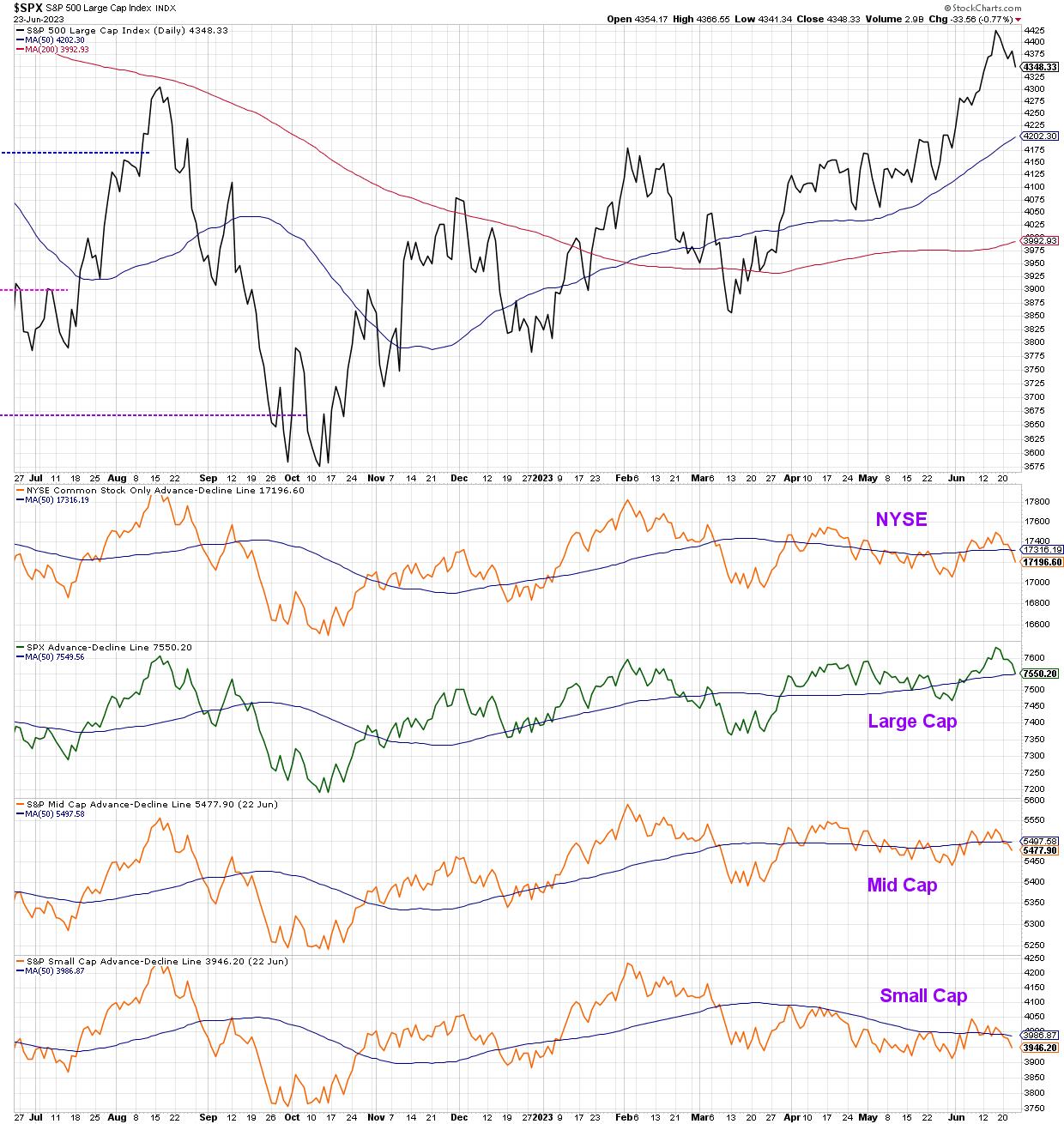
Recently, we've focused on the overextended nature of the small group of mega-cap leadership names in 2023, and even identified three key charts to watch for a pullback in the technology sector. This week, we observed further deterioration in breadth indicators, with the cumulative advance-decline lines for all cap tiers closing Friday in a position of weakness.
At the end of the day, our growth-oriented, cap-weighted benchmarks will follow the direction of the FAANG stocks. And that will remain the case until there is some dramatic upheaval in the calculation of our widely-followed equity benchmarks.
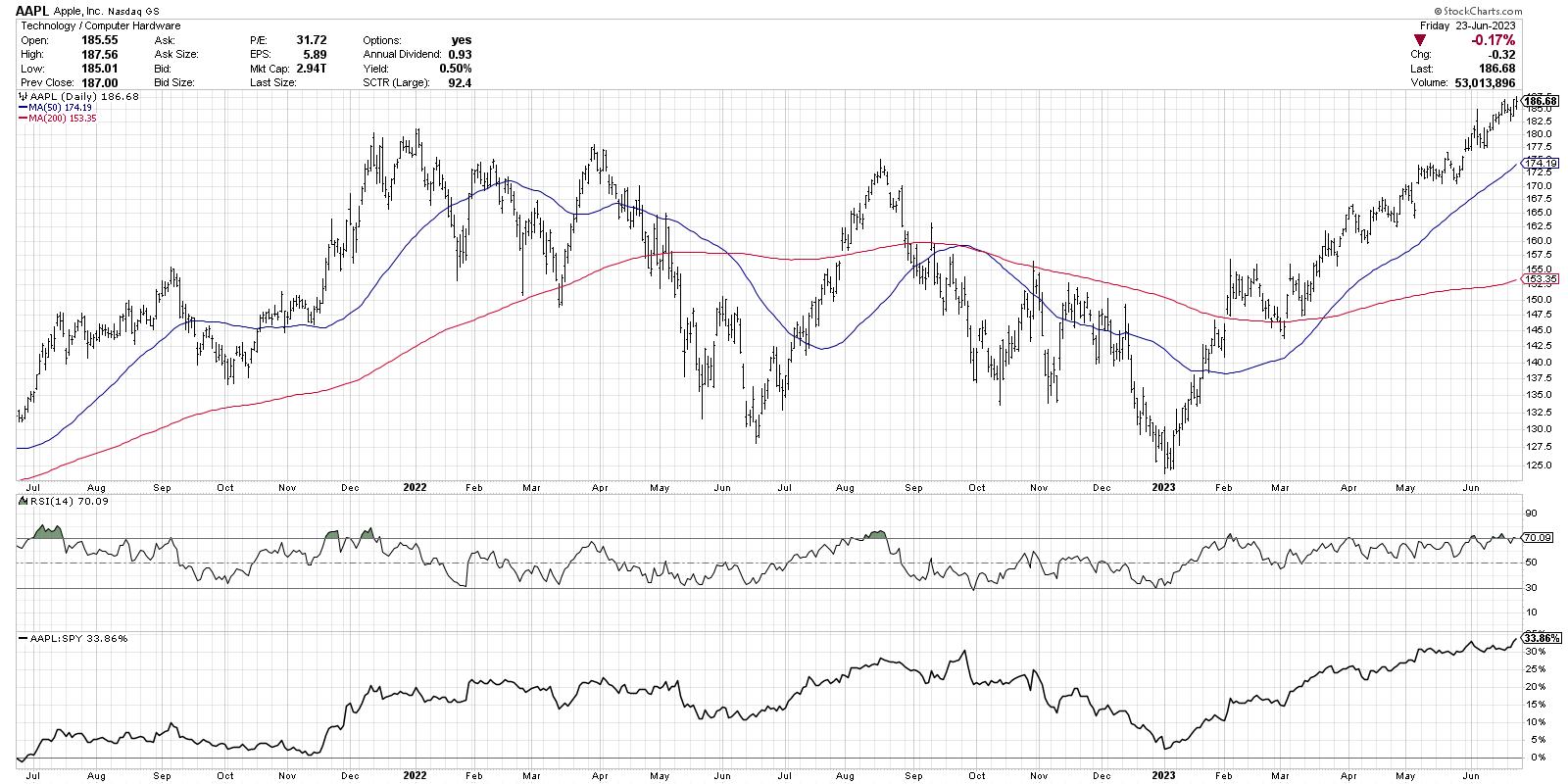
With that in mind, charts like AAPL are still working. Higher highs and higher lows are an uptrend by definition, and Apple is displaying plenty of both in 2023.
So if AAPL looks so bullish right now, then why are we talking about downside targets for the S&P 500? Well, that has to do with two key market breadth charts that flashed big-time sell signals this week.
First, let's check the McClellan Oscillator, which is based on cumulative advance-decline data.
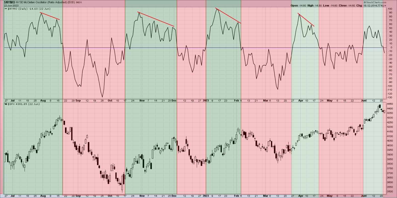
I've shaded this chart green when the indicator is above the zero level, and red when it flips back below the zero line. Think of it as an oscillator that tracks the rate-of-change of the cumulative advance-decline line, showing us the trend in breadth over time.
The most recent sell signal in late April did not lead to much of a decline, with the SPX drifting slowly higher until the next buy signal about a month later. Previous sell signals over the last 18 months have been incredibly valuable, highlighting the most important drawdowns in both bullish and bearish cyclical markets. So I'm inclined to follow the lessons of history and assume that this week's signal is a good reason to think more defensively and focus on capital preservation instead of capital growth.
Here's another breadth indicator that just turned bearish, and it's based on point & figure charts of the Nasdaq 100 members.
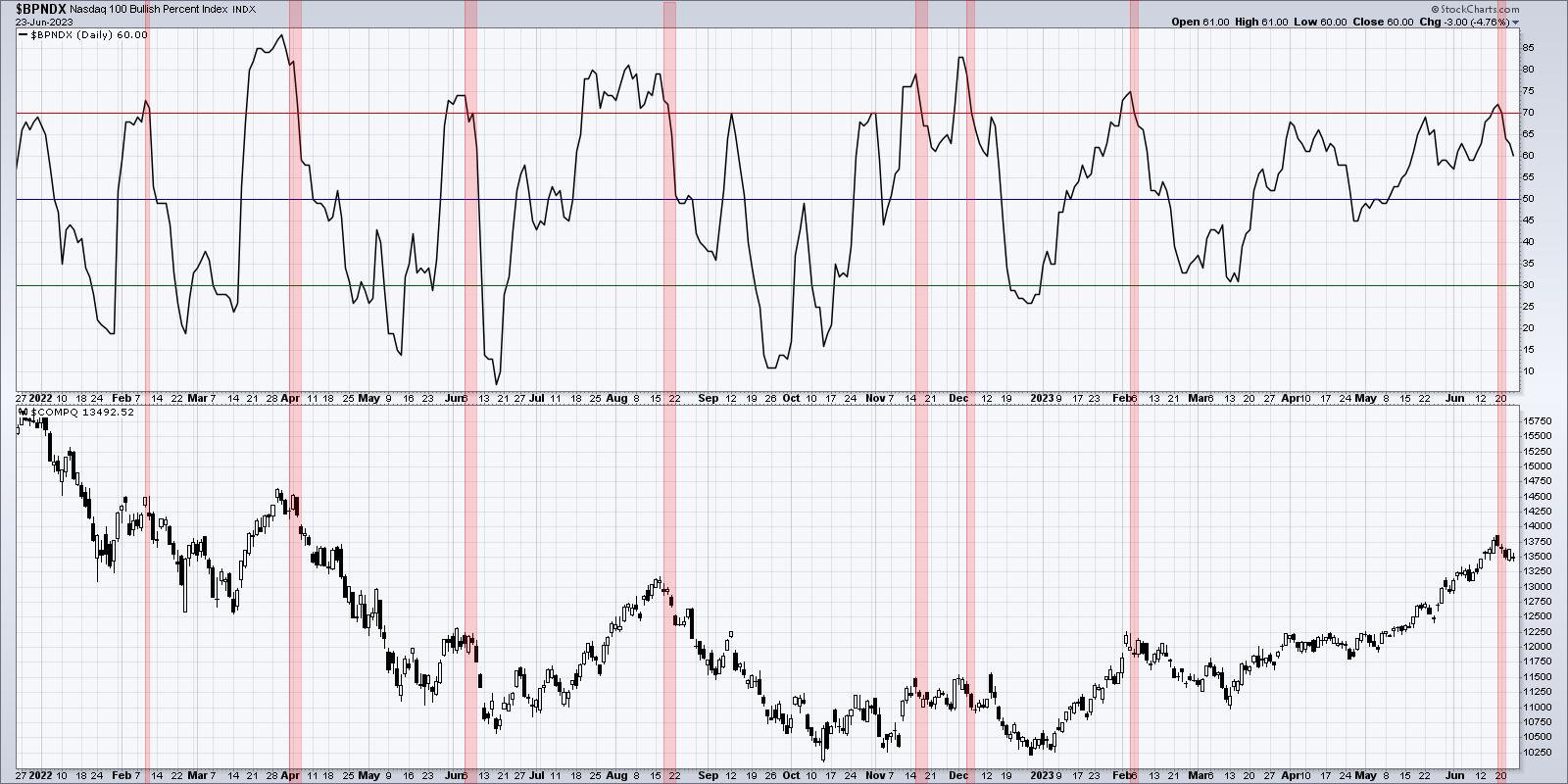
I've highlighted in red when the indicator moved above the 70 level and then back below. To rephrase, we're looking for when the breadth became overwhelmingly positive, and then turned much less positive. If you know point & figure charting, you know that it takes quite a bit to rotate from a bullish signal to a bearish signal, so I've found these rotations to be a great indicator of potential market tops. Almost all of these bearish signals over the last 18 months have preceded healthy pullbacks, and in some cases have come at the beginning of meaningful declines in price.
So let's assume for a moment that the market continues lower next week. What are some downside objectives to keep in mind?
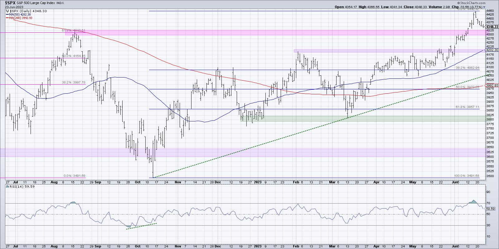
The first level to watch is the recent breakout level. You'll often see stocks break above a key resistance level, then soon after revisit that level from above. This can serve as a springboard to further price gains once resistance becomes support. So that means 4300 is the initial level and, as long as we remain 4300, then this would be a brief pullback indeed!
If we break 4300, then I'd be looking toward the 50-day moving average, currently sitting right around the February 2023 high at 4200. Strong charts often pull back to an ascending 50-day moving average, and one could argue that a similar move for the S&P 500 in June-July could set the stage for a resumption of the long-term uptrend. If both of those levels fail, then I'd be focused in on the 4060-4080 range. 4083 represents a 38.2% retracement of the October 2022 to June 2023 rally, so a key Fibonacci level to expect price support. A trendline connecting the major lows in 2022 and 2023 currently lines up around 4050 so we have what's considered a "confluence of support".
Now given all of the evidence above, here's what we should we really be asking ourselves as investors in June 2023.
How comfortable would I be with a 5% drop in the S&P 500? 10%? 20%?
How could I protect myself now from the downside risk we discussed?
At what "line in the sand" should I get more defensive? And where would I consider adding to existing positions?
By thinking through downside possibilities now, you can be better equipped to handle any challenging market environment!
Our latest YouTube video digs into the Nasdaq 100 Bullish Percent Index, including potential impacts to the Technology and growth stocks more broadly speaking.
RR#6,
Dave
P.S. Ready to upgrade your investment process? Check out my free behavioral investing course!
David Keller, CMT
Chief Market Strategist
StockCharts.com
Disclaimer: This blog is for educational purposes only and should not be construed as financial advice. The ideas and strategies should never be used without first assessing your own personal and financial situation, or without consulting a financial professional.
The author does not have a position in mentioned securities at the time of publication. Any opinions expressed herein are solely those of the author and do not in any way represent the views or opinions of any other person or entity.


