TAKEAWAYS
- The head and shoulders pattern is a classic price pattern that confirms an exhaustion of buyers.
- Investors should consider the three phases of price patterns, and make sure to confirm all three phases before taking action.
- This pattern yields a minimum downside objective of around 4080-4100 for the S&P 500.
There's no denying that we've seen signs of distribution from key stocks like Apple, Inc. (AAPL) and Tesla (TSLA) breaking down to breadth conditions that have become less bullish by the week.
This week, we confirmed a head and shoulders topping pattern for the S&P 500, giving a bearish tone to the major equity averages going into next week. While the selloff into the end of this week was certainly related to the Fed meeting and Powell's press conference on Wednesday, the signs of deterioration have been building for the last couple of weeks.
Today, we'll break down the head and shoulders topping pattern on the $SPX chart, outline the three phases of price patterns in general, and identify some potential downside targets for the S&P 500.
The Head and Shoulders Pattern Defined
A number of technical analysis disciplines, from Elliott Wave to Dow Theory, use an analysis of highs and lows to define trends and identify potential reversals. Charles Dow's basic definition was that an uptrend is comprised of higher highs and higher lows. Once that pattern is broken, then the uptrend may be in jeopardy.
Robert Edwards and John Magee, in their classic book Technical Analysis of Stock Trends (one of the most important books on our Recommended Reading List), described the head and shoulders top as an important pattern representing a "change of character" on the chart.
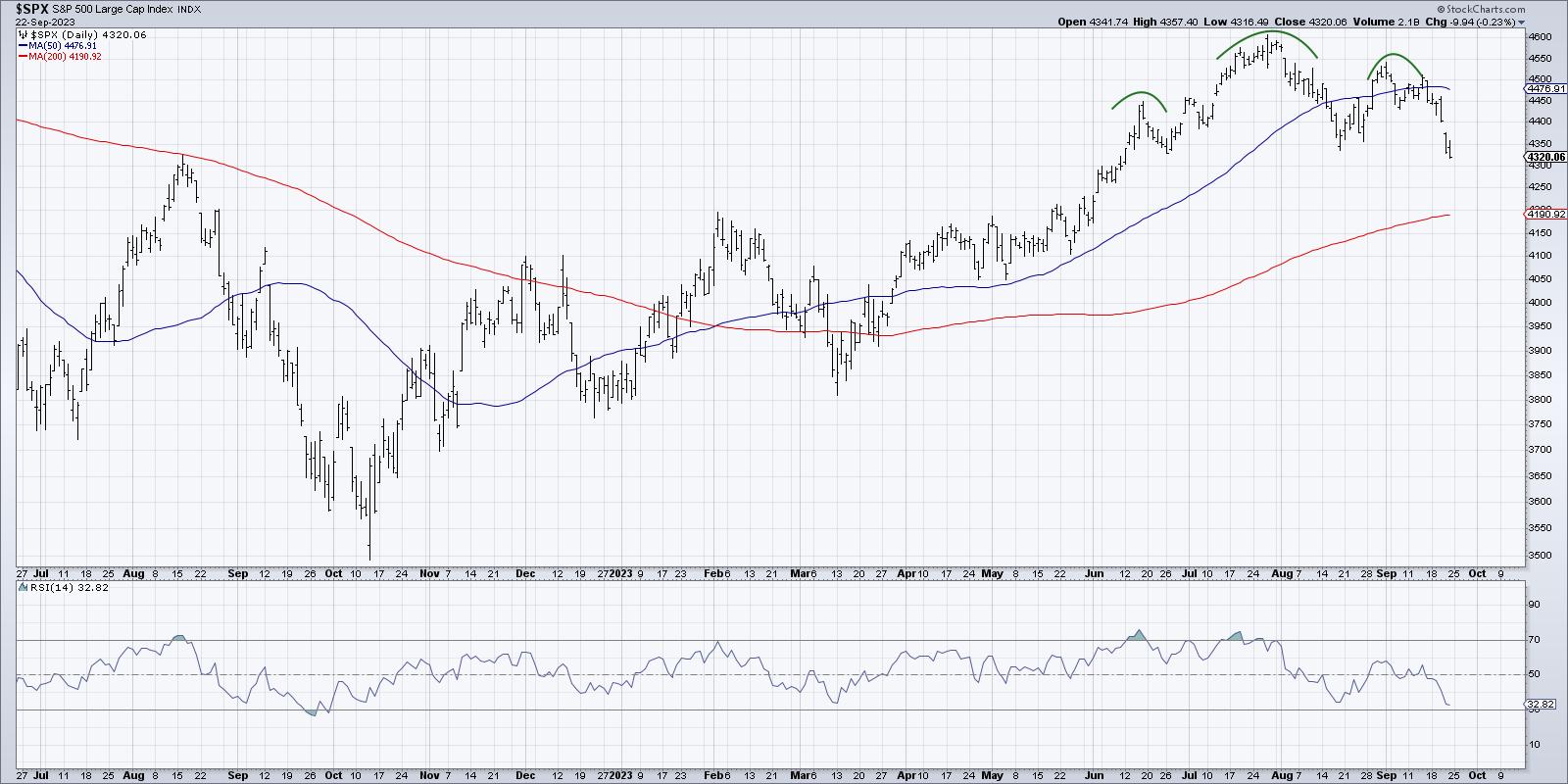
I like to think of the head and shoulders top as a failed attempt to make another new high. The uptrend phase keeps making higher highs and higher lows until, finally, there's a failed attempt to push to a new price high. This often indicates an exhaustion of buyers or sellers beginning to unload shares into the market or both. For whatever reason, the price no longer fits the description of an uptrend.
I've found that novice technical analysts tend to label price patterns like the head and shoulders way too early before the pattern has been completed. This is why I've come to describe the three phases of price patterns. By waiting for these three steps, you can minimize false signals and whipsaws.
The Three Phases of Price Patterns
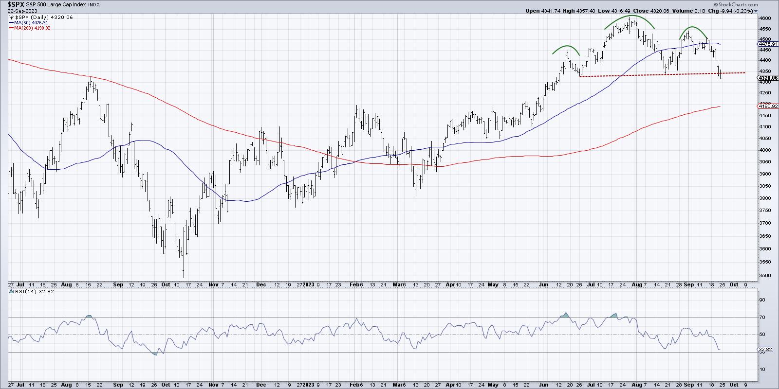
All price patterns can be broken down into three specific phases: the setup, the trigger, and the confirmation. Let's review these three steps using an updated S&P 500 chart that includes the crucial neckline.
The setup is when the pattern starts to become recognizable. You can see the lower high (the right shoulder in a head and shoulders top); it sure looks like a head and shoulders pattern, and you're ready to label it as such.
But you have to remember that until the price breaks the neckline of the pattern (dashed red line above), you can only label it as a "potential" head and shoulders pattern. The trigger is the point at which you can remove the "potential" label, and correctly identify the pattern as completed.
On the S&P 500, that meant we needed a break below the neckline which was around 4350. Then and only then can we identify likely downside targets based on the height of the pattern.
The final phase is the confirmation, which involves some further move in the direction of the breakdown. This is a crucial step, because I've often found that a chart will break below a key level of support, only to reverse course and move right back in the previous direction. This sort of whipsaw move can be frustrating for traders, as what appears to be a clear signal never materializes into anything further.
There are a couple of different ways to define the follow-through, but I tend to keep it very straightforward. I look for at least one more bar moving in the direction of the breakdown as a validation that the pattern has been completed.
We saw the initial breakdown of the pattern on Thursday, and then Friday's session pushed even further down below the neckline. In my opinion, that is enough to declare this as a confirmed head and shoulders top for the S&P 500 index.
Downside Objectives for SPX
Now that we've confirmed a breakdown, what's next for the major equity averages? We need to remember that short-term patterns yield short-term objectives, and long-term patterns yield long-term objectives. So while this breakdown seems like a climactically negative bear move for the SPX, it may just confirm that the current corrective move has a bit further to go.
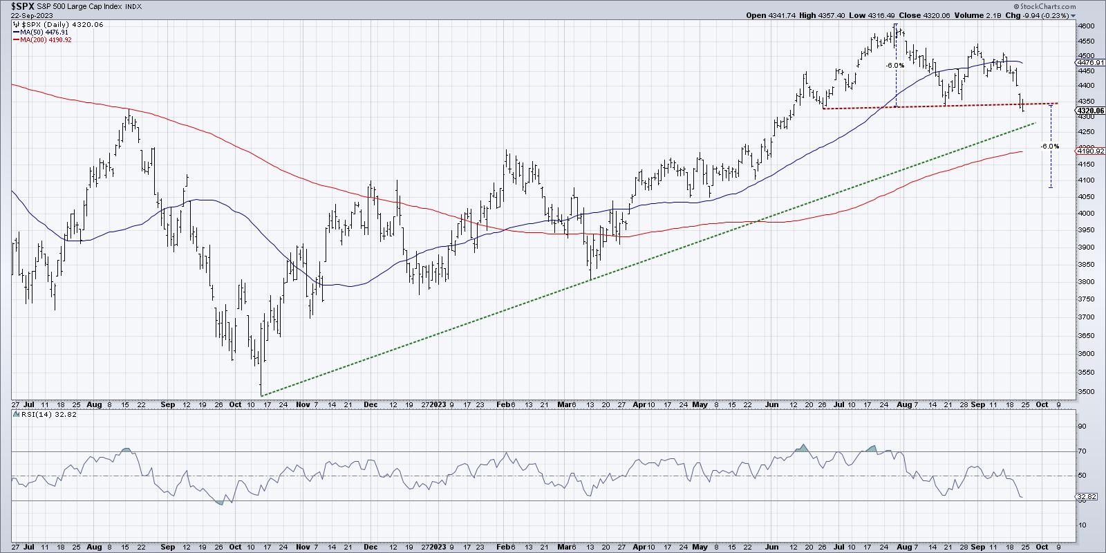
The classic measurement technique for a head and shoulders pattern is to take the height of the pattern from the head to the neckline and then project a similar move down after the break.
This particular pattern consisted of about a 6% move from the July peak to the neckline, which means that a similar downside move would result in a minimum downside objective of around 4080.
It's worth noting that I'm using percentages here because I almost always use log scale charts, where the Y-axis is defined by percentages instead of dollar values. The other way to measure the downside objective is just to use the dollar values on an arithmetic scale. It's about a 250-point range from the top of the head to the neckline, which would mean a downside objective of around 4100.
It's important to remember that these patterns do not occur in a vacuum! So other potential areas of support, including the 200-day moving average and major trendlines, are still very much in play. But one thing I've learned over the years is to follow the trend. And for now, the trend in the S&P 500 appears negative.
RR#6,
Dave
P.S. Ready to upgrade your investment process? Check out my free behavioral investing course!
David Keller, CMT
Chief Market Strategist
StockCharts.com
Disclaimer: This blog is for educational purposes only and should not be construed as financial advice. The ideas and strategies should never be used without first assessing your own personal and financial situation, or without consulting a financial professional.
The author does not have a position in mentioned securities at the time of publication. Any opinions expressed herein are solely those of the author and do not in any way represent the views or opinions of any other person or entity.
