TAKEAWAYS
- There have been less new 52-week highs since mid-September, suggesting leaders are falling off.
- The percent of S&P 500 members above their 50-day moving average is below 75%, which often serves as a threshold for a downturn.
- The S&P 500 Bullish Percent Index remains strong, but a drop below the 70% could confirm a pullback for the major indices.
As a bull market reaches an exhaustion point, market breadth indicators often tend to diverge from the price action of the benchmarks. This "breadth divergence" occurs as leading names begin to falter, and initial selling drives some stocks down to new swing lows.
Today, we'll review three market breadth indicators, outline what tends to happen at the end of a bull phase, and describe what we'd need to see to confirm a likely market top based on historical topping phases.
New 52-Week Highs on the Decline
As I discussed with my guest Mark Newton earlier this week, one of the most effective ways to gauge a potential market top is to watch for a decline in the percent of stocks making new 52-week highs.
What will a contentious election season mean for your portfolio, and how can you position yourself as the market moves through the seasonally weakest part of the year? Join me for a FREE live webcast on Tuesday 10/15 at 1:00pm ET called "Election 2024: Positioning Your Portfolio" and we'll review all the charts you should follow to navigate election season and beyond!
In a bull market phase, it makes sense for more and more stocks to be achieving this feat. But as a bull market matures, fewer and fewer names are pushing higher, and this indicator tends to diverge from the price action.
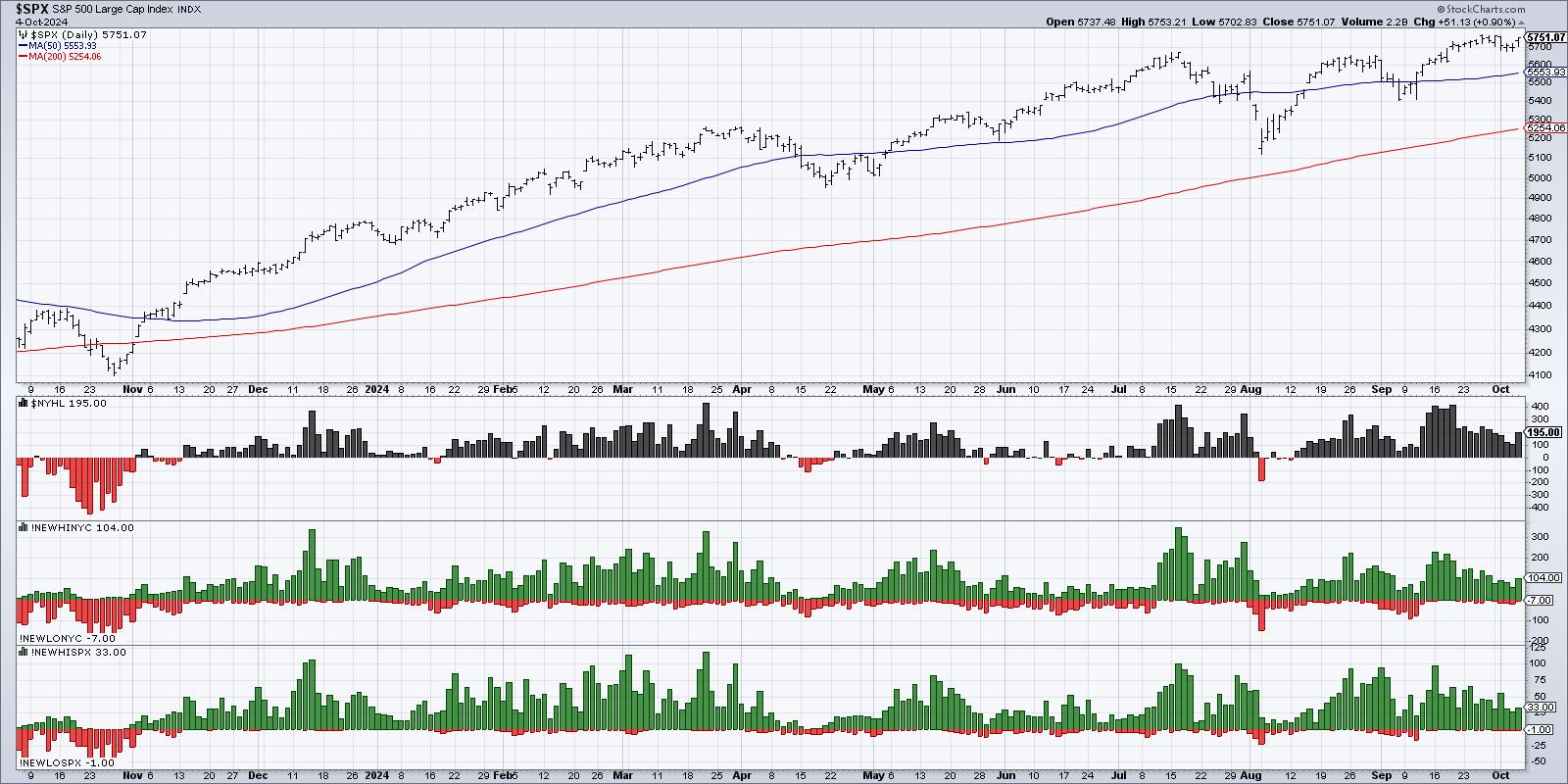
At its highest level in mid-September, we observed about 20% of the S&P 500 members making a new 52-week high on the same day. By Thursday of this week, that number was down around 5-6%. So, while some stocks are still pounding higher, fewer and fewer names appear to be participating in the uptrend.
More Stocks are Breaking Their 50-day Moving Average
This next chart features two indicators based on the percent of stocks above their moving averages. The top panel represents the percent of S&P 500 members above their 200-day moving average, which I consider a decent way of measuring long-term breadth conditions.
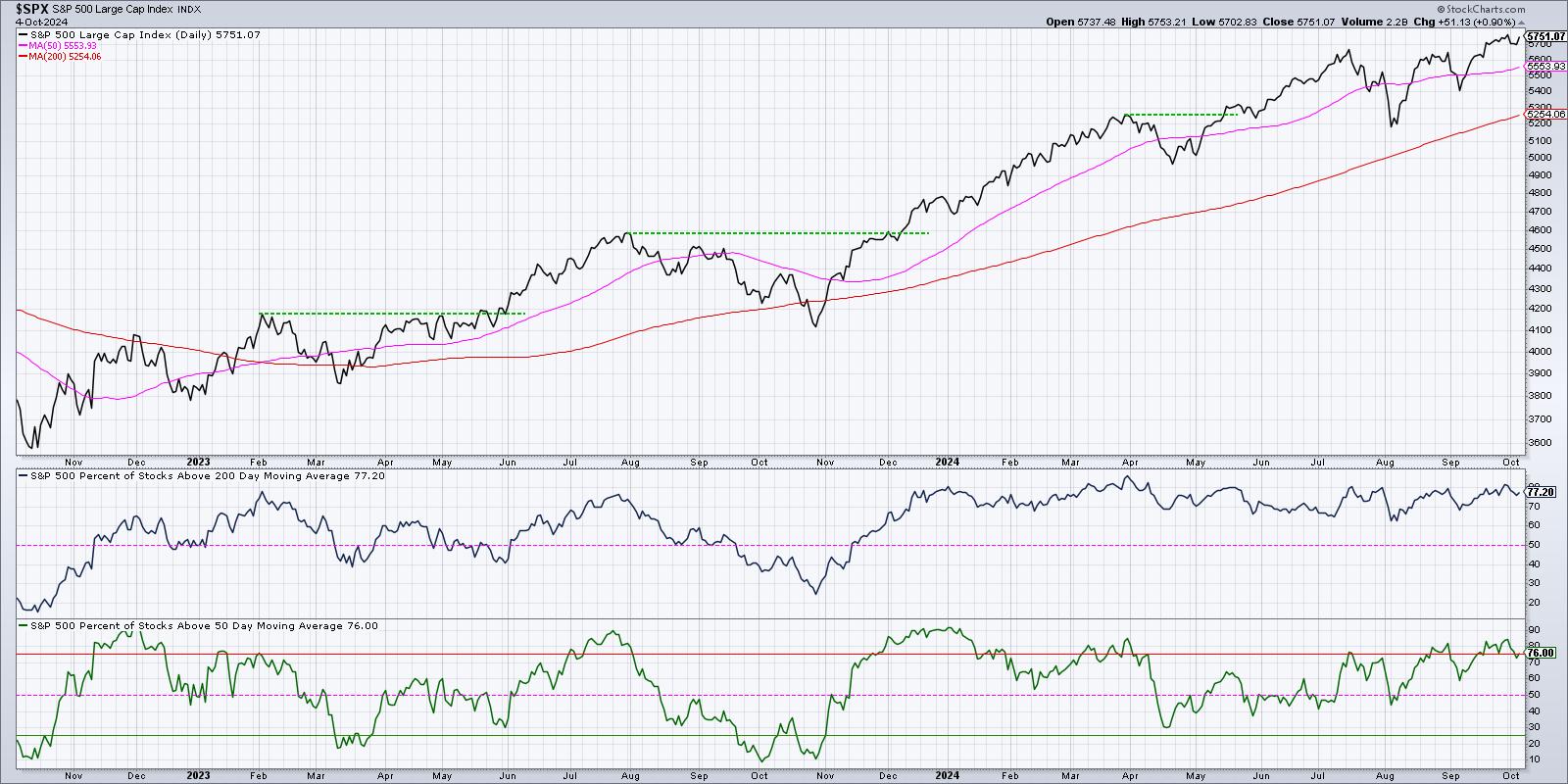
When the S&P 500 index pulled back in April and August, this indicator remained well above the 50% level, confirming that most stocks remained in a primary uptrend despite the short-term weakness. When we instead use the 50-day moving average, shown in the bottom panel, we can see that this week the measurement dipped below 75%.
I have often found that tactical market pullbacks are marked by this indicator breaking below the 75% level, as that suggests that stocks which had been trending higher are now breaking down below this short-term measure of trend.
Watching the Bullish Percent Index for a Key Bearish Signal
Finally, we can use point & figure charts to create a breadth indicator called the Bullish Percent Index. Over the last couple weeks, this indicator has pushed above 80%, which represents one of the highest levels in recent years. This confirms that four out of every five S&P 500 members are showing a bullish signal on their point & figure charts.
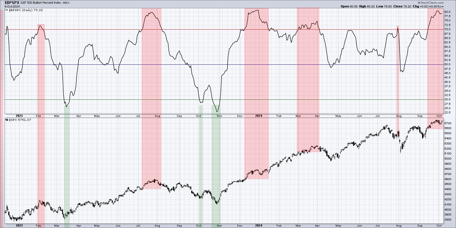
In this situation, I like to watch for the Bullish Percent Index to dip back below 70%. That will show that some of those strong point & figure charts are starting to register sell signals, which would mean the price action has changed from bullish to bearish. For now, this indicator remains comfortably about the 70% level, but, based on historical data, that signal could signal a death knell for the bull market phase.
Market breadth indicators are so valuable as they allow investors to look "under the hood" to assess real market conditions from the hundreds of stocks that comprise our major indexes. While these readings remain largely construction for now, these charts could provide fantastic signals of a new pullback phase in October.
RR#6,
Dave
P.S. Ready to upgrade your investment process? Check out my free behavioral investing course!
David Keller, CMT
President and Chief Strategist
Sierra Alpha Research LLC
Disclaimer: This blog is for educational purposes only and should not be construed as financial advice. The ideas and strategies should never be used without first assessing your own personal and financial situation, or without consulting a financial professional.
The author does not have a position in mentioned securities at the time of publication. Any opinions expressed herein are solely those of the author and do not in any way represent the views or opinions of any other person or entity.


