Relative Rotation Graphs, RRGs, are a wonderful tool to get a grip on the bigger picture of markets and the rotational movement of trends in relative strength across various instruments in a universe or a portfolio. However, this is only the beginning. Once you have detected something that could be worth your time for further investigation you need to go back to your regular charts and workflow to make up your mind for decision time.
In other words we need to make a connection between what we see on a Relative Rotation Graph and a regular price chart. This connection is made via the two inputs to the RRG plot. These are the two RRG-lines; the JdK RS-Ratio line and the JdK RS-Momentum line. I have tried to visualize that connection in the schematic picture below.
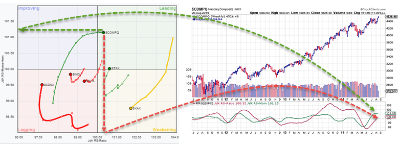
On the left hand side there is a Relative Rotation Graph that shows some major markets stock-indices against the $SPX as the benchmark. This is the default RRG that will show up when you hit the RRG charts link from the home-page and which is also available to free users. One market that pops out is the Nasdaq ($COMPQ). The Nasdaq just entered the leading quadrant from the improving quadrant and is the highest ranked index based on the RS-Momentum axis. Now, in order to make the connection between the RRG and the regular price chart of the Nasdaq I have put the price chart of the Nasdaq in combination with the RRG lines plotted below the price pane, next to the RRG plot.
As you can see on the RRG plot $COMPQ is just above the 100-level on the RS-Ratio axis indicated by the red dotted arrow that points down from $COMPQ to the x-axis. The green dotted arrow point left to the y-axis, the RS-Momentum scale and shows that $COMPX is at a level around 101.25. Finally the red and green arced arrows point to these same levels on the RRG lines plotted below a regular price chart.
Adding the RRG-lines to a regular price chart will enable you to keep making the connection between what is happening on the RRG chart and what is happening on the price chart and embed relative strength analysis, via the RRG-lines, into your regular work-flow.
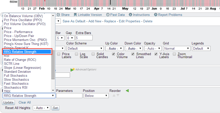
Now adding the lines is as simple as adding a MACD or the RSI to your charts. On the chart controls go to the indicator drop-down and select the <RRG Relative Strength> indicator. Make sure that you change the benchmark parameter if needed. In our example of the Nasdaq relative to the S&P 500 the default $SPX can stay but when you are looking at commodities for example you may want to change the benchmark to something more meaningful!
One more thing to bear in mind, at least for the time being, is that the time-frame used on RRG charts is WEEKLY, in order to make a proper connection to the RRG-lines on a price chart the scale of that price chart should also be set to WEEKLY!
If this raises any questions or in case you have any other questions regarding the use and interpretation of Relative Rotation Graphs then by all means hit me up either via comments on this or other blog articles or on the S.C.A.N! , probably best under the 'other charting tools' section'. I will make an effort to respond within 24 hours!
Julius