DAILY data now available for RRG charts
Until now Relative Rotation Graphs on StockCharts.com could only be rendered using weekly data-streams... Not any more! The early adapters and users who check in on RRGs on a daily basis may have seen the new addition already.
When you open up an RRG chart you will notice that an extra drop-down box has been added on the top-line just before the 'update' button. When you click that drop-down arrow you will be given the choice between weekly and daily data as can be seen on the screen-shot below.
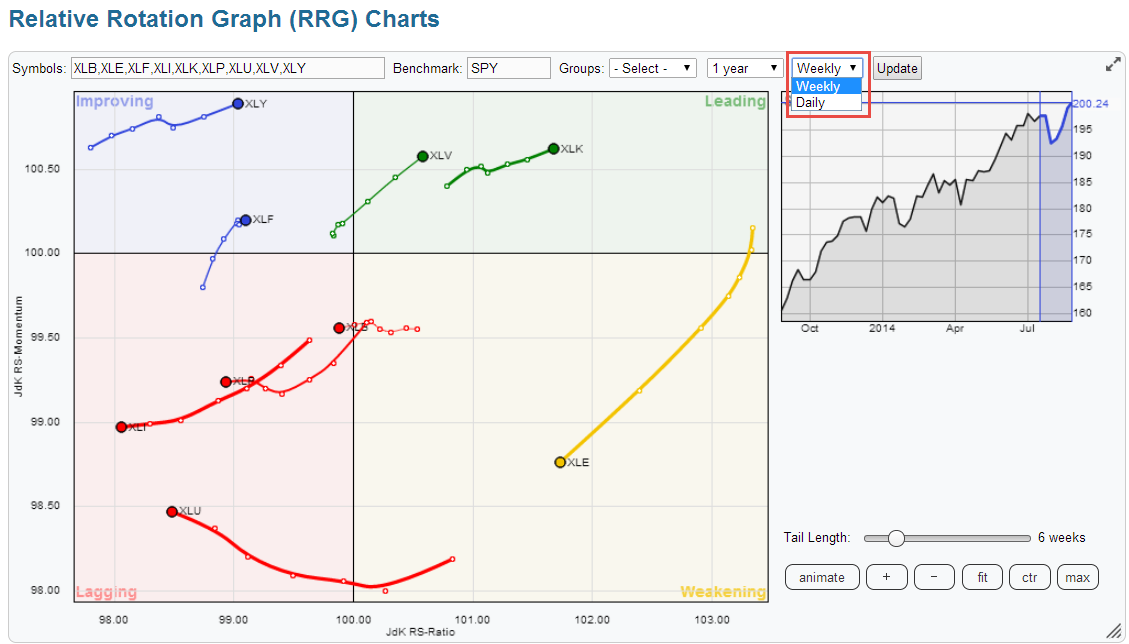
When you switch between an RRG with weekly data and one based on daily data, showing the same universe, you will notice that they look quite different.... I will try to explain the difference and how to make the connection between the two.
First of all it is very important to realize that Relative Rotation Graphs are a 'visualization' tool just like any other chart. Best way to illustrate this is by looking at the S&P 500 chart. Below I have printed a S&P 500 index bar-chart using weekly bars.
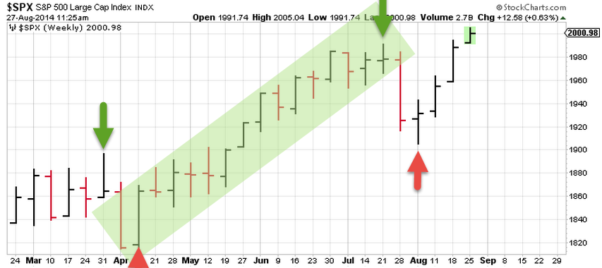
If we use the definition of 'higher highs and higher lows' for an up-trend, and vice versa 'lower highs and lower lows' for a down-trend, we can label the move from March-April to July-August as (part of) an up-trend with the leg from the April low to the July high as more or less one straight move up. However, when we zoom in on that move on a daily chart we see quite some differences. Below is the same chart of the S&P 500 but now using daily bars.
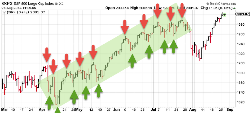
As you can see the 'big moves' on the weekly chart can be broken down into smaller moves on the daily chart. The down-move that occurred in April shows up on the weekly chart as 'just' one leg down. On the daily chart it is actually broken down in a small series of lower highs and lower lows. The whole up-move from April low into the late July high, which is one leg on the weekly chart consists of a whole series of higher highs and higher lows.
Back to the Relative Rotation Graph. The first chart in this article shows the RRG for the S&P 500 sector ETFs on a weekly basis against the SPY with a six week trail. Changing the time frame from weekly to daily makes the picture below.
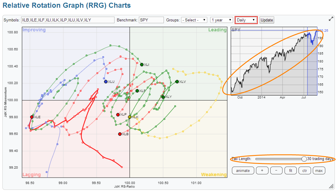
The time frame has been switched to daily in the red outlined box in the top of the graph. But also note that I have changed the tail length to 30 days in order to match the 6 weeks tail that is shown on the previous weekly RRG. I realize that this causes a bit of a mess on the plot but the point that I want to make is that the 30 day tails on the daily RRG show exactly the same period of price action as the 6 week tail on the weekly RRG but in more detail.
A very nice feature to get a better handle on what's going on in such a crowded plot is to click on of the lines in the table just below the RRG chart. Selecting one of the securities on the plot will highlight that specific security and dim all others. This enables users to still view the complete RRG, even with long tails on all securities, but put the focus on only one of the observations. You can browse through the list by clicking the next security or using the arrow keys on your keyboard. Selecting the benchmark symbols brings back all securities on the plot to the foreground again.
This nifty little feature enabled me to put together the screenshot below.
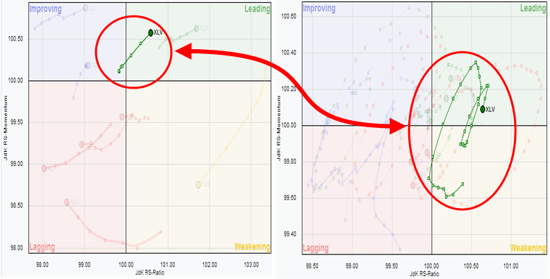
On the left hand side is the same RRG as we have seen on top of this article, the weekly RRG of S&P 500 sector ETFs with the six week tail. On the right hand side of this image is the same universe but now based on the daily data-stream and with the 30 day tail. In both pictures the Health Care sector (XLV) is highlighted.
As you can see the straight move up in a nice 45 degree angle on the weekly RRG translates into an almost full rotation that has taken place almost completely on the right hand side of the RRG on the daily plot. The best way to illustrate these moves using 'classic' relative strength charts is by plotting the Relative Strength line for XLV against SPY on a weekly scale and on a daily scale on top of each other.
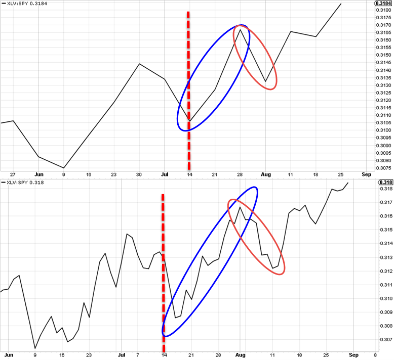
The dashed red lines mark the 6-week and 30-day tail starting points on the respective RRGs. On the weekly chart, in the top-pane, the setback is just one leg in the high-low rotation of the relative strength line which is completely invisible on the weekly RRG chart. On the daily chart in the lower pane, that same move is a series of lower highs and lower lows, causing the rotation down to the weakening quadrant on the daily RRG.
I hope this article helps you to, better, understand the relationship between weekly and daily Relative Rotation Graphs and make use of it. As usual if you have any questions please do not hesitate to post them in the comments. I'll make an effort to get back within 24 hours!
Julius